SoftBank is a conglomerate holding company active primarily in technology, energy, mobile communication, broadband, and finance. It was founded in the fall of 1981. Originally, it worked as a software distributor but only a year later it entered the publishing business. In 1994, the firm went public. The following year, it acquired US-based Ziff Davis publishing, thus starting a 15-year-long period of active expansion.
Meaning and history
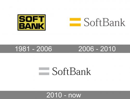
The most notable modification the SoftBank logo has gone through took place in 2006. It was more of an overhaul than a subtle alteration, and it resulted in a far more modern and stylish look.
What is SoftBank
The Japanese holding SoftBank Group Corp was ranked No 27 in Forbes Global 2000 list in 2021. It is headquartered in Minato, Tokyo. Its founder was Masayoshi Son.
1981 – 2006
The original logo was simple, bright, and highly legible. It was adequate and recognizable, although it might lack symbolic meaning.
The design was dominated by the lettering “SoftBank” set in two lines. Such a structure created a certain visual rhythm, where each letter at the top had a corresponding letter below.
The shape of the glyphs was dominated by rectangles. The ends of the letters were straight, and even the “O” was nothing but a softened rectangle.
As a result, the glyphs perfectly fitted the overall shape of the logo, which was also a rectangle.
The original palette was highly eye-catching. The combination of yellow and black is characteristic, for instance, for the body of wasps. In other words, subconsciously, we perceive these colors as a symbol of danger. This has been used by multiple brands and also by designers creating warning signs.
2006 – 2010
The logo became fundamentally different, although you can still notice a wink to its visual heritage.
As SoftBank explains on its corporate website, the designers drew inspiration from the banner of Kaientai, which was a legendary company founded by Ryoma Sakamoto, a renowned Japanese samurai.
Kaientai played an important role in transforming Japan into a modern state. When the company was created, its founders took into consideration the most recent information and knowledge that were available back then.
The fact that Kaientai was a navy and trading company is crucial for understanding why its banner became the inspiration behind the SoftBank logo. Similar to Ryoma Sakamoto and his followers, who weren’t afraid of turbulent waters, SoftBank and all the people who work for it also take part in a metaphorical voyage “sailing boldly forward… giving everything to achieve their goals”.
Also, the brand emphasizes that two lines stand for the mathematical symbol meaning “=” (“equal” or “answer”). This aspect of the logo implies that SoftBank Group has a solution (“answer”) to its customers’ problems and also provides interactive communication.
2010 – present
The color of the lines became gray, to reflect the transformations in the brand identity that were taking place at the time.
Colors and font
The company calls the shade of gray used for the emblem “shining silver”. The color was chosen for its ability to look shiny no matter what colors surrounded it. When used for a pair of parallel lines, it represents “the Information Revolution”, and also the ability to be unaffected by “the passage of time”, as the explanation on the corporate website claims.
The type in the SoftBank logo is the Japanese font called Mincho. According to the company, it symbolizes timelessness and was used to convey their desire to be innovatory and “build a new era that makes people happier while paying homage to history”.


