Sodexo is a food services and facilities managememanagnt company based not far from Paris, France.
Meaning and history
The company started working in 1966 as Société d’Exploitation Hotelière.
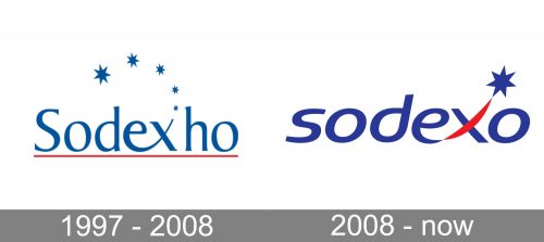
1997 — 2008
During this decade, there were two versions of the Sodexo logo.
The shorter version showcased the name Sodexho, while the full version included the lettering “Alliance.”
In their core, however, the two versions were the same. There was the name of the brand in dark blue with five stars forming a curve above it. The stars varied in size, from the smallest one at the beginning of the curve above the “x” to the largest one above the “d.”
Below, a thin red horizontal bar could be seen. In the full version, the word “Alliance” broke the bar into two identical parts.
2008 — present
The name was shortened to “Sodexo” as a result of a shareholder vote. The aim was to simplify the name (in some languages, the combination “xh” isn’t that easy to pronounce).
The logo also changed, replacing the five stars with a single one. It was still positioned in the same place, just above the top right end of the “x.”
The design has grown cleaner. The red bar disappeared. The letters lost the serifs, and even the lower end of the “d” was gone. There is more contrast and motion, too.
Font
The type in the 2008 wordmark is more minimalist than the previous one, due to the disappearance of the serifs. It also looks more dynamic because of the italics.
Colors
The 2008 Sodexo logo preserves the palette of its predecessor (blue with a red accent). However, there is a slight shift in the shade. The blue has grown darker providing better contrast.


