

![]() Martin Marietta Logo PNG
Martin Marietta Logo PNG
In this article, we will trace the history of the logo of the Martin Marietta brand irrespective of the status the brand had at a given period of time.
Meaning and history
![]()
The American company got its current name only in 2014. Until then, it was known as Lockheed Martin, but the specialization was the same. Martin Marietta is one f the leading providers of materials for building roads and foundations, providing governments and companies in more than 20 states of the USA, Canada, and the Caribbean.
As for the visual identity, the logo of Martin Marietta was changed several times, and each of the redesigns was a result of an acquisition or a merger, with the following name change of the company.
What is Martin Marietta?
Martin Marietta is the name of an American company, engaged in heavy building materials and construction aggregates supply. The company was established in 1993, and by today has grown into a very reputable player in its segment, providing materials all over the USA, Canada, and the Caribbean.
1961
![]()
The company was founded as a result of the merger of Glenn L. Martin Company and American-Marietta Corporation.
The original Martin Marietta logo featured the lettering “Marting Marietta” in an italicized sans. The writing in white was placed inside a black rectangle.
1995
![]()
Marting Marietta merged with Lockheed Corporation. The new company adopted the name Lockheed Martin and developed an independent brand identity.
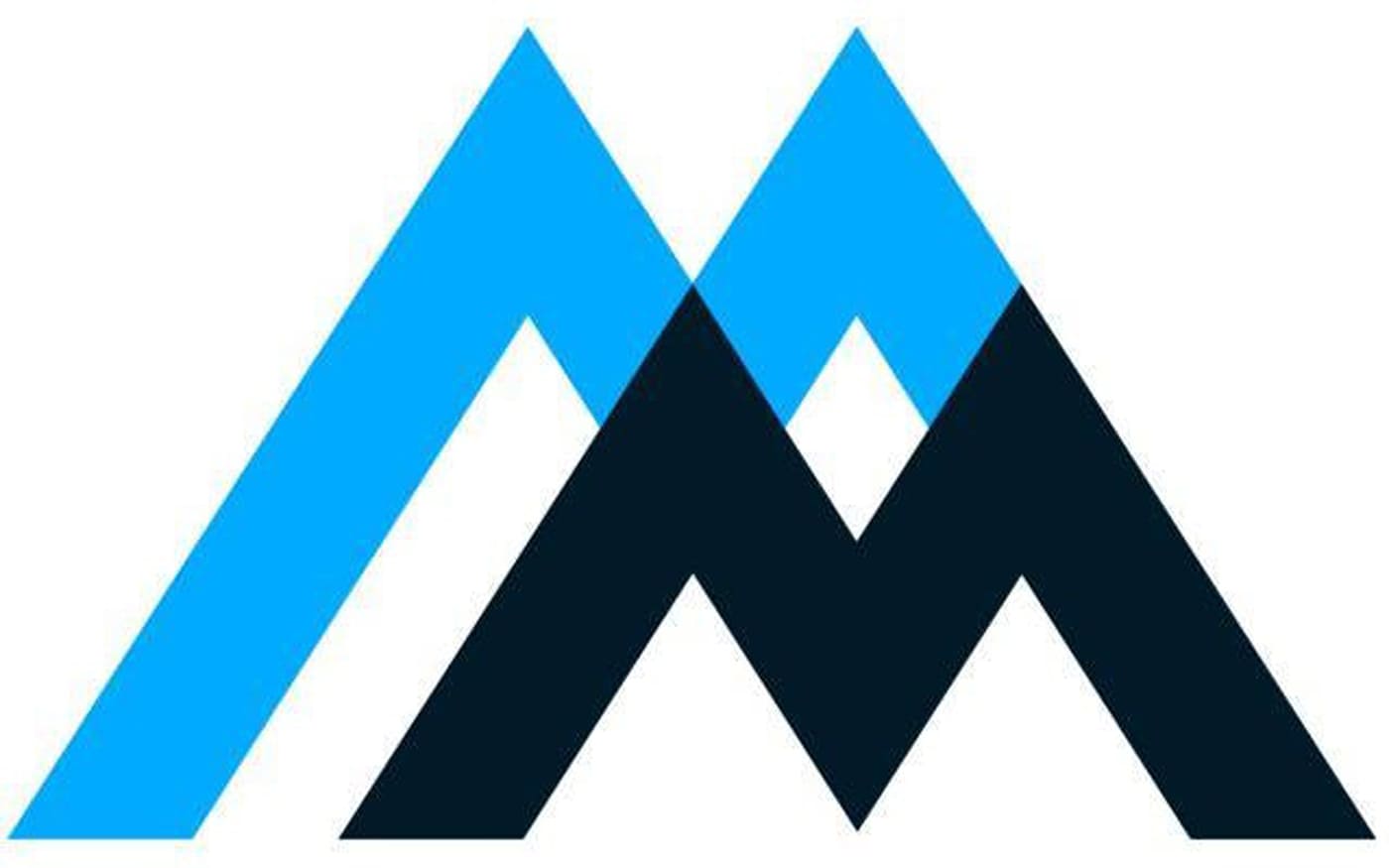
However, Lockheed Martin spun off Martin Marietta Inc. as a separate company, due to which it has had the right for its own logo. It featured a large “M” (or even double “M”), which also looked like the hills. The left end of the letter was extended and formed a horizontal line, above which the lettering “Martin Marietta Materials” could be seen.
2014
![]()
The double “M” moved to the right. The two letters became bold and were colored in different colors, gray and blue. Also, the smaller “M” at the forefront shifted a little to the right, which only reinforced the resemblance with the hills.
The two words of the Martin Marietta logo featured the types of different weights.


