Sky News is a primary news channel from United Kingdom. Established in 1989, it now has branches across the world, as well as presence on various online platforms. The channel is ultimately owned by Comcast, which is an American media conglomerate. Sky News is mainly aired in Ireland and Great Britain.
Meaning and history
The channel was initially aired in 1989, and the company behind was formed a year later. There’s no clear explanation behind the name choice. One of the most popular connections is that Sky used satellites to broadcast their programs from the beginning, including the brand new satellites network called Astra (‘of stars’).
What is Sky News?
Sky News is a major news channel from Great Britain. Besides being a big TV channel, they also have a huge presence online. The channel is owned by Sky Group, which, in turn, is owned by Comcast.
1989

The basis of this logo was a square, inside of which there was a circle, inside of which was the word ‘Sky’ in smooth, bold letters. In front of the emblem’s bottom, they put the word ‘News’ in a thin serif font. The coloring was a gradient of various shades of turquoise.
1989 – 1990
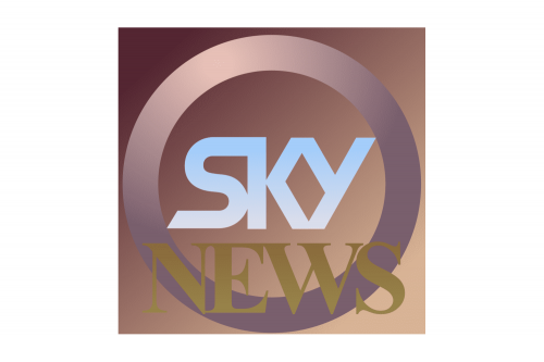
Later that year, they got rid of the square, made the ring bit much thicker and introduced a new color scheme: a combination of silver and various brown hues. The logo was put onto a big square-shaped background.
1990 – 1993

The one thing that changed in 1990 was coloring. Now, it’s mostly blue with silver letters for ‘Sky’ and yellow letters for ‘News’.
1993 – 1995
The 1993 logo is a slightly different composition. ‘Sky’ was still placed inside a ring, but it was now on top of a tall rectangle, colored grey. Close to its bottom, they also placed a horizontal rectangle. It was a grey-and-white image with the map of the globe depicted partially on it. In the center, there was also a big word ‘News’ in black.
1995 – 1997
In 1995, a tall blue rectangle was introduced. In its top, there was an oval white slot with ‘Sky’ written in the same old font, but blue. Both the word and the oval rotated counter-clockwise a bit. The word ‘News’ was displayed some way below. It was now a normal sans-serif with white letters and black rims.
1997 – 1998
That’s the same idea: a blue oval with white ‘Sky’ on it is put right above ‘News, written in black sans-serif.
1998 – 2001
The 1998 logo uses a rectangle basis with virtually even proportions, but still more wide than tall. It was divided into two sections: a curved red area in the bottom & the dark blue section above it. The two were separated by a strip of yellow, which is obviously meant to be a horizon between the sky and the land. The name of the company was shared by two of these sections. The font was a white, smooth sans-serif.
2001 – 2005
This logo is a narrower strip. It has the same white-colored name, written on it in smooth letters. There is a distinct color behind either word – blue and red, respectively. The division is still done in a curvature to make it look like a border between sky and earth.
2005 – 2007
It’s the same strip, but they colored it red and white this time. In particular, they put a smaller white rectangle on the right to accommodate the word ‘News’. ‘Sky’ was on the left. Font-wise, they made the former all-uppercase, and that’s all.
2007 – 2008

The colors were switched in 2007. Besides that, some 3D effects like glittering and shades were added.
2008 – 2010
This time, the red section grew in size and got rid of the white frame around it. The shades and were also rearranged slightly.
2010 – 2013
The word ‘Sky’ was turned black and fully-lowercase, but the style otherwise stayed the same. Notably, the shading grew more intense and was concentrated around the edges now, and particularly near the top of the red section.
2013 – 2015

Minor changes happened to proportioning and positioning, but the lighting and shading effects also got tweaked once more.
2015 – 2018

The font is the ‘News’ now turned smoother and rounder. They sanded down most sharp corners, but changed little else.
2018 – 2021
 All the gradients and shading were toned down in 2018. The whole strip was just a bit darker in its lower half now. The red bit became more saturated on average. Plus, the font in the word ‘News’ turned much slimmer and lowercase. Lastly, they added a thin grey frame surrounding the emblem.
2021 – Today

The frame was gotten rid of in 2021.


