![]() Jaws Logo PNG
Jaws Logo PNG
Jaws is the name of a book, written by Peter Benchley in the 1970s. First published in 1974, the novel became one of the contemporary classics and turned into a very successful franchise with the famous The Jaws movie, directed by Steven Spielberg.
Meaning and history
![]()
The visual identity of the famous horror is Lavinia yet solid and strong. Composed of a single wordmark, the logo is often accompanied by an image of a shark with its mouth open and its teeth sharp. But the official logo is only the logotype, which is instantly recognizable all over the globe due to a few very remarkable details.
The Jaws inscription is written in all capitals of an ExtraBold sans-serif typeface, where the letters “A” and “W” are placed so close to each other, that creates a feeling of a single organism. Divided by a thin diagonal line, the letters are massive and solid and evoke a sense of something powerful and fundamental.
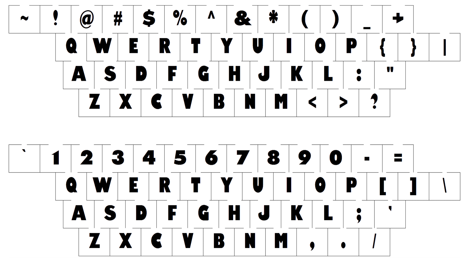
The typeface, which looks very similar to Wynwood JNL and Rolphie 16 Max SC, has its letter “J” modified. Its curved tail has a diagonal cut, which resembles two things at one time — an ocean wave, to represent the water element, and the sharp shark’s teeth, pointing on the main hero of the novel.
As for the color palette, the Jaws logo is usually executed in bloody-red and placed on a blue background. Sometimes the letters gain a delicate black shadow, but in most cases, they are just plain red. The shades of red can vary depending on the placement, that is how the logo becomes a bit darker, colored in burgundy red for some editions.
Font