Bedford is a renowned British company established in 1931. It specializes in manufacturing commercial vehicles and is currently owned by a leading automotive corporation. Operating primarily in the United Kingdom, Bedford has established itself as a prominent player in the transportation industry, producing high-quality vehicles known for their reliability and versatility.
Meaning and history
Bedford, founded by General Motors (GM) in 1931, was a renowned British car manufacturer that operated from 1931 to 1986. The company established itself as a leading producer of commercial vehicles in the United Kingdom. Throughout its history, Bedford achieved significant milestones, including the production of reliable and versatile trucks, vans, and buses. Their vehicles gained popularity due to their robustness, efficiency, and suitability for various industries and applications. However, in 1986, Bedford faced financial challenges and ceased operations. Currently, the company no longer exists as an independent entity in the automotive industry.
What is Bedford?
Bedford was a British automotive company that operated from 1931 to 1986. They specialized in manufacturing commercial vehicles, including trucks and vans, and were known for their reliable and durable products.
1931 – 19??
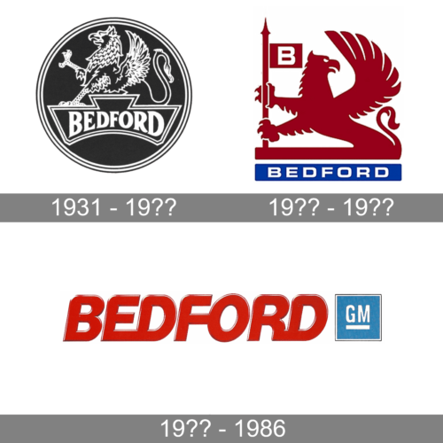
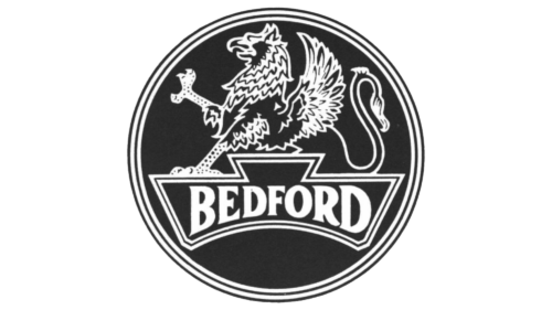
A very detailed drawing of a griffin decorated a round emblem, which was done in a black and white color palette. A decorative banner with the brand’s name was placed underneath the image of a griffin. The designers chose a bold font with flare serifs. To add elegance to the sophisticated and powerful brand image, the designers drew several thin alternating black-and-white lines.
19?? – 19??
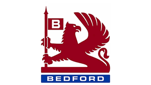
The griffin became the key element of the logo. It held a post with a flag featuring a white “B” initial. The griffin was drawn as a solid crimson silhouette with relatively minimal details. Nonetheless, it did not take away from the powerful and majestic appearance of the griffin. This illustration was accompanied by a blue rectangle with the full brand name printed in white, bold, uppercase letters using a basic, sans-serif typeface.
19?? – 1986
A bold, red inscription replaced the griffin. The white highlights created an illusion of volume and closely spaced characters featured bold, rounded strokes. The brand’s name was accompanied by a small blue square with “GM” printed in white, sans-serif letters.


