

![]() Simply Southern Logo PNG
Simply Southern Logo PNG
Simply Southern is a casual fashion brand from the United States, which was founded in 2005 in a small kiosk in Greensboro, North Carolina, and by today has grown into a popular label, with its t-shirts and hoodies sold in more than 6 thousand stores across the USA.
Meaning and history
![]()
Simply Southern is a conscious fashion brand, which puts a human at the center of its value system. The company designs simple and comfortable clothing with some small unique details in the southern style, in pleasant colors, and with recognizable prints. Apart from working in fashion design, Simply Southern is also known for its charitable activities — the label helps people in need all over the globe.
Starting from a small kiosk in 2005, today the brand has grown into a large and confident player in the casual fashion market, with its garments for the whole family sold in more than 6 thousand malls and branded boutiques all over the USA. Also, the t-shirts and garments of the brand can be bought online with international delivery.
What is Simply Southern?
Simply Southern is the name of an American fashion brand, established in 2005 in North Carolina. The brand is specialized in the design and production of casual garments for men and women, including t-shirts and hoodies in the southern style.
In terms of visual identity, the brand has faced a lot of misunderstanding in the press and public, as its logo was claimed to resemble a Nazi SS symbol. Although it boasts a fresh and tender color palette, which shows the label as a modern, easy-wearing, and progressive one.
2005 – ????
![]()
The original primary Simply Southern logo, designed for the brand at the very beginning of its history, was set in a pink, blue, and white color palette, which looks fresh and playful. It was a roundel with a thick light-pink frame in a double-blue outline. The name of the brand was written in blue serif characters around the perimeter of the frame. As for the central part of the badge, it was set in white and boasted an enlarged stylized “SS” monogram, executed in thick blue bars with a thin white line in the middle.
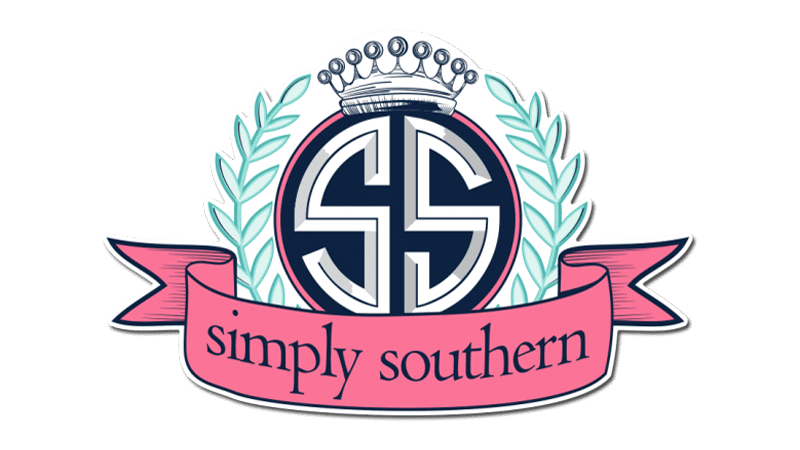
???? – Today
![]()
The redesign of the Simply Southern badge was held for a reason: many people thought it looked like a Nazi SS badge, and it created a sting controversy with the brand’s philosophy. The new badge of the brand features a geometric maze-like emblem with a narrow capital “S” overlapping an extended one. The emblem can be placed whether above the lowercase logotype, straight on a blue rectangular banner, or inscribed into a white circular frame, with the lettering set around its perimeter.
Font and color
The elegant lowercase lettering from the new primary badge of the Simply Southern fashion brand is set in a full-shaped modern serif font with sophisticated medium-weight lines of the letters. The closest fonts to the one, used in this insignia, are, probably, ITC Legacy Serif Bold, or Adobe Jenson Light Caption, with some minor modifications of the contours.
As for the color palette of the Simply Southern visual identity, it is based on a combination of blue and white, with the addition of baby-pink. Blue is a color of confidence and stability, while white adds a sense of loyalty and trust, and pink represents tenderness and playfulness.


