Tom Tailor is a lifestyle clothing company based in Hamburg, Germany.
Meaning and history
Tom Tailor is a popular fast-fashion brand, which its doors in 1962 in Germany. The history of the label started fromthe production of simply checked shirts for men, and for the first decades, menswear was the only focus of the fashion house.
Gradually the range of products was expanded, and in the 1980s the company released its first collection of women’s and children’s clothing. Interestingly, over the years, the Tom Tailor collections were distributed through large shopping malls. The first mono-brand Tom Tailor store did not appear until 1994.
Today, Tom Tailor guaranteesgood quality, actual shapes and silhouettes, and a wide choice of colors. Tom Tailor collections are designed for an audience of 0 to 95 years old.
What is Tom Tailor?
Tom Tailor is a popular European clothing brand, which was established in Germany at the beginning of the 1960s, as a menswear label, but grew into a real empire, offering collections for the whole family, along with accessories and leather goods
Old
The initial Tom Tailor logo was composed of a laconic graphical emblem in dark blue, placed above heavily stylized lettering in the same color. The emblem featured a bold capital letter “T” with an arched horizontal bar, which made it look like a mushroom. The letter was drawn against a white background and enclosed into a horizontally-oriented oval frame. The lettering cut was set in a futuristic custom typeface with bold lines and clean contours.
Today
Tom Tailor was established in 1962 in Hamburg. Its products are sold in around 35 countries worldwide.
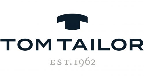
Apart from the name of the brand, the Tom Tailor logo includes the letter “T,” which is also an emblem. Both the proportions and the shape of the glyph are unusual. To begin with, the upper bar, which should have been horizontal, is made up of an arch. The vertical line is very thick, like the leg of a stout mushroom. Despite the distinctive style, it is still easy to identify that it is the “T.” In other words, the design does not interfere with meaning.
As for the lettering “Tom Tailor” below the emblem, it is perfectly legible without being as distinctive. The letters also look somewhat stout but they have a clean, neat shape. The design forces behind the brand opted for a minimalist sans serif typeface providing excellent legibility.
There is also the lettering “Est. 1962” below, which is given in a traditional serif type. The glyphs are smaller than the wordmark. Also, they are gray, which makes them less prominent than the main, dark blue part of the logo.
Colors
The blue color featured in the Tom Tailor logo creates a relaxed feel, like contemplating the sky or the ocean.
Font and color
The uppercase sans-serif lettering from the primary Tom Tailor badge is set in a modern and distinctive font, which looks pretty close to such types as Turnpike and ITC Blair Pro Bold, with strict and straight lines and angles.
As for the color palette of the Tom Tailor visual identity, after the redesign of the 2010s, the badge turned black-on-white, which made it look more modern and minimalistic, evoking a sense of progressiveness, actuality, and style.


