Massimo Dutti is a Spanish fashion brand of quality clothing and accessories, which was established in 1985 by Inditex Group, which is one of the world’s largest and strongest players in the fashion retail segment.
Meaning and history
Massimo Dutti is a Spanish fashion brand created in 1985 and named after its founder. Initially, the company produced only premium men’s clothing. However since few people could afford expensive clothes at that time, the brand did not do very well. The situation changed for the better in 1991 when 65% of its shares were acquired by the Inditex concern. From that moment the rapid development of Massimo Dutti began. Already in 1992, the first women’s collection of the brand was released, followed by a collection for children, lines of bags, shoes, and branded perfumes.
The brand emphasizes the mixing of current trends in clothes with the preservation of a note of classics. Often expensive fabrics are used – silk, cashmere, and wool for women, and corduroy and suede for men’s outfits. Muted colors are chosen, although, of course, there are exceptions – modern fashion does not tolerate constancy and requires experimentation.
Today Massimo Dutti is considered one of the most successful brands in the masstige (mass-market x prestige) segment – clothes that are premium in quality but affordable in price. The brand has more than 700 stores in 70 countries and more than 4000 employees.
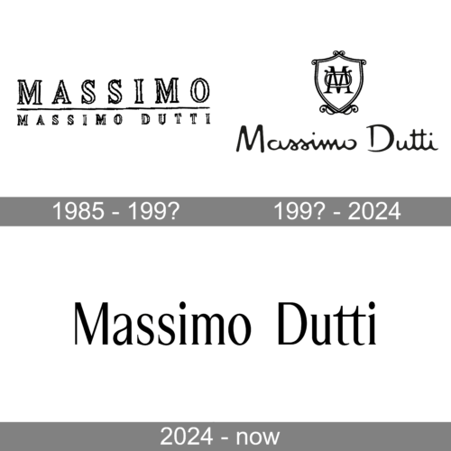
1985 – 199?

If the previous logo could speak, it would say “classic elegance.” You can see refined glyphs of classic proportions with small but visible serifs.
The letters are white with a black outline. On the top, there is the word “Massimo” separated from the words “Massimo Dutti” below by a horizontal bar.
199? – 2024
The Massimo Dutti visual identity is modest, yet very recognizable. As the majority of fashion labels, the brand features a simple monochrome logo, comprised of a single wordmark.
The wordmark is executed in a handwritten cursive typeface with smooth rounded lines. It has a retro-style character, but the first letters “M” and “D” look modern and confident. The wordmark is perfectly spaced and makes the logo look harmonized and confident.
The black color of the lettering elevates the logo, making the brand look powerful and evoking a sense of expertise in design and quality.
The Massimo Dutti logo is a perfect signature for such a successful brand, which values style and high-quality fabrics. It is timeless and sleek, making the label look luxurious.
2024 – Today
The redesign of 2024 has introduced a completely reworked logo for the famous fashion brand. The emblem, which has been an essential part of the Massimo Dutti visual identity for more than thirty years, has been removed, and the wordmark gained a different style. The new inscription is written in a neat and elegant serif typeface with slightly narrowed contours of the title case characters. Nothing else is on the logo now, and it makes it look sophisticated and stable.
Font and color
The elegant title case lettering from the new Massimo Dutti logo is set in a fine serif typeface with small serifs on the ends of the distinctive lines. The closest fonts to the one, used in this insignia, are, probably, Trona or Esperantotrade, but with the capital letters modified and set in sans-serif.
As for the color palette of the Massimo Dutti visual identity, there is nothing shocking — the black uses the black-on-white scheme, which is a perfect choice for a fashion brand, as it looks fine and confident on labels, independently of what the fabric of a garment is.


