Sierra Mist is a PepsiCo label of soft drinks, which was created in 1999. The brand is specialized in the production of lemon-flavored drinks and is distributed across the globe.
Meaning and history
In the original Sierra Mist logo, there was a slice of lemon and a slice of lime placed one in front of the other. They looked rather true-to-life, although their tempting juiciness had a near-surrealistic quality.
As for the typographic part of the label, it was dominated by the word “Mist” in a bold sans with several distinctive elements, including the shortened horizontal bar on the “t,” the diagonally cut ends of the “s,” and the triangular shape of the gaps at the top of the “m,” to name just a few. The white-yellow-green gradient supported the “lemon-lime” theme.
The word “Sierra” above echoed the style of the “Mist” but it was smaller. Similar proportions were preserved in the following versions.
The background seemed to be a hybrid by a dive in the deep dark ocean and a walk in the jungle.
1999
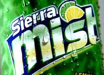
The very first logo, placed on a Sierra Mist can, was created in 1999. And though the original emblem stayed with the brand for just two years, it became a basis for all the following redesigns.
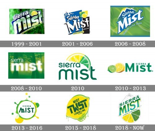
The badge was composed of an enlarged silver “Mist” lettering written in the lowercase with the “M” enlarged, and a smaller white “Sierra” placed above the first two letters of the main wordmark. All letters were outlined — the upper level in blue, and the bottom one is green. A lemon and lime slices were drawn above the “S” in “Mist”, reflecting the flavor of the beverage and making the whole emblem brighter.
2001
While the label was redrawn from scratch, it preserved the two citrus fruits from the original bottle. Once again, they were placed in front of each other. This time, though, there were not the slices but a whole lime and a whole lemon.
The lettering was white (the gradient disappeared). The type was lighter and more elaborate. The word “Sierra” was inspired by handwriting.
The picture in the top left corner referred to the original meaning of the word “Sierra” (“mountain range” from Spanish).
2006
This variant combined the two previous ones. The green background was blurry, like in the original one, although it was not as realistic. The green color and the pattern imitating the shape of citrus fruits were the only reminders of the “lime” theme.
The mountain theme borrowed from the second logo merged with the lemon. The result was the lemony sun rising above three snow-capped peaks. The typography was more like the second logo, although it was slightly straightened.
The design looked lighter and more dynamic due to the disappearance of the heavy color blocks.
2008
A completely new Sierra Mist logo was adopted. This time, it was dominated by the “forest mist” theme. It was introduced partly by the blurry word “Mist” and partly by the forest design in the background. The typography lost its jazzy feel. This seemed necessary to leave the logo legible enough despite the “misty” effect.
The lemon and lime remained indirectly – they were represented with the help of the colors.
2010
The citrus fruits made a comeback just two years later. The two lime and lemon slices now merged into a single one.
While the type did not use a gradient, its shape had something “watery” about it, with its rounded angles and “liquid” ends of the letters in the second line.
2010
Before the year ended, PepsiCo introduced another version.
The tiny slices of the fruits in the previous logo sent a subliminal message there was too little juice inside. The new design looked generous featuring half of each of the fruits. The “fluid” wordmark was replaced by a heavier static one. And yet, the water splashed in the background partly made up for the lack of lightness and dynamism.
2013
This version was more abstract. The lemon and lime now took the form of green and yellow rings with splashes all around. However, the company had to include the lettering “lemon-lime” in the logo to make up for the absence of the citrus fruits themselves.
The mountain theme made a comeback through the shape of the “M.”
2016
The name of the drink changed to Mist Twist. And yet, even the new logo (which was redrawn from scratch) still featured the familiar citrus theme. This time, there was a whole lemon placed in front of a whole lime. Also, there was a slice. The type was a bold, rectangular one, with fascinating gaps in the glyphs.
2018
When the brand returned to the original name, a new Sierra Mist logo was introduced. It includes several motives from the older versions (the mountains, the hybrid lemon-lime slice), although they now look different. The design looks dynamic and optimistic due to the diagonal structure.
Font and color
The Sierra Mist visual identity uses a custom and very elegant serif typeface, which was clean thick lines and sharp small serifs on their ends. The font of the brand’s logo looks pretty similar to Porkshop Italic, but with the lines thickened and slightly refined.
As for the color palette, the drink’s logo is executed in gradient green and yellow, which are the shades of success, energy, and joy, and when placed on a white background they brilliantly depict light and fresh citrus taste, reminding of hot summer days and bubble of the beverage.


