Sheffield Shield is the name of the Australian Cricket League, which was established at the end of the 19th century and named after Henry North Holroyd, 3rd Earl of Sheffield. He was the most active cricket patron of that period. Today the lineup of Sheffield Shield consists of six teams (one from each state of Australia), Where Each team plays each home and away, but there can be exceptions.
Meaning and history
Sheffield Shield has a very long and impressive history, which started in the 1890s, and throughout the years the league has changed several names and logo concepts. The name of the organization was changed with each new sponsor, for example, the end of the 20th century was marked by the sponsorship of National Foods Corporation, and specifically, its brand Pura.
1999 – 2000
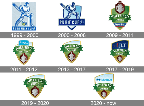
So the name of the league in 1999 was switched to Pura Milk Cup, and the visual identity got redesigned accordingly to the new sponsorship. The emblem was executed in a blue and white color palette, which is probably the first combination associated with dairy products. The concept featured an image of a cricket player standing with the bat on a light blue background and with a dark blue banner under his feet. Between the legs of the player, there was a delicate blue-yellow and green crest with the “ACB” abbreviation on it. As for the main inscription, the “Pura Milk Cup” was set in the uppercase of a traditional sans-serif typeface, in white.
2000 – 2008
With the redesign of 2000, the name of the league was shortened to Pura Cup and the logo was redrawn in a more modern and bold style. The emblem was now drawn in a crest shape with a bold dark blue outline, balancing the thick lines of the cricket player’s uniform and a wide horizontally stretched rectangular dark blue banner with the white modern sans-serif lettering, followed by an abstract geometric element, composed of a thin circular outline and a thick smooth line, set vertically.
2009 – 2011
In 2009 the name of the league came back to the Sheffield Shield, but with the new sponsor, Weet-Bix, the logo featured two different inscriptions. However, this was the year, when the classic Sheffield Shield crest was designed, and with all the following versions only the sponsorship affiliations were redesigned, as for the crest itself — it was only slightly refined. With the Weet-Bix sponsorship, the burgundy and silver shield seal was set on top of the badge, and the corporate blue, white and red banner of the sponsor was placed on the bottom part of the logo.
2011 – 2012
In 2011 the league changed the sponsor and now it was Bupa. The burgundy and silver ornate shield moved from the top part of the crest to the bottom, and the light-blue and white Bupa logo were placed above the green ribbons with the lettering. It was a delicate title case “Bupa” inscription followed by a thin white line, representing a heartbeat. As for the “Sheffield Shield logotype, it was set in bold shadowed sans-serif with more stable and geometric shapes of the letters.
2013 – 2017
In 2013 the league used its iconic crest without any additions. The seal with the ornate shield was placed on the bottom of the crest, on its sand-gold part, under two green ribbons with white lettering on them. As for the top part of the shield, it was cut diagonally and featured a light blue gradient shade, looking like a clear sky of a sunny day.
2017 – 2019
With the sponsorship of JLT, the Sheffield Shield league got its most stylish and bright logo, which only stayed for two years. The upper diagonal part of the crest was vertically stretched and changed its blue shade to a dark one, with gradient rays coming up from the green ribbons of the wordmark. The “JLT” abbreviation in an elegant and sophisticated serif typeface was written in white on the right from the Ruby-red emblem of the company, composed of three arched lines of different thicknesses.
2019 – 2020
In 2019 the simple Sheffield Shield logo from 2013 was used for one season again. It was in between two sponsorships, and the badge has had no changes at all, it was exactly the same as it was designed six years ago.
2020 – Today
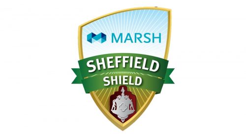
Starting 2020 Sheffield Shield Cricket League is sponsored by Marsh, and this is when the original idea of the logo design fully correlated with the sponsor’s corporate colors. The upper sky-blue part of the Sheffield Shield logo was slightly enlarged and got a modern sans-serif “Marsh” inscription in the uppercase written on it, on the right from the voluminous geometric emblem of the brand, which looks like a pixel infinity sign. Both the lettering and the emblem are executed in several shades of blue, with the light ones prevailing.
Font and color
The Sheffield Shield logo is based on a bright and lively color palette: sky-blue, grass-green, and sand-gold, with some gradient additions and a burgundy and silver seal on the bottom. All the colors are natural and calm, evoking a sense of growth, life, and position energy, and standing for the air, soil, and plants. Green is the main color of the badge, as both ribbons with the lettering are drawn in this color, and its main meaning is progress and development.
As for the typeface, the Sheffield Shield logo uses a pretty simple yet bold and neat sans-serif font, which is pretty similar to narrowed FF Meta Std Condensed ExtraBold, FF Unit Pro Bold, and Molécula Ultra Bold, with their elegant tall letters looking solid strong.


