

![]() Indy 500 Logo PNG
Indy 500 Logo PNG
The Indy 500, short for Indianapolis 500, is the world’s oldest automobile race and has been held annually at Indianapolis Motor Speedway since the early 20th century.
Meaning and history
![]()
To begin the history of the oldest race on the planet, the racetrack is the place that gave its name to such a legendary race. It is named after the capital of Indiana, Indianapolis Motor Speedway. The complex was built in 1909. Small competitions were held here, including those for motorcycles. The first event held on long distances was the 100-lap Prest-O-Lite Trophy in 1909. It was won by Bob Berman on a Buick.
Initially, the track was a dirt surface, but massive fatal accidents in the early years forced the organizers to reconsider their approach and pave the track with more than a million bricks. That’s how the name Brickyard came about. It wasn’t until before World War II, by 1936, that bricks began to be replaced by tar. It wasn’t until 1961 that the bricks were finally completely replaced with asphalt, leaving only a small paving in the start area to preserve the track’s history.
The autodrome has hosted Formula 1, MotoGP, of course, IndyCar and NASCAR races over the years. But still, the main race is the annual Indy 500.
The first race was held on May 30, 1911. Later the autodrome began to open for the public every May 1, and now the Indy 500 race is held on the last Sunday of May (every May 30 until 1974).
Experts consider the Indy 500 to be one of the top three races on the planet, along with the Formula One Monaco Grand Prix and the 24 Hours of Le Mans, with the Indianapolis 500 being the oldest.
What is the Indy 500?
The Indianapolis 500, also known as the Indy 500, is a car race held annually since the beginning of the 20th century at the Indianapolis Motor Speedway (Indiana, USA), attracting 300 thousands of fans and millions of television viewers. Being organized by Tony George, the event is held on one of the Memorial Day weekends, at the end of May. The Indy 500 is a stage of the IndyCar Series.
In terms of visual identity, the Indy 500 can boast one of the largest amounts of redesigns in history, as for each new race a new logo was created, and considering the age of the event, the number of badges, designed for it throughout its history, is approaching to 100.
1909
![]()
The banner, advertising the race in 1909 was drawn in a classy art-deco style in gray, yellowish, and red shades with bold elegant lettering at the top and bottom parts of a vertically-oriented rectangle, and the drawing of a motorcycle race in the center.
1911
![]()
For the very first race, held at the Indianapolis Motor Speedway in 1911, the logo was drawn online in a very ornate and detailed style. The large poster featured an image of two raging cars on the speedway, enclosed into a gray stone frame with lettering on it. The upper part of the frame comprised the bold red “Indianapolis Motor Speedway” in a thin white outline, while the bottom featured the black elegant “The Greatest Race Course in The World”.
1912
![]()
In 1912 the poster was redrawn in a fresh and light color palette — with a lot of black lettering on a plain white background, and a drawing of a classy race car in blue and white, accompanying the text. You can also find detailed black-and-white drawings inserted in the article.
1913
![]()
For the race of 1913, the concept was completely rethought. Now it was a horizontally-oriented black-and-white photo of the track, enclosed into a copper frame with light gold vignettes all over it. The elegant lettering was placed both on the top and bottom sides of the rectangular frame.
1914
![]()
In 1914 the bright hand-drawn poster was inviting guests to another race. It was a drawing of a blue racing car with the white number “16” on it. The top part of the poster featured a bold red “World’s National Auto Races” inscription, while the location and the date were written in one line at the bottom of the composition, also in red.
1915
![]()
The more minimalistic logo of the Indianapolis Motor Speedway was introduced in 1915. The composition was set in green and white, with the name of the tournament written in the upper part of the composition, and the drawing of a winged wheel under it. Both elements were enclosed into a thick rectangular frame.
1916
![]()
The redesign of 1916 introduced a logo, which looked very minimalistic compared to all the previous versions. Also, this was the last badge, designed for the race before it got shut won for several years because of World War I. The poster was set in white and blue, with the lettering above and under a small graphical element — a wheel with two wings and the name of the Speedway.
1919
![]()
The World War I theme and mood were adopted for the Indy 500 race held in 1919. It was a very colorful and detailed drawing with soldiers and flags of different countries. The bottom right corner of the composition featured a delicate white banner with lettering on it.
1920
![]()
For the poster in 1920, the night sky background was chosen. The purple and green color palette looked very stylish and bright, with the lettering set in blue and violet, adding a touch of mystery and creativity. The logo looked very modern and attractive. This was the last logo from the colorful hand-drawn era of the race.
1923
![]()
The logo of 1923 featured only lettering, set in bold dark characters against a plain white background, on several levels. The top three lines boasted an enlarged “Indianapolis Motor Speedway Company” inscription, which was underlined by a small “Tenth International Sweepstakes Distance 500 miles”. Both parts of the lettering were set in an elegant gothic-styled typeface with sharp elements and elongated lines.
1924
![]()
The logo became more ornate in 1924, with massive graphical elements added to the top part of the poster. That was a figure of a warrior and a large dark-winged background behind him. The name of the company was set in white capitals on a black background, while all the additional information was placed under the image, and set in black letters.
1925
![]()
The new color palette was adopted for the Indy 500 logo in 1925. It was a black and yellow badge, with some small white elements. The main hero of the new badge was an eagle, placed in the center of the emblem with its wings spread to the sides. The name of the company was written in white capitals on the top part of the black frame, while the information about the race and its price was placed on a yellow background in the middle of the composition.
1926
![]()
The logo from 1926 was executed in a very elegant and chic gray and orange color palette, with just one element in orange — the racing car, placed in the center of the poster. The car was drawn near a tall tower with a triangular roof, and placed in the center of the poster, surrounded by white vignettes and black lettering.
1927
![]()
A new style was adopted for the Indy 500 visual identity in 1927. It was a very powerful image of a man, holding a raving car in his hands. Under the car, you could see a city landscape with roofs. The image was set in a black, orange, and white color palette, which looked very dramatic.
1929
![]()
A modern and bright logo was introduced in 1929. The image was set in a fresh light-blue and burgundy color palette with white and gray additions. The lettering was placed on the top blue and the bottom burgundy segments, executed in a cool art-deco typeface with bars of different thicknesses.
1930
![]()
For the eighteenth race on the Indianapolis Motor Speedway, the logo was created in 1930. It was a horizontally-oriented rectangle in muted green and red, with the image of a racing car in the center, bold red lettering on the background, and additional text in black capitals
1932
![]()
The logo from 1932 was very intense, set in a red and blue color palette with massive graphical elements and bold uppercase characters. On the left of the horizontal rectangle, there was an image of a racer, set in the profile, facing to the left, while the right part was taken by the lettering, and the two racing cars were placed at the bottom of the badge.
1933
![]()
In 1933 the logo for the event was executed in a very cool turquoise, black, and white color palette looking super modern and stylish. The abstract composition was built around a black racing car, surrounded by white geometric lines and a black door-like element. All the lettering on the poster was set in white letters on solid blue banners.
1934
![]()
The 22nd race took place in 1934, and the logo for it was executed in a green and white color palette, with a detailed image of the cars. All the lettering was placed on an enlarged white flag, placed in the center of the composition, with a black plane on its left.
1935
![]()
The banner from 1935 was executed in an intense black, white, and red color palette, with the stylized racing car driving on the left from a solid black circle with white lettering on it. The name of the enemy was written on top of the poster, with the additional text set in white slanted capitals on thin red banners.
1936
![]()
In 1936 the Indy 500 banner turned to gold and turquoise, with black as an additional color. It was a very elegant composition, where black geometric lines were cutting the surface of a calm image, adding sharpness and modernity to it.
1937
![]()
The 25th race was held in 1937, and its logo looked very intense and even aggressive, due to the use of a black, white, and purple color palette and the sharp geometry of the image. The black car was the main hero. Placed in the left part of the horizontal rectangle, it was accompanied by bold purple lettering on top of it and a white spot with torn sharp edges on the right.
1939
![]()
The banner from 1939 was drawn in a distinctive and minimalistic manner, with the use of a calm blue and yellow color palette, with white additional strokes. There were several white and yellow cars drawn on a track, and a solid blue vertical rectangle on the right, with the white and yellow lettering written over it.
1940
![]()
The orange and black color palette was brought back to the Indy 500 visual identity in 1940. The stylish geometric banner featured a light background with a vertical gray rectangle on the left, overlapped by a horizontal orange one, in the center. The lettering was set in the bottom part of the badge, with the race’s number on top, in narrowed orange capitals.
1941
![]()
The last pre-war logo was introduced in 1941, for the 29th race. It was a banner, executed in a patriotic blue, red, and white color palette, with massive red lettering set diagonally above and under the blue racing car in the center. In the background of the logo, there was a clock in two shades of blue.
1946
![]()
The thirtieth race took place after World War II, in 1946. It was set in a victorious red color palette, with a large racing flag placed above the car, which was driving to the left. All the lettering was set in white and black, with the price for a ticket raised two times and written in the bottom left corner.
1947
![]()
The logo from 1947 featured a detailed portrait of a racer, combined with a stylized minimalistic drawing of a racing car in red, black, and blue. The composition was accompanied by lettering in different styles, arched above the car and set in the bottom left corner in straight horizontal lines.
1948
![]()
For the banner of 1948, the designers desired to use not a drawing, but a photo, executed in a blueish color palette and accompanied by a lettering on red and blue background both on top and at the bottom of the poster.
1949
![]()
The logo from 1949 had a black-and-white checkered racing flag as the main element. It was placed on the top part of a red and blue banner, above a small racing car. All the lettering was written in bold white characters on a solid blue background at the bottom of the poster.
1950
![]()
A very stylish and even futuristic image of a racing car was drawn on the poster from 1950. It was a blue, yellow, and white banner, with the car on a white track set at the bottom of the poster, and the yellow and sky-blue lettering — above it, against a solid blue background.
1951
![]()
The logo from 1951 was someone super cool. Set in a black and yellow color palette, the badge boasted a three-dimensional image of a winged wheel in the center. The gradients of yellow, gray, and black on the background created a super bright and eye-catching composition, where the bold yellow lettering in a slanted sans-serif font looked very balanced.
1952
![]()
The redesign of 1952 has brought us back to earlier versions of the Indy 500 logo. The new poster was set in a green and yellow color palette with the graphical part executed in black and white. The yellow lettering was set in a delicate serif font in the upper right corner of the poster, against a solid green background.
1953
![]()
In 1953 the last “random” banner for the Indy 500 was introduced. The black and white badge with bold yellow lettering in the script and a bright red racing car on the left looked very professional and intense.
1955
![]()
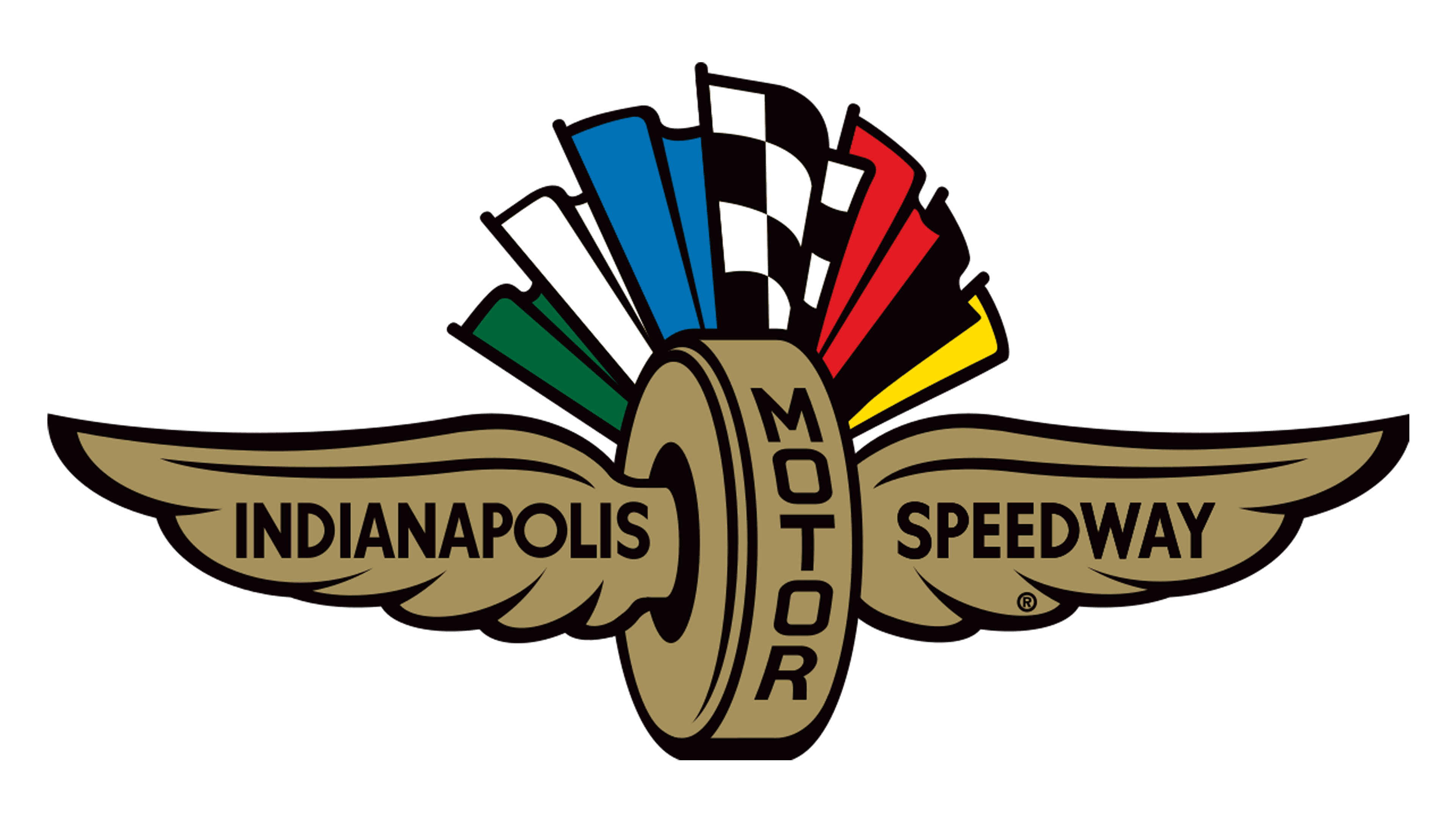
In 1955 quite a long era of similar logos for the Indy 500 started. The badge, designed this year has only been slightly modified from race to race throughout more than twenty years. It was a vertically rounded rectangle with plain white background, where the composition with a winged wheel and seven multi-color flags coming out of it was set. The number of the race and the “500” was written on top of the badge, while the additional lettering was set under the winged wheel.
1959
![]()
In 1959 the number of the race, set in the upper left corner was changed to “43”, and the contours of all elements were strengthened. There was also an additional logo created in the same year, but it’s pretty simple: the red contoured winged wheel accompanied by a bold red inscription in the uppercase of a classy serif font.
1960
![]()
The additional lettering from the bottom of the banner was completely removed in 1960. As for other elements, they remained in their place, but all the contours were cleaned up and modernized, with the colors of all flags intensified and some gloss added to the surface.
1962
![]()
The concept from 1954 was used again for the race of 1962, but for this year an additional logo was designed too. It was a cold and bright geometric badge with a blue circle in a thick red outline, and the two white-and-black crossed racing flags in the center. The lettering was set around the red frame’s perimeter in black and white.
1963
![]()
The number of the race in the upper right corner was changed to “47” with the redesign of 1963. The tagline at the bottom of the logo came back, and all the elements remained just as they were on the badge of 1954.
1964
![]()
The same concept was used for the logo of 1964 when the 48th racing event took place. The only difference between this badge and the previous one was in a lightened-up color palette, which wasn’t significant much.
1965
![]()
In 1965 Indy 500 goes live on TV, and for this occasion, a new logo was designed. It was a bright banner in a white, blue, and red color palette, with nine racing cars on a track and a lot of text in blue and red capitals of a geometric sans-serif typeface. The “Indianapolis 500” wordmark was placed in the center of the banner, arched from the center.
1966
![]()
For the 50th anniversary of the Indy 500 race the new logo was introduced in 1966. It was chic and elegant cursive lettering in black and gold, surrounded by bold serif text in black and red. The “Golden Anniversary” logo stayed in use for just one event.
1967
![]()
In 1967 the refined logo with a golden winged wheel and seven flags came back. It was all the same but with the smaller tagline at the bottom of the banner set in bright yellow now. That was the 51st Indy 500 race, which was shown in the upper left corner of the logo.
1968
![]()
The redesign of 1968 has slightly refined the contours of the dogs in the Indianapolis 500 badge, and replaced the “51st” with the “52nd”. Nothing new was brought to the race’s visual identity.
1969
![]()
The tagline turned orange again after the redesign of 1969, however, all the other elements remained untouched, except for the number of the race, of course, which now was “the 53rd”.
1970
![]()
Absolutely the same badge was used for the 54th racing even if the Indianapolis 500, with no additional elements added, and no contours modernized or redrawn. Although, it was the last banner from the first part of the “seven flags” era.
1971
![]()
A purple ribbon with the yellow “Awards over One Million Dollars” inscription was placed diagonally in the upper right corner of the banner with a golden winged wheel and seven colorful flags. The contours of the wheel were refined, giving more distinction to the wings and their feathers.
1972
![]()
The redesign of 1972 made the purple of the ribbon deeper, which transmitted attention to the new element, while the inscription with “the 56th” turned black and looked very delicate and lightweight. The colors of other elements were also brightened up.
1973
![]()
The “500” turned purple, while the ribbon with the “million dollars” turned red, and the lettering on it —was white. For the tagline the colors were also switched, and now the top and bottom lines featured red, supporting the diagonal ribbon, while the middle one was set in purple.
1974
![]()
Everything remained the same for the logo of 1974, apart from the number of the race in the upper left corner, which was now “the 58th”, still set in black, with no addition of orange.
1975
![]()
The end of the “seven flags” era happened in 1975, and this year the iconic logo was used along with an additional one, set in a black-and-white color palette with the outlined winged wing and bold black lettering in serif font around it.
1976
![]()
The style of the Indy 500 logo was finally changed in 1976, even though the flags were still there, they were placed differently. The six colorful flags were waving above the white building of the Speedway, standing on a checkered black and white floor. The lettering was very delicate and almost not seen at all.
1977
![]()
For several years, starting in 1977, the event had been using a logo, which looked more like a magazine cover. The bright drawing with the track, cars, and spectators was accompanied by a massive geometric sans-serif “Indianapolis 500” in black, and small additional lettering at the bottom of the banner, also in black.
1978
![]()
The redesign of 1978 has added some text to the “cover”, and changed the main image, showing a red racing car surrounded by staff members in red and white checkered shirts. The title was accompanied by small blue and red unscripted above and under it, and some black lettering was also added to the bottom left part of the image.
1979
![]()
For the logo of 1979, the designers used not a drawing, but a photo, showing a racer in a white and red car with a blue ring on its bonnet. The “Indianapolis 500” lettering was still set in black geometric capitals on top of the badge, accompanied by a bold red tagline and a small blue line with the price of the event ticket.
1981
![]()
A completely new concept was adopted by the designers of the Indy 500 visual identity in 1981. The badge became very minimalistic and confident, composed of stylized three-leveled lettering, with the bottom line featuring blue “500” followed by seven slanted blue parallelograms in different thicknesses. The top line “65th” was also set in blue, while the middle, “Indianapolis”, — was in red.
1982
![]()
The blue and red color palette of the Indy 500 logo was kept after the redesign of 1982, but the concept was slightly changed. Now the red uppercase “Indianapolis” with blurred edges was overlapping a heavy blue “500” in a horizontally-striped pattern. The composition was underlined by additional lettering in blue, enclosed between two thin blue horizontal lines.
1983
![]()
The logo, used by the race in 1983 was a bit more ornate and complicated than two previous insignias. It was composed of a stylized “Indianapolis” inscription in bold white letters with a red outline, placed above the purple “500” with the middle zero decorated with two white and purple wings.
1984
![]()
The purple, red, and white color palette from the previous badge was adopted by the logo, introduced in 1984. However, it was a new concept, with the winged wheel, set on the left from the heavy white “500” on a purple and red horizontal banner; with the red italicized “Indianapolis” above it and the date of the event in bold purple capitals — under it.
1985
![]()
The logo from 1983 came back to the Indy 500 visual identity in 1985, with the colors intensified and the additional lettering on the top bar of the “N” modernized to the new date. Also, the “500” part with the winged zero was slightly enlarged.
1986
![]()
The logo from 1986 looked more like a federal plate number, with the red and purple banner, having its bottom angles rounded and the upper part decorated by a wheel with two elongated wings, making up an eagle-like image. The name of the event was written in two levels over a banner, in white and blue characters.
1987
![]()
The Indianapolis 500 logo was slightly simplified with the redesign of 1987, which has also lightened up its color palette. The red and blue banner was accompanied by the white outlined “Indianapolis” in the title case of a rounded sans-serif typeface, while the enlarged “500” was set against the two-colored banner with no outline and with its contours and cuts distinctive.
1988
![]()
The blue and red Indianapolis 500 logo from 1988 featured a voluminous geometric digit in white and red, accompanied by a smooth blue and white “Indianapolis set above it. The whole composition was underlined by a waving ribbon with the date of the event written along it in red capitals.
1989
![]()
Somewhat new was introduced by the designers in 1989. A stylized red “500” became the hero of the composition, being accompanied by a delicate “Indianapolis” in gold sans-serif title case and a small yellow image of a winged wheel, overlapping two zeroes in the digit.
1990
![]()
The redesign of 1990 has created a fantasy typeface for the black “Indianapolis” part of the logo, while the “500” was enlarged, set in red and white, and had its digits set diagonally, in the upright direction. The numeric part of the logo was overlapped by a blue-contoured image of a winged wheel.
1991
![]()
A new triangular shape was given to the Indianapolis 500 logo after the redesign of 1991. The white triangle in a thin red outline was pointing down and had its top line decorated by a stylized wheel with two geometric wings in blue and red. All the text was written inside the triangle, and its bottom part comprised a contoured image of a blue Diamond. This was the 75th racing in the Indy 500 history.
1992
![]()
The redesign of 1992 has removed the triangle from the Indianapolis 500 logo, placing two lines of the wordmark on a plain white background. The red straight “Indianapolis” in the upper case of a classy serif typeface was separated from the voluminous white and red “500” by a contoured blue winged wheel.
1993
![]()
The Indianapolis 500 logo, created in 1993, followed the same color palette as several previous badges but was executed in a different style. In the center of the composition, there was a solid blue silhouette of a racing car, accompanied by a light blue emblem with a winged wheel and an enlarged red “500” written above it in medium-thick lines. The “Indianapolis” wordmark was written at the very top of the banner, in the uppercase of a modern sans-serif typeface.
1994
![]()
In 1994 the orientation of the Indy 500 badge became vertical. The “500” got enlarged and was now set in blue at the bottom part of the banner, overlapped by two racing car silhouettes. The wordmark was set above the digit, in narrowed red capital letters, in a bold geometric sans-serif typeface.
1995
![]()
The redesign of 1995 introduced a completely new color palette and style for the Indianapolis 500 visual identity. It was now set in purple and emerald green, with a contoured racing car in the background. The enlarged geometric “500” was written in purple in the center of the logo, with two green wings on the sides and an arched “Indianapolis” lettering above it.
1996
![]()
In 1996 the concept of the Indy 500 logo was modernized, and the new badge boasted an intense image with the diagonally placed “500” in gold and black, enclosed into a rounded frame, formed by a stylized racing track with the green car on it. The “Indianapolis” wordmark was set in massive white characters right above the “500” and was decorated by a stylized winged emblem in gold on top of it.
1997
![]()
The redesign of 1997 has again created something completely new for the famous race. The badge featured a combination of a silver voluminous digit, placed above a yellow and red car, and accompanied by a yellow lettering, which was arched above the “500” on a solid black background, decorated with a red “roof” and a golden-winged wheel on top.
1998
![]()
In 1998 the logo of the Indy 500 became brighter and more vivid. More colors appeared in the palette — light yellow, medium blue, red, and white. The winged emblem was redrawn and now looked more like an emblem of a superhero. The main elements of the badge were placed on a blue background, which had a shape of an eye, with two yellow ribbons arched on the top and bottom borders. All the lettering was set on those ribbons.
1999
![]()
In 1999 the concept was changed again with an enlarged white and yellow “500” becoming a central part of the badge again. The number was covered by a red-arched “Indianapolis” inscription, set in a narrowed sans-serif font on a black background. At the bottom of the badge, there was a red and black car, which was balancing the colors of the wordmark.
2000
![]()
The logo, introduced in 2000, was set in a grayish blue and orange color palette, with the “500” stylized as the wheels, intertwined with a gray racing track, which was horizontally “orbiting” the oval badge. The wordmark was written in white and orange capitals along the top part of the framing, and accompanied by a sharp geometric wing d wheel emblem in gray and blue.
2001
![]()
The redesign of 2001 was another surprise. The designers managed to find a color palette that hasn’t been used for the Indy 500 logo before, even though it seems almost impossible. The new badge was set in calm muted shades of moss green, red, and black, with bold lettering and a number set in one size and style, and enclosed into an oval frame with a stylized racing track.
2002
![]()
The logo, introduced in 2002, featured a vertically-oriented blue oval with white lettering around its perimeter, accompanied by two enlarged crossed racing flags with a black-and-white checkered pattern, and a red geometric badge with a white wordmark on it. The new logo looked very bright and full of energy.
2003
![]()
The era of contemporary and more or less minimalistic logos started in 2003, with this badge, executed in a sleek and serious dark-green and red color palette with white and gray additional elements. It was a geometric crest with the white “Indianapolis 500” set on a white red ribbon crossing it diagonally. The roundel with the “87th” was inscribed between two gray wings on top of the crest.
2004
![]()
For the 88th racing event, held in 2004, the logo got oriented horizontally, and looked like an emblem from a bonnet of a car, with chrome details and sharp elongated elements on top. The badge was set in a calm yet confident color palette, with the white “500” enlarged and placed on a solid black rectangular badge in the center of the composition.
2005
![]()
In 2005 the enlarged number was overlapping a red and black roundel, with white lettering written around its perimeter. The roundel was placed over a voluminous triangle, pointing down, and executed in the black and gray palette. The winged wheel emblem was redesigned and set in gray, black, and red on top of the roundel, with the wings featuring square cuts.
2006
![]()
The redesign of 2006 used a classic crest shape, which was slightly extended horizontally. The crest was set in a calm light shade in between yellow and green, and was overlapped by a burgundy “500”, and two green ribbons, with the top one boasting the white serif “Indianapolis”, and the bottom one — the “May 28, 2006” datemark in small title case characters.
2007
![]()
In 2007 the crest was redrawn in a more confident and contemporary manner, using a color palette, composed of red, blue, and cream beige. It was now more vertical, with a red-winged wheel on top, and an enlarged blue “500” in the center. The horizontal red ribbon with the “Indianapolis” lettering was set on top of the crest, while the bottom was decorated by two red ribbons with five-pointed stars, and a blue and beige checkered pattern between them.
2008
![]()
The redesign of 2008 has created a bright and clean logo, featuring a solid orange roundel, enclosed into a light-yellow frame, with the two segments on top and at the bottom — in a calm shade of blue. The wordmark was set in solid black across the roundel, with each character and digit outlined in yellow. The logo looked very stylish and eye-catching.
2009
![]()
In 2009 a more traditional style was adopted for the Indy 500 badge, along with a usual blue, red, and white color palette. The red cursive lettering was placed above the heavy “500” in solid blue, and accompanied with a half-circle element with a red arched frame at the bottom. The two elegant silver wings were coming out of a silver wheel at the bottom of the composition.
2010
![]()
The redesign of 2010 has introduced a super bright badge in blue and burgundy, with a rounded crest shape and an art-deco mood. The black “500” in the center was decorated by an enlarged stylized winged wheel emblem in bright blue, with a thin white outline of geometric feathers. The white “Indianapolis” was written over a burgundy banner with rounded ends, set on top of the crest, and decorated by a geometric crown in two shades of blue.
2011
![]()
For the 100th anniversary of the Indianapolis Motor Speedway, the series of new badges was created in 2011. The primary one featured an elegant composition in blue and gold, with a red ribbon and sophisticated white serif lettering on it. Gold was used for two wings, set at the bottom of the rounded crest with a horizontally-striped gray pattern.
2012
![]()
The logo, created for the event in 2012, looked completely different from all the previous versions. It was a light gradient blue composition with the wing coming out to the left from the middle zero in “500”, which was sticking out above the line. The number was set on a white background and outlined in blue, having “Indianapolis” in dark red capitals overlapping it on the left.
2013
![]()
Another version of the logo was introduced in 2013, and featured a sleek and cool composition, with the slanted extra-bold “500” in white placed over a blue oval, with a bright yellow winged wheel emblem placed right above the numbers. As for the “Indianapolis” inscription; it was set in small capitals in the upper right corner of the composition, using a modern slanted sans-serif typeface.
2014
![]()
The redesign of 2014 has created a very elegant badge with a dark red roundel at the background. The roundel was placed over a blue triangle pointing down, and decorated with a wheeled emblem on top and three horizontal lines in gold, coming out from the sides and cut diagonally. The wordmark was set in two levels over a red roundel, executed in white characters with a voluminous golden outline.
2015
![]()
The badge from 2015 looked super modern, with the voluminous composition in light blue, red, and white, where the stylized wings were coming through the three-dimensional zeroes, drawn as two wheels. The graphical part was accompanied by a flat bold “Indianapolis” in blue capitals of a geometric sans-serif typeface, written against a plain white background.
2016
![]()
For the 100th Running of the event, the Indianapolis 500 on the logo was finally replaced with the “Indy 500”, and this is when the new era of the logo design for the event started. The badge from 2016 was set in a yellow and gray color palette, with the flat stylized wordmark set against a plain white background and enclosed between two gray wings.
2017
![]()
The blue and red color palette was brought back to the Indy 500 logo in 2017. It was a diagonally oriented composition with a heavy “500” in blue, having the bars of the digits elongated to the left, forming a stylized geometric wing. The red “Indy” in capitals of a custom font was placed on the left from the “5”, and accompanied by an additional lettering in blue.
2018
![]()
The redesign has refined the contours of the Indy 500 logo and changed its orientation to horizontal. All shapes of the elements got softened and gained more space between each other. The “Indy” got a bit smaller and was now set above the blue “500”, not on the left. As for the wing, it also became more delicate.
2019
![]()
The logo, designed for the racing event in 2019 looked super modern and professional. It was a sleek crest in dark blue, with a golden outline, placed on a white background with a brick pattern on it, as a heritage to the Indianapolis Motor Speedway history. The “Indy 500” world was written over the crest in bold white characters.
2020
![]()
The brick pattern was removed from the logo in 2020, and the shape of the crest was changed to a vertical “leaf”, with two angles rounded, and two — sharp. The blue color of the background was replaced by a burgundy, while the framing and additional lettering remained gold. As for the main wordmark, it was kept untouched and looked even better in the new color palette of the badge.
2021
![]()
The redesign of 2021 has brought back the blue and gold color palette from the version of 2019 and switched the shape of the Indy 500 logo to a vertically-oriented rectangle with rounded corners. The crest was inscribed into a stylized structure with a geometric roof and a flag on its top, and three thin segments coming out of it to the sides.
2022
![]()
For the logo of 2022, the color palette composed of burgundy and white was used again. As for the shape of the logo, it got back to a traditional crest, but now the crest was decorated with two golden branches on the sides. As for the other elements of the badge, they remained untouched.
2023
![]()
The redesign of 2023 has kept the recognizable lettering for the Indy-500 logo but switched its color palette to black, white, and gold, which made the banner look super cool and brutal. All the decorative elements were removed from the concept, and now it’s just a bold stable lettering on a slanted banner with rounded angles and a delicate golden image of a winged wheel at the very bottom.
Font and color
The bold white lettering from the primary Indy 500 logo is set in an italicized geometric sans-serif typeface with some angles of the characters softened. The closest fonts to the one, used in this insignia, are, probably, Bunken Tech Sans Std ExtraBold Italic, or Mesquin Italic.
As for the color palette of the Indy 500 visual identity, it is based on a chic and sophisticated combination of burgundy, white, and gold, which represents professionalism, excellence, and quality.


