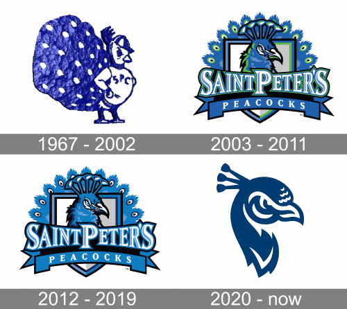
 Saint Peter’s Peacocks Logo PNG
Over 15 athletic teams representing Saint Peter’s University in Jersey City, New Jersey, play as Saint Peter’s Peacocks and Peahens.
Meaning and history
Saint Peter’s Peacocks, the embodiment of athletic spirit at Saint Peter’s University, originated with the establishment of the university in 1872 in Jersey City, New Jersey. As the university’s athletic representation, the Peacocks have been a part of the Metro Atlantic Athletic Conference, predominantly participating in NCAA Division I competitions. Their journey through the years has been marked by notable successes, particularly in basketball, which stands as their flagship sport. The men’s basketball squad has been a recurring participant in the NCAA Tournament. Their most extraordinary achievement came in 2022, when they astoundingly reached the Elite Eight of the tournament. This breakthrough not only carved a niche for them in the annals of NCAA history but also served as a testament to their resilience and prowess in collegiate basketball. Presently, the Peacocks continue to fortify their presence across various sports such as soccer, baseball, and track and field, upholding a balanced emphasis on both athletic prowess and academic excellence.
What is Saint Peter’s Peacocks?
Saint Peter’s Peacocks represents the athletic teams of Saint Peter’s University, a significant contender in NCAA Division I sports. They have gained acclaim for their basketball program, most notably for their remarkable journey to the Elite Eight in the 2022 NCAA Tournament, a testament to their competitive spirit and skill in collegiate sports.
1967 – 2002
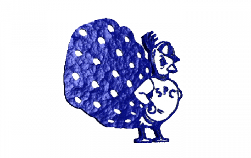
Since 1967, the Saint Peter’s Peacocks logo has been updated three times, and yet, it has been consistent in its visual core.
The 1967 logo featured an anthropomorphized peacock standing in full height. The logo was dominated by the tail. It did not look like a tail but rather like a blue patch with white dots.
2003 – 2011
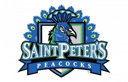
In 2003, the teams introduced an emblem featuring only the peacock’s head with the tail on the background. The name of the team in large letters could be seen in the forefront.
2012 – 2019
The updates made in 2012 were very subtle.
2020 – Today

The 2020 logo features a peacock’s dark blue and white head.
Saint Peter’s Peacocks Colors
NAVY
PANTONE: PMS 541 C
HEX COLOR: #003C71;
RGB: (0, 60, 113)
CMYK: (100, 41, 5, 36)
BLUE
PANTONE: PMS 285 C
HEX COLOR: #0072CE;
RGB: (0, 114, 206)
CMYK: (99, 22, 0, 1)
GRAY
PANTONE: PMS WARM GRAY 6 C
HEX COLOR: #A59C94;
RGB: (165, 156, 148)
CMYK: (11, 15, 18, 32)
BLACK
PANTONE: PMS BLACK 6 C
HEX COLOR: #000000;
RGB: (0,0,0)
CMYK: (0,0,0,100)
WHITE
PANTONE: P 1-1 C
HEX COLOR: #FFFFFF;
RGB: (255, 255, 255)
CMYK: (0, 0, 0, 0)


