Buffalo Bulls is the name of an athletic program from the University at Buffalo, a public educational institution, which was established in 1846, and is based in New York. The program of the university is composed of 16 men’s and women’s teams, which all play in the first division of the National Collegiate Athletic Association.
Meaning and history
Apart from playing in the first division of the NCAA, the Buffalo Bulls teams are also members of the East Division of the Mid-American Conference, an intercollegiate athletic organization, which was established in 1946, and today has 12 members and fields 24 sports disciplines. The Buffalo Bulls program joined the conference at the end of the 1990s, and the men’s football club plays as a part of FBS, the highest league tier of the collegiate football hierarchy in the USA.
What are Buffalo Bulls?
Buffalo Bulls is the collegiate athletic program of the University at Buffalo, New York. It consists of 7 men’s and 9 women’s teams, which compete in various sports disciplines, including indoor and outdoor Track and Field, Wrestling, Football, Swimming and Diving, Cross Country, and a few others.
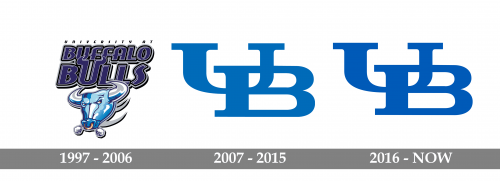
As for the visual identity, the teams of the Buffalo Bulls athletic program have had its logo redesigned several times throughout the years, although the last two versions of the badge are almost identical, the previous badge is completely different, with only the blue color palette linking it to the other badges of Buffalo Bulls.
1997 — 2006
The Buffalo Bulls logo, designed in 1997, stayed with the athletic program for nine seasons. It was a combination of a modern caricature of the Bull’s head in light blue, set under the two-leveled inscription in dark blue. The lettering was executed in all capitals of a custom sans-serif typeface with smooth corners, and thin white details complementing the solid blue bodies and black outline of the letters. The “U” in the “Bulls” was enlarged and had its lines elongated and curved, repeating the shape of the Bull’s horns. That was a very intense and bright logo, which was instantly recognizable and memorable, although it was a bit overloaded with details.
2007 — 2015
The redesign of 2007 made the heavy and detailed Buffalo Bulls logo super minimalistic and clean. The new design concept of the program’s visual identity was based on just two letters, “U” and “B”, placed diagonally on a white background, and drawn in solid medium-blue color with no outlines. The “B” was overlapping the “U” in its bottom right part.
2016 — Today
With the redesign of 2016, the minimalistic concept of the Buffalo Bulls logo remained untouched, but the shade of blue got deeper and darker. This slight change made the whole badge look more professional and powerful even without refining the contours of its capital letters, set in a heavy and elegant serif typeface.


