The logo of the second oldest food retailer in the UK is simple and clear, and this is the reason why it appeals to customers who visit the retailer’s numerous stores across the country.
Meaning and history
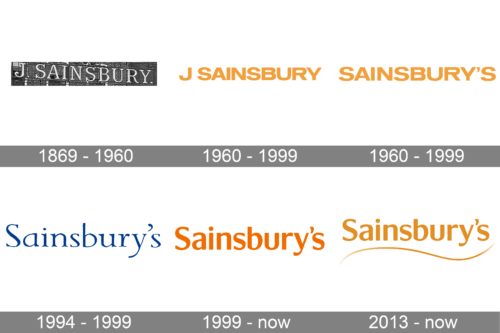
Sainsbury’s has been in trading business since 1869. A married couple John James Sainsbury and his wife rented a store in one of the poorest streets of London and offered good food at low prices. They established the company that was named after its founder. By 1922 it had become the largest retailer of groceries in the UK.
Almost 150 years have passed, and Sainsbury’s has a chain of supermarkets consisting of over 1200 stores, which means the second place among supermarket companies in the United Kingdom.
Over such a long period of time Sainsbury’s corporate symbol hasn’t changed much. It has always consisted of just one wordmark representing the company’s name. There have been a couple of modifications, though.
1869 – 1960
The original Sainsbury’s logo, created at the end of the 1860s has stayed with the company for almost a century. It was a simple yet very elegant uppercase “J. Sainsbury” lettering in a traditional and sophisticated serif font, executed in white and outlined in black for more volume.
1960 – 1999
It was the word “Sainsbury’s” written in all uppercase typeface of orange colour. The fronts of the stores and various fascias featured the title “J Sainsbury” as a rule.
1994 – 1999
The redesign of 1994 changed the color palette of the Sainsbury’s badge to dark blue, and completely changed the style and typeface of the inscription. It was a title case lettering in a fancy designer serif font with rounded and slightly extended contours of the characters.
1999 – now
In 1999 customers saw a new logo. The creative agency M&C Saatchi developed it as well as the font, the new slogan and the new staff uniforms. They changed the all-caps style of the 1960s into a rounded, upper-and-lower typeface version and made the logo look friendlier.
The logo of 1999 is still used on store fronts. For the purposes of advertising another version was introduced in 2013 ‒ the same wordmark but paired with a horizontal wavy line underneath which looks like a hint to a wide range of goods available at the supermarkets of the retailer.
Sainsbury’s logo is often accompanied by slogans. At different times they were different. Thus, in 1999 the brand statement was “Making life taste better”. In 2005 they switched over to “Try something new today”. Today their slogan is “Live well for less”. The slogans are placed in the bottom line and are usually handwritten.
2013 – Today
In 2013 the company has refined the logo, designed in 1999, slightly alternating the shade of orange and adding a thin and elegant wavy line in the same color under the logotype. In a new tone and with this delicate element, the badge started looking more tender and airy, showing the brand from a new side.
Color
Sainsbury’s emblem has always been orange. This colour is defined as “living orange” and implies confidence and cheerfulness. Though, when it was unveiled it was met with some controversy. There was even a case when residents of a coastal town in Essex expressed their concerns about Sainsbury’s orange logo and the retailer had to reconsider the plans to open a store in that town.


