Safran is a French corporation specializing in such spheres as aircraft engine production, rocket engine production, aerospace-component production, and defense. It has over 76,000 employees in over 350 locations across 31 countries (as of 2021).
Meaning and history
Despite its seeming simplicity, the Safran logo makes a great job in introducing the company and conveying its mission. It also somehow creates a positive image of the products the brand offers. The versions of the logo discussed below seem to have the same meaning: they represent an aircraft flying around the globe. Evaluating the way the logo has been changing over time, you can conclude that the brand was trying to show its readiness for innovations while also preserving its heritage.
What is Safran
Safran S.A. was created in 2005, when SNECMA, which made aircraft and rocket engines, merged with SAGEM, an aerospace component manufacturer. The corporation headquartered in Paris, France, is listed on the Euronext stock exchange.
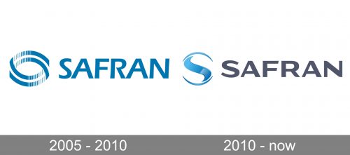
2005 – 2010
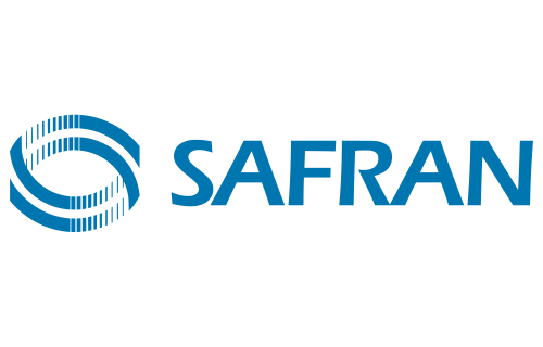
The old version showcases the name of the brand combined with a dynamic emblem. The wordmark is set in an all-caps sans. At a cursory glance, the letters may seem simple. Yet, if you take a closer look, you will notice that the lines forming the glyphs go from thick to thin in a somewhat unusual and unexpected way. Such an effect requires some work from the designer.
On the symbolic level, such a type represents a product that, while looking simple, offers outstanding performance due to the hard work of experts who had created it.
The emblem can be described as two interlacing eye shapes or two links of a chain. While the image looks pretty abstract, you can feel it conveys speed and, once again, technological expertise. These connotations result partly from the smart combination of solid parts with white gaps. Also, you can notice how the links seem to flow into each other while in actuality being two separate elements.
There is hardly anything special about the dark blue color. Yet, it possesses several qualities that are beneficial for the brand. Firstly, it is business-like while also being better memorable than simple black. Also, it is close to the color of the night sky, thus creating a link with the aircraft and rocket industries, where the corporation works.
Additionally, it creates a good contrast with the white background and makes even the tiniest details stand out. This point is of paramount importance as there are plenty of small nuances in the Safran logo.
2010 – present
The logo was redrawn. On the one hand, it has preserved some of its features. On the other, it now looks more refined and professional.
The structure combining a curvy emblem on the left with an all-caps wordmark on the right has remained unchanged.
The emblem has a sleeker, more dynamic look. This partly results from the fact that the blue shape now looks streamlined, whereas, on the old logo, there were some awkwardly protruding details.
Trying to figure out what the emblem represents, we can hypothesize that that’s a Safran aircraft or rocket making its way above the globe. The aircraft (or its trace) is represented by the blue swoosh, whereas the globe is the white and blue circle.
Colors and font
The use of blue can be explained by the fact that it’s the color of the sky: the night sky in the older Safran logo and the sky during the day shown in the newer logo.
The type seems functional yet techy and carefully thought-out.


