Apollo Tires Ltd., a major player in the tire industry, was founded by Mathew T. Marattukalam in 1972. The current owner, Onkar S. Kanwar, leads the company, Which has expanded its operations globally. The company’s headquarters are in Gurgaon, Haryana, India, and it has manufacturing units in India, the Netherlands, and Hungary. It serves a vast network of clients across Europe, Asia, and Africa.
Meaning and History
Apollo Tires was established by Mathew T. Marattukalam in 1972 with a vision to revolutionize the tire manufacturing sector in India. From its humble beginnings, Apollo has grown into one of the industry’s key players, distinguished by significant technological advancements and robust market strategies. One of its pivotal achievements was the introduction of the Vredestein brand in Europe, which has been instrumental in solidifying Apollo’s presence in the European market. Over the decades, Apollo has expanded its product line and geographic reach, entering new markets in the Middle East, Southeast Asia, and more recently, North America.
Today, Apollo Tires holds a strong competitive position with a reputation for quality and durability. It is recognized for its substantial contributions to sustainability and innovation in the tire industry. The company continues to focus on expanding its market share and enhancing its product offerings through continuous research and development, striving to meet the evolving needs of global customers.
What is Apollo Tires?
Apollo Tires is a global tire manufacturing company that produces a wide range of automotive tires. Specializing in products that cater to various market needs, from cars and trucks to bicycles and agricultural machinery, Apollo aims to deliver high performance and safety.
1972 – 2009
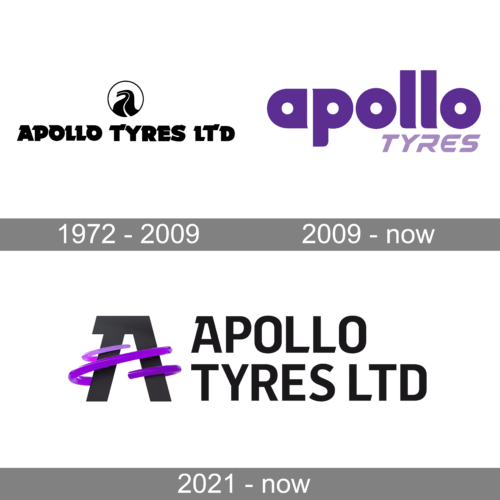
The first logo is a vintage emblem from 1972 that utilizes simplicity and a stark contrast to communicate its brand. At first glance, the logo is a visual play on the letter ‘A’ with a clever incorporation of a tire in its negative space. The ‘A’ is bold and stylized, signifying the first letter of “Apollo,” and the space within it forms the hollow of a tire, symbolizing the core product of the company. The font for “apollo” is in a soft, approachable lowercase with rounded edges, conveying a sense of innovation and friendliness, while the word “TYRES” is in uppercase letters, creating a strong presence and giving balance to the overall design. The overall effect of the logo is a balanced mix of form and function, hinting at a company that values tradition and straightforwardness.
2009 – Today
The current logo is a clean, contemporary design that conveys a sense of clarity and modernity. The word “apollo” is rendered in a unique lowercase typeface with soft curves, emphasizing approachability and modernity. The ‘o’ at the end of “apollo” is distinct, resembling a tire, reinforcing the company’s identity as a tire manufacturer. The word “TYRES” is again in uppercase, providing a visual anchor and suggesting a dependable nature of the business. The consistent purple color across the logo is vibrant yet sophisticated, signifying the brand’s ambition and quality. This logo design strikes a balance between being visually engaging and functionally clear, suggesting a company that is innovative, customer-friendly, and industry-leading in its approach.
2021 – Today
This logo from 2021 represents a significant evolution in the company’s branding. The text “APOLLO TYRES LTD” is in a robust, uppercase, black sans-serif font that denotes professionalism and reliability. The standout feature is the stylized ‘A’ wrapped in a sleek, purple, orbit-like swirl that suggests movement and speed. The swirl might represent the rotational motion of tires, reinforcing the nature of the business. The gradient purple gives a vibrant, energetic feel, contrasting with the solidity of the black text, which grounds the logo with a sense of authority. The three-dimensional aspect of the swirl adds a modern touch and implies a company that is dynamic and evolving. This logo communicates a perfect blend of traditional business values with a modern, progressive outlook.


