

![]() Ray-Ban Logo PNG
Ray-Ban Logo PNG
Clean and uncomplicated, the Ray-Ban logo ensures name recognition throughout the world. It is a truly fashion logo ‒ elegant, intriguing and playful.
![]()
In the fashion industry to which the Italian brand of sunglasses and eyeglasses belongs, it is a must to have a fashion logo design. The Ray-Ban logo is exactly like that.
Meaning and history
![]()
The cursive Ray-Ban logo appeared on the lenses in the 1980s. The symbol of the eyewear brand is just a wordmark which is the company’s name. No wonder, its look is based only on the font and the color. The designers took advantage of them to communicate the necessary information and to create the logo that has a personality.
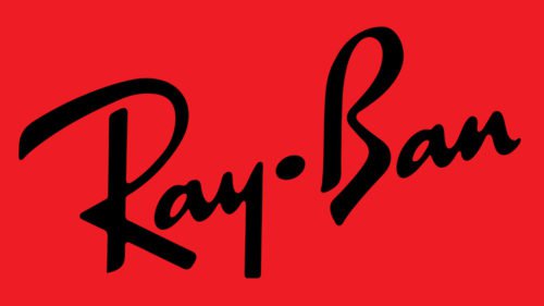
The Ray-Ban wordmark appears in white on red. White represents purity, sophistication and efficiency. Red attracts attention and evokes strong emotions. Paired together, they make the image look optimistic and youthful.
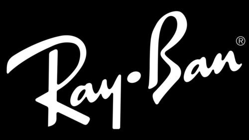
The upward diagonal wordmark complements the custom typeface they created. It looks free flowing and suggests energy, dynamism and some playfulness.
![]()
Everything in the design promises that the products adorned with this symbol bring happy emotions to consumers.
The Ray-Ban logo also includes the wordmark “Genuine since 1937” in black. It is below, in all caps.
![]()
The Ray-Ban visual identity looks professional, just the right emblem for a company that specializes in fashion.


