Rimowa is a luxury brand of travel goods and luggage manufacturing companies, which was established in 1989 in Germany. The brand became famous due to its iconic aluminum suitcases and was acquired by LVMH Group in 2016.
Meaning and history
The history of the world-famous suitcase manufacturer Rimowa began in 1898 in Cologne. The founder of the business, Paul Morzek, built a small factory on the outskirts of the city.
At first, the suitcases were made from traditional materials – wood and leather. But everything was changed by a fire, which destroyed all the stock of raw materials for production. Only a bundle of aluminum plates intended to be inserted into the walls and bottoms of the suitcases to reinforce them survived.
An unexpected way out of the situation was found by the son of the founder, Richard. He later headed the company and gave it the name Rimowa. “Ri” and “Mo” are the first two letters symbolizing the name and surname of Richard Morszeck, and “Wa” is an abbreviation of the German word Warenzeichen, which means “trademark”.
What is Rimowa?
Rumors are the name of the iconic luggage bags manufacturer, which was established in Germany at the end of the 19th century and grew into one of the most fashionable labels in its segment. Today Rimowa is owned by the luxury LVMH group.
1898 – 1937
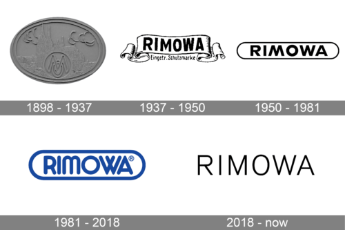
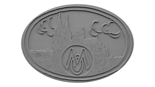
The very first logo for the famous German brand was created in the end of the 19th century, and stayed active for almost forty years. It was a horizontally-oriented oval metal medallion with the city landscape embossed on it, and the rounder with the “MO” monogram placed in the center. The smooth and thick contours of the letters were supported by the arched strokes, drawing smoke or clouds above the roofs of the houses.
1937 – 1950

The Rimowa logo designed in 1937 featured a traditional elegant badge composed of a horizontally oriented ribbon with curved sides and a bold black uppercase wordmark on it. The lettering was executed in a slightly narrowed sans-serif typeface with each letter solid and stable.
1950 – 1981

The redesign of 1950 changed the concept of the logo, placing the refined and modernized logotype on a white background and enclosing it into a clean horizontally stretched oval, drawn in thin lines. The new image looked strong and stylish despite its minimalist design.
1981 – 2018

In 1981 the Rimowa logo was changed again. The concept of the logotype enclosed into an oval frame remained, but the execution was changed. First of all, the color scheme got switched to blue and white, and the lines of all elements became thicker. The typeface of the lettering was also changed and now it was a custom rounded sans-serif font with unique shapes of the letters.
2018 – Today
The Rimowa visual identity is a reflection of a luxury fashion brand, which values quality and design above all. The logo, composed of a wordmark with an emblem, looks simple yet sophisticated and high-end.
The Rimowa nameplate in all the capital letters is executed in a clean and sharp sans-serif typeface, designed by Bureau Borsche exclusively for the brand. It looks fresh and airy due to a wide letter spacing.
The Rimowa emblem looks more like a monogram with the letter “M” as the main hero. Yet it’s not the only meaning of the brand’s symbol. The sharp and strict letter “M” is placed in the rhombus with rounded angles and overlaps it. The icon was inspired by the silhouette of Cologne Cathedral, which was a part of the original Rimowa visual identity.
The Rimowa logo and monogram are fine and sophisticated, yet with a strong modern spirit. It looks perfect on any placement — whether on the stylish brand’s products or on the packaging. The wordmark is usually printed in black, while the Rimowa emblem is just embossed.
Font and Color
The minimalistic uppercase lettering from the primary Rimowa logo is set in a medium-weight sans-serif typeface with distinctive long bars of the characters and slightly softened cuts of the lines. The closest fonts to the one, used in this insignia, are, probably, Sequel Sans Light, or URW Form Semi Condensed Light, with some minor refinements.
As for the color palette of the Rimowa visual identity, like most the luxury fashion and accessories brands, it uses a minimalistic and laconic black-and-white combination, which looks chic and elegant, and allows placing the badge on different backgrounds.


