Philip Morris is the name of one of the world’s most famous tobacco products manufacturers, which was originally founded in the middle of the 19th century, and got its second life in 2008. The company owns eight major cigarette brands, including the one with the same name, which are being distributed in more than 150 countries across the globe.
Meaning and history
Philip Morris is one of America’s largest cigarette and tobacco manufacturers, which is mostly known for its Marlboro brand but also produces cigarettes under the name Philip Morris, along with six other labels, owned by the company.
Philip Morris International is one of the world’s largest tobacco companies, headquartered in Lausanne, Switzerland. It was founded in 1847. Products are produced by 46 manufacturers in 32 countries and sold in 180 markets in the world, where it is constantly bought by about 150 million people. Develops and sells smoke-free alternatives to traditional cigarettes
What is Philip Morris?
Philip Morris is one of the world leaders in the manufacturing and distribution of cigarettes. The company was established in the 1850s, and by today produces its cigarettes in more than 30 countries across the globe, selling them in 180 countries.
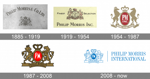
In terms of visual identity, the Swiss-American company is pretty old-fashioned and conservative. Philip Morris still uses the crest from its original logo, only slightly refining it and adding colors.
1885 – 1919
The very first emblem for Philip Morris was designed in a monochrome palette, with the graphical part set under an arched serif lettering in the uppercase, with the first letters of each word enlarged. The company’s visual identity is built around a royal-type crest resembling that of the Knights Templar.
1919 – 1954
The redesign of 1919 switched the composition and color palette of the Philip Morris badge, placing the emblem above the lettering, which was now written in a straight line, using a bolder and serif font with rounded shapes. The crest was drawn in pale red now, with some letters added to the central part, and placed on a light yellow background.
1954 – 1987
In 1954 the badge got gold and red, with white outlines, enhancing the modern smooth shapes of the redrawn crest. The “Veni Vidi Vici” inscription on the ribbon, underlining the red crest, was now more readable due to the use of extra-bold white sans-serif letters. This logo can still be seen on some of the products of the company.
1987 – 2008
In 1987 the look of the Philip Morris logo became more classic and sophisticated, with the emblem outlined in black and placed above the elegant serif lettering in black. The “Veni Vidi Vici” got replaced by the black “Philip Morris International” in clean sans-serif.
2008 – Today
The current emblem, however, looks more discreet due to a shift in the color palette. Now, the picture consists of light blue outlines and white filling. The only field that is given in a color other than white is the dark blue ellipse with the script letters “PM.”


