Rihanna is an R’n’B singer, born on Barbados, with an estimated net worth of over 600 million USD. Robin Rihanna Fenty became popular in the middle of the 2000s, after relocating to the United States. Since that time she has released 8 albums and sold almost 300 million copies worldwide.
Meaning and history
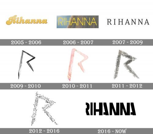
At the beginning of her career, Rihanna was changing her logos pretty often, trying to find the right style, which will become her signature. That’s why there were at least four major redesigns, which finished in 2016 when the famous singer found what she’s been looking for.
2005 — 2006
The initial logo for Rihanna was designed in 2005 and featured a bold yellow cursive lettering with thick sleek lines and rounded edges. The letters had a delicate shadow, which made them look three-dimensional. It was a bright logotype, but too soft and calm.
2006 — 2007
In 2006 the singer goes more modern with her thin and straight stencil sans-serif inscription. The color palette is still based on yellow, but now it looks brighter and more vivid, showing the energy and progressiveness of Rihanna. This logotype looked great on dark and contrasting backgrounds of album covers and posters.
2007 — 2009
The timeless elegance. This is how the Rihanna logo from 2007 can definitely be called. Black wordmark in classy serif typeface was perfectly balanced, having pretty much space between the letters, which made the whole inscription look light, yet solid and chic.
2009 — 2010
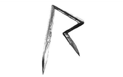
The first sharp “R”, which became iconic in no time, was introduced to the audience in 2008. In its initial version, the open letter with thick contours and pointed ends of the lines was executed in a gradient silver. It looked as if it was drawn with a nail polish or a shiny eye shadow. Anyway, the symbol looked extremely strong and powerful, but its colors and texture added femininity.
2010 — 2011
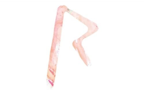
In 2010 the Rihanna “R” was redrawn in a new style and palette. Though the shape and the contour of the letter remained untouched, the insignia started looking different in the new light pink palette with small green and white accents. This new color scheme made the angles look smoother, and created a different tender and soft overall mood, adding a girly touch and showing a new weaker side of the strong woman singer.
2011 — 2012
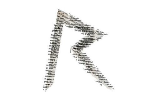
The Rihanna “R” from 2011 came back to the black and white color palette, but this time featured a newspaper pattern, reflecting the gossips, fake news, and paparazzi side of the music industry. It was a cool and stylish emblem with instantly recognizable contours and shape. The newspaper “R” stayed with the iconic singer for another year.
2012 — 2016
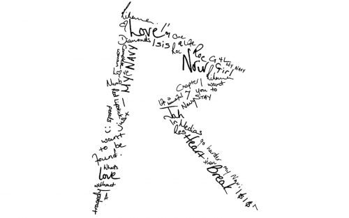
The most famous and recognizable logo was designed in 2009. A simple stylized letter “R” with open contour and sharp angles was executed in many different colors and patterns. The first version had a three-dimensional silver metallic lacquer texture, white the second was in a tender pink aquarelle. There were also newspaper patterns and handwritten text in black and white.
Each style was created to better suit the background and placement, so any possible idea could be supported by this iconic logo.
2016 — Today
In 2016 the new era started for Rihanna. The new style was supported by the new visual identity — now it is a simple and strict black sans-serif wordmark with bold sleek letter lines. But there is one unique thing about this traditional design approach — the bottom part of the inscription is cut, so we only see the upper part of the letters, which finished slightly after the horizontal bars of the letters “A”.
This minimalist detail makes the whole logo instantly recognizable and shows the singer’s individuality as well as her songs and stage looks.


