

![]() Sublime Logo PNG
Sublime Logo PNG
Sublime was the name of a musical band from California, which existed from the end of the 1980s till the middle of the 1990s. The band, composed of three musicians, performed in ska-punk and rock-reggae styles.
Meaning and history
![]()
The founder and leader of the band were Bradley James Nowell (22. 02. ’68 – 25. 05. ’96), guitarist and vocalist. In addition to him, the band consisted of Eric Wilson, bassist, and Bud, who played drums. There was a fourth member, a kind of mascot – Knowell’s dog, a Dalmatian named Lou Dog, who was named after Bradley’s grandfather and appeared on the cover of their compilation.
In 1996 Knowell, who suffered from drug addiction, died of a heroin overdose, and ‘Sublime’ broke up immediately – after the leader’s death the musicians made no attempts to keep the band together.
What is Sublime?
Sublime is the name of a former American ska-punk band, established in 1988, and closed in 1996. From the beginning until the band’s dissolution, the lineup was unchanged. Sublime consisted of vocalist and guitarist Bradley Nowell, drummer and percussionist Bud Gaugh, and bassist Eric Wilson.
In terms of visual identity, the history of a short-lived band has only got two logos, one for each of the albums released by Sublime. The first one, used for the first album, 40oz to Freedom, was bold and colorful, while the second, from the Robbin’ the Hood, was completely different — minimalistic and laconic.
1992 – 1994
![]()
The first Sublime logo, from the first album of the band, was composed of a stylized sun drawing in a yellow palette, with the star having its eyes enlarged and very sad. The sun was placed against a solid black background and accompanied by a small red rectangular banner with the black uppercase “Sublime” lettering written on it in a heavy and extended geometric sans-serif typeface. The banner was placed above the drawing.
1994 – 1996
![]()
For the second album, Robbin’ the Hood, the logo of the band was completely redrawn. The graphical part has been erased, and the lettering — rewritten in the lowercase of a bold typewriter serif font, in black. The black inscription was set against a plain white background, with no additional symbols or elements.
Font and color
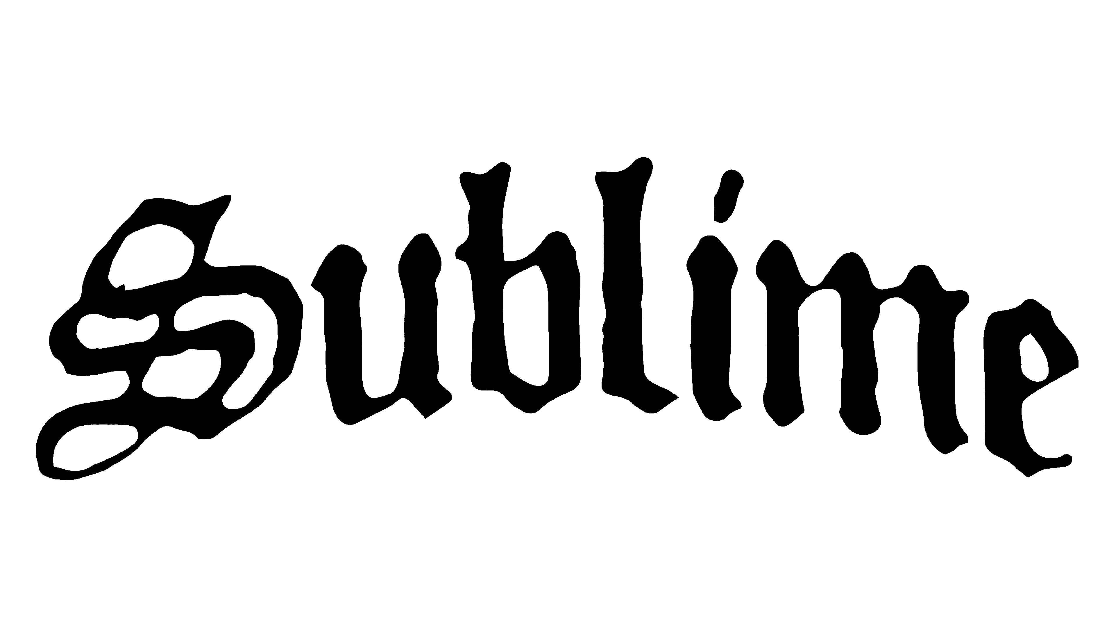
The stylish lowercase lettering from the second album of the Sublime band was set in a bold typewriter typeface with the serifs and bars rounded on their ends. The closest fonts to the one, used in this insignia, are, probably, Typer Pro Mono Heavy, or Typewriter Spool SFT Extra Bold, with some minor modifications of the contours.
As for the color palette of the Sublime visual identity, for the last two years of the band’s existence, it was based on a simple monochrome combination, which is a timeless choice, standing for confidence, elegance, and professionalism.


