Reserved is a label of affordable clothing and accessories manufacturer from Poland. The brand was established in 1989 and today has more than 1,5 thousand stores across twentieth countries in Europe and Asia.
Meaning and history
Reserved is a very famous European brand of affordable clothing, which was founded in 1998 in Poland by the large fashion group LLP, which also owns such labels as Cropp, Mohito, and a few others.
The first store of the brand was opened in 1998 in Poland, and since then the company has opened its locations all over Europe, having more than a thousand physical stores by today, and successfully selling its clothing and accessories via its online platform.
What is Reserved?
Reserved is the name of a casual clothing brand, which was established in Poland at the end of the 1990s. Today the brand l, owned by one of the largest European fashion groups, LLP, has thousands of stores across the globe, offering affordable clothing and accessories for men and women.
1998 – 2014
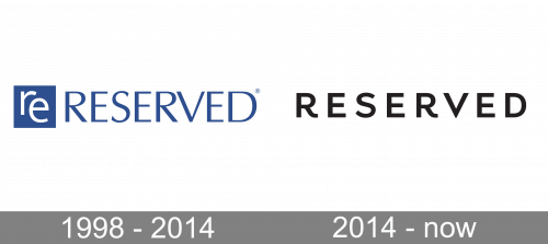
The first logo, used by the fashion brand from Poland, was composed of a graphical icon, placed on the left of the uppercase logotype. Both elements were set in a calm and medium-dark shade of blue, with the emblem featuring a solid blue square and two lowercase “Re” letters in white, and a blue inscription in all-caps, set in elegant clean lines against a white background.
2014 – Today
 The Reserved logo is based on the common principles of the fashion industry’s visual identity design — simplicity and elegance.
The logo is composed of a wordmark, placed inside a black rectangular frame. When used on a signboard, the rectangle is elongated and the lettering is located in its right part.
The Reserved wordmark is written in all capital letters of a modern and sophisticated sans-serif typeface, which is close to the Andes font, but with shorter lines of the letters.

The unique detail of the Reserved nameplate is the tails of the letters “R”, which are curved and create a playful mood for the whole logo.
The monochrome palette elevated the Reserved logo and makes it look stylish and contemporary. Being one of the low-budget brands, Reserved features a fine and elegant logo, which can compete with luxury brands’ visual identity.
Font and color
The stable uppercase lettering from the primary Reserved badge is set in a playful modern sans-serif typeface with traditional shapes of the letters slightly modified, having their tails elongated a curved. The closest fonts to the one, used in this insignia, are, probably, Lota Grotesque Alt 1 Semi Bold and Aalto Sans Essential Alt Medium.
As for the color palette of the Reserved visual identity, it is based on black lines written against a white background, a minimalistic and laconic choice, shared by many fashion-related brands, as it makes any badge timeless and sophisticated.


