Renault Sport is a division of the French automaker Renault, specialized in the development and production of high-performance and racing vehicles. The parent company, Renault, has ownership of this dedicated arm. Primarily based in France, Renault Sport has also extended its operations across various international motorsport platforms. It’s well-known for participating in series like Formula One, rallying, and other motorsport events. The division has garnered critical acclaim for producing sportier versions of Renault’s mainstream models, such as the Renault Sport Clio and the Renault Sport Megane.
Meaning and history
Founded in 1976 as Renault Sport, this specialized division of the Renault Group is known for its high-performance cars and participation in motor racing events. It amalgamated Renault’s earlier sports car and motorsport activities, offering an amalgam of technology and speed. With a heritage deeply rooted in Formula One, the company has achieved considerable success, including multiple World Championships. Renault Sport has also created sporty renditions of Renault’s standard models, gaining popularity for cars like the Renault Sport Clio and Megane RS.
Currently, Renault Sport is an integral part of Renault, making significant contributions to the brand’s reputation for innovation and performance. The company maintains its foothold in Formula One and continues to produce consumer vehicles that incorporate cutting-edge racing technology. With a range of electric and hybrid options in the pipeline, Renault Sport aims to be at the forefront of sustainable high-performance driving.
What is Renault Sport?
Renault Sport is the performance and racing subsidiary of the French automaker Renault. It is involved in motorsports, including Formula One racing, and produces high-performance variants of Renault’s mainstream vehicles. The division has earned multiple championships in various motorsport disciplines and continues to be a key player in both racing and consumer automotive markets.
1980’s – 2004
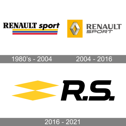
A custom font with slab serifs called Renault Bold was designed to print the “Renault” portion of the inscription. The word “sport” was done using a sans-serif font similar to Futura Std Bold Oblique as well as all lowercase characters, which put the accent on the first word. Starting from the end of the letter “E” the inscription had three lines going underneath. The yellow, blue, and red lines were separated by thin white spacing, which made the lower portion resemble the French flag. The yellow line reflected the energy of the sports cars.
2004 – 2016
The updated logo also featured the bright and energetic yellow, but the blue and red were gone. The yellow was used as a vertical rectangular background. It carried the instantly recognizable Renault rhombus done in metallic silver. It appeared to have volume and was slightly indented into the backdrop, which created even more interest. To the right, the logo had “Renault Sport” printed in two lines using a dark gray color. The first line was printed using a font that resembled Motoya Aporo W8 but with an addition of serifs. The second line was italicized, which created a feeling of movement and speed.
2016 – 2021
The company continued to use yellow to add a bright, energetic, and positive note that instantly grabbed attention. It was used for two horizontally elongated rhombuses stacked one on top of the other. Instead of writing the full name, the designers added bold, black “R.S.” on the right side. The letters were italicized to add dynamic and the “R” got a serif at the top. The logo turned out modern and was very appropriate for the sports automobiles.


