Reese’s is a brand of chocolate snacks, produced by the Hershey’s company since the end of the 1920s. The Reese’s candies consist of chocolate and peanut butter, the favorite American sweets.
Meaning and history
Reese’s is a legendary chocolate brand, which is known all over the world and is considered one of the most loved sweet brands in the United States. Reese’s Peanut Butter Cup is a chocolate candy, most often round in shape, filled with peanut butter. This classic candy, first made in 1928, remains the most popular of all Reese’s products.
Reese’s Peanut Butter Cup was created by Harry Barnett Reese, who was trying to get his small basement-based company on its feet. Before starting his own business, Reese had worked at the Hershey’s Chocolate Company for a long time and had a good relationship with its owner Milton Hershey, so Reese used the Hershey’s high-quality milk chocolate in his Peanut Butter Cup candies from the beginning. After H.B. Reese’s death, his children sold the business to Hershey’s, and Reese’s became its subsidiary.
Another famous Reese’s product is Reese’s Pieces, but this candy did not become popular until after 1982 when Steven Spielberg’s Alien came out. Spielberg and his team originally wanted to use M&M’s, but Mars, the company that owned M&M’s, declined the partnership. The Hershey’s, on the other hand, not only agreed to collaborate but also spent a million dollars to market the film
What is Reese’s?
Reese’s is the name of one of the Hershey’s chocolate brands and is the most popular in the American confectionery market among similar products, namely the famous candy Reese’s Peanut Butter Cups. The Reese’s brand was founded in 1928.
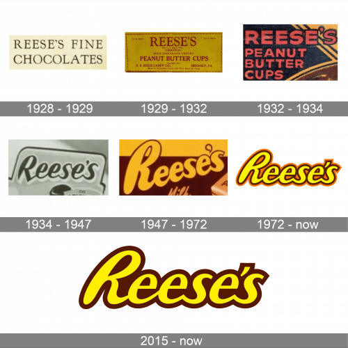
In terms of visual identity, the Reese’s brand has experimented with its logo several times throughout the years, but all of the versions were based on the lettering and used a warm chocolate color palette. The prototype of the current version of the Reese’s logo was introduced already in the 1940s.
1928 – 1929
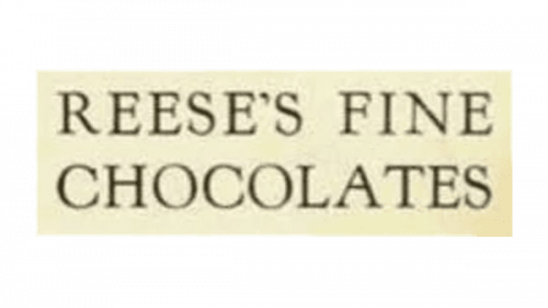
The very first logo for the newborn Reese’s brand was created in 1928 and stayed in use by the company for several months. It was designed for the original name of the brand, Reese’s Fine Chocolates, which was written in two levels, using the uppercase characters, executed in an elegant serif font, in black lines against a creamy-yellow background.
1929 – 1932
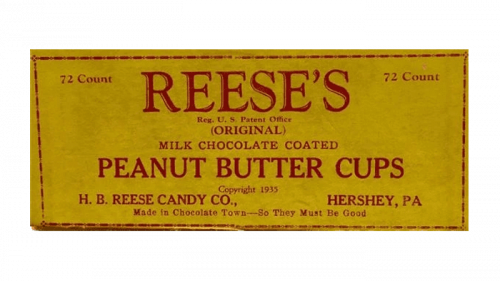
In 1929 the brand was renamed Reese’s Peanut Butter Cup, and a new logo was created for it. Now it was a dark red inscription on an intense yellow background, with a lot of additional lettering in a smaller size, than the enlarged bold serif capitals of the brand’s name.
1932 – 1934
The redesign of 1932 introduced a very intense and dark modern badge for Reese’s brand. The lettering here was set in the uppercase of a heavy geometric sans-serif font, with the red capitals outlined in black and placed over a black rectangular badge with orange and brown decorative lines drawn in its right part. This was the last logo, designed for the brand, with the name “Reese’s Peanut Butter Cup”.
1934 – 1947
In 1934 the name of the chocolate manufacturing brand was shortened to just “Reese’s”, with a new logo designed for it. Now it was smooth and bold cursive lettering with double lines of the title case characters. The inscription was placed on a smooth light background and enclosed into a rectangular frame with rounded angles.
1947 – 1972
The redesign of 1947 created a bright yellow and orange badge, which became a basis for the current iconic version of the Reese’s badge. It was heavy rounded circular lettering in a thick outline, written diagonally over a rectangular banner, horizontally separated into two halves — yellow and brown.
1972 – Today
In 1972 the Reese’s logo was redesigned again, and the badge, created during that redesign is still used by the brand. It is a smooth title case lettering in a handwritten cursive typeface with the characters slanted to the right. The yellow letters of the wordmark are outlined in brown and orange.
2015 – Today
The version of the Reese’s logo, designed in 2015, uses the same typeface as the version from 1972, and the same shade of yellow for the heavy smooth characters. Although, in the new version the orange outline was removed, and now the yellow inscription features an extra-thick brown outline, which adds softness and warmth to the composition.
Font and color
The smooth cursive lettering from the primary Reese’s logo is set in a title case of a custom cursive font with distinctive contours and softened lines of the characters. The closest fonts to the one, used in this insignia, are, probably, Atomic Wedgie, or Halley Shadow Italic, but with significant modifications of the characters’ contours.
As for the color palette of the Reese’s visual identity, it is based on a combination of yellow and brown, with one of the versions featuring orange too. These shades are warm and bright Brenda, reflecting the product’s flavor and representing the brand as a high-quality one.


