Twix is the brand of a chocolate bar, manufactured by Mars since 1967. The sweet snack is composed of a biscuit and caramel, topped with chocolate and the package contains two bars, which is the signature of the brand.
Meaning and history
Twix is a famous chocolate bar that is produced by Mars Incorporated. The main distinctive feature of the bar is that each pack contains two chocolate sticks filled with cookies and caramel. These two sticks when placed vertically in parallel to each other make up a “Pause” symbol, and this symbol has become an inevitable part of the marketing strategy of the brand, and its visual identity.
Originally, the chocolate bar, which the whole world knows as Twix, had the name Raider. The production of candy bar was launched in 1967 in Great Britain. There are several versions of why the brand was renamed, and where the iconic today’s name came from.
The first version is based on a legend that Twix bars were invented back in 1904 in Paris by confectionersIxran and Tweln, both named Edgar. The name “Twix” was given by the first letters of their last names. For a long time, they couldn’t decide on the shape of the chocolate and got inspired by stage pipes.
The second version is much more simple. It says that the name “Twix” is a derivative oftwo English words “Twin” and “Biscuits”.
Under the brand name Twix, the product was imported into the United States in 1979. But in some European countries, Twix is still sold under the Raider brand.
What is Twix?
Twix is the name of a famous chocolate bar label, which is owned by Mars Corporation. The label was introduced at the end of the 1960s, and today is known and loved in dozens of countries all over the globe. Twix has always been very creative with its advertising campaigns.
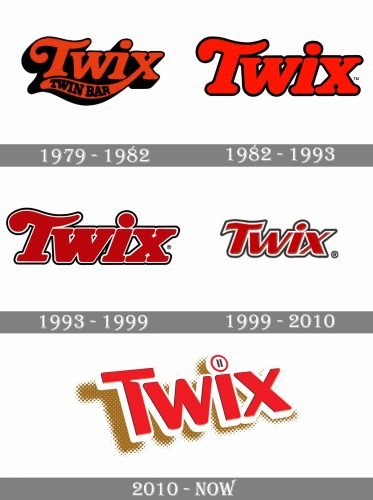
1979 – 1982
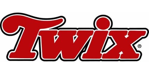
The first version of the Twix text-based logo was designed in 1979z it was composed of a bold italicized serif typeface with an elongated left tail of the letter “X”, where the “Twin Bar” inscription was placed. The lettering was executed in red with black outline and shadow, the additional inscription was also drawn in black.
1982 – 1993
The redesign of 1982 brought simplified shapes and removed all the extra lettering. The red became brighter while the elongated tail of the “X” was cut.
1993 – 1999
In 1993 the horizontal bar of the letter “T” was curved and the color palette became a little more burgundy than red, with an addition of white to the outline.
1999 – 2010
In 1998 the Sony was changed to sans-serif with a lore distinct edges of the letters. The color palette and the double outline remained the same.
2010 – Today
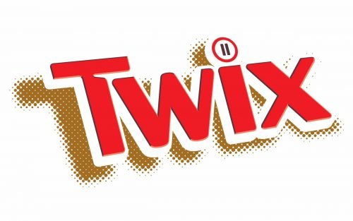
In 2010 the look of the logo was refined. The lettering became more three-dimensional and the wordmark gained layers and shadow. The light brown color was added to the palette, symbolizing both milk chocolate and biscuits, the main components of the Twix chocolate bars.
The dot above the letter “I” is a stylized Pause button, telling you to take a pause and get some Twix.
Font and Color
The bright and friendly title case lettering from the official Twix badge is set in a bold sans-serif typeface with shadowed characters placed diagonally. The designer’s custom font on the Twix insignia was created exclusively for the brand but has something in common with such fonts as Motoya Sousyoku Em AJis-W6, but with major modifications of the letters.
As for the color palette of the Twix visual identity, it is based on a combination of red, white, and chocolate-brown, with two black stripes. The colors represent warmth and friendliness, reflecting the chocolate taste of the product and the welcoming character of the label.


