Due to the latest modification, which took place in 2013, the Reebok logo became absolutely minimalistic. It has attracted a lot of criticism as being too simple and generic. However, many designers point out that, although it is far from being unique, it works perfectly on apparel and, generally, gets the job done.
Meaning and history
One of the oldest sportswear brands in the world, Reebok was established in 1895, and for the first part of its history used a simple Inion Jack logo, celebrating the country of the brand’s origin. Though the symbol was changed to something abstract in 1958, the label came back to the roots later, in the 1970s, and still uses a symbol, inspired by the British Flag today.
The iconic vector emblem for Reebok is an abstract representation of the Union Jack crossing the racing track, and this is how the brand combines two of its main values — legacy and progress; it also reflects a trinity of physical, mental, and social wellbeing, which the brand aims to provide people across the world through their products and philosophy.
1958 — 1977
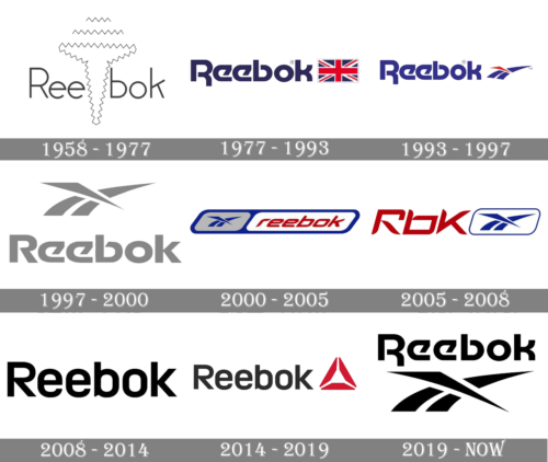
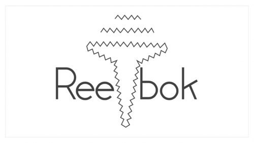
The next logo after the Union Jack was introduced by the brand in 1958 and boasted a modern and light sans-serif inscription, where the brand’s name (which means “African Antelope”) was divided into two parts by an abstract geometric shape with thin zig-zag contouring. Two horizontal zig-zag lines were placed above the symbol.
1977 — 1993
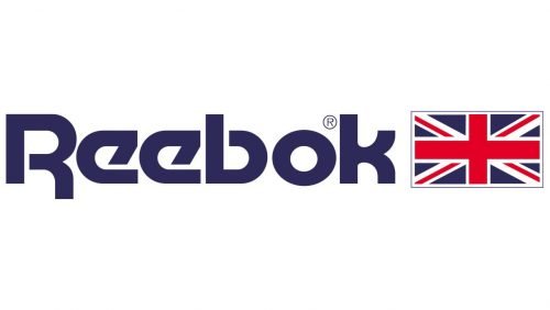
In 1977 the British flag comes back to the brand’s visual identity, being placed on the right from a bold blue wordmark in a custom sharp sans-serif typeface with diagonal lines and rounded angles of the letters. This typeface is still in use by the brand today.
1993 — 1997
In 1993 the iconic emblem for Reebok was designed. Composed of two blue smooth lines merging in one and crossed by a red sharp and narrow triangle, the image was placed on the right from the custom wordmark in a lighter shade of blue in comparison to the previous version.
1997 — 2000
The symbol moves to the top of the logo in 1997, and the color of both the image and the logotype is switched to a light gray. The new palette made the logo look elegant and light, pointing to the professional qualities of the brand.
2000 — 2005
The redesign of 2000 completely changed the style of the Reebok logo, keeping the iconic emblem untouched. The sharp brand’s signifier in bright blue is placed on a gray background on the left from the logotype. Both parts of the visual identity are located inside a smooth parallelogram with a thick blue outline. The frame is divided into two segments, light gray for the emblem, and white for the wordmark. The typeface of the lettering is changed to a sharp and square sans-serif which was italicized to represent speed and motion. The intense red color of the inscription elevated the whole look and added a sense of passion and energy.
2005 — 2008
Later, in 2005, the company starts using the shortened name “RBK” for its logo. The letters in a unique sharp font were placed on the left from the blue emblem, enclosed in a rectangular blue frame with rounded angles.
2008 — 2014
The redesign of 2008 brought a new minimalist look to the Reebok visual identity, redrawing its logotype in a traditional and neat sans-serif in a light shade of blue and completely removing the emblem. This experimental version stayed with the brand for almost six years and became a basis for the next redesign.
2014 — 2019
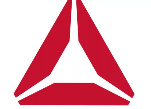
In 2014 the smooth and sleek logotype is being colored black and complemented by a new geometric emblem of the brand, composed of a red triangle, consisting of three equal segments.
2019 — Today
With the redesign of 2019, the brand comes back to its logo version from the 1979s, with the difference in color palette and the emblem location. Now the sharp iconic symbol is placed under the wordmark and executed in a monochrome palette, which adds a sense of power and distinction to the whole image.
Symbol
The British flag logo was used for almost a century. It was only in 1986 that the company decided to replace it by the so-called vector logo. It featured an abstract Union Jack streak across a race track. This move can be explained by the fact that Reebok wanted to establish itself as a global brand and also as a performance brand.
The Delta emblem
In 2013 Reebok launched a repositioning process establishing itself as a fitness brand rather than a company connected with specific sports. One of the core parts of the new strategy was the introduction of the Delta logo. In its official statement, the company claimed that the Delta triangle was chosen as a symbol of change and transformation. Each part of the triangle stood for one aspect of a person’s transformation: physical, mental, and social.
Font
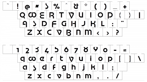
The minimalistic sans-serif typeface featured in the earliest Reebok logo was replaced by a customized Motter Tektura wordmark in the 1970-s. Yet, eventually Reebok opted for a completely different custom type. The sans-serif font looks clean and minimalistic, although it is not as recognizable as the previous one.
Color
The original blue-and-red color scheme, which was based on the colors of the British flag, was transferred to the 1986 version of the Reebok insignia. Subsequently the company made the combination simpler, leaving only black wordmark on the white background. The 2013 redesign brings back the red color.


