 Red Horse Extra Strong Logo PNG
Red Horse Extra Strong is the name of a beer label, owned by the San Miguel Brewery, the largest and the most famous brewery in the Philippines. The label was established in 1982 and is specialized in the production of extra-strong lager with 6,9% alcohol by volume.
Meaning and history
Red Horse Extra Strong is a beer label, which has been known in the Philippines since the beginning of the 1980s, and since the 1990s the beer started being exported to the international markets.
The label of the beer says that in addition to barley malt and cereals, which are usually used for the production of beer, sugar, and starch can also be used in the Ted Horse Extra Strong, and it explains the name of the brand. The beer is called strong because it uses not only barley malt but also various grains, sugar, and starch to obtain the required strength of 6,9% vol.
The two most common beers in the Philippines are Red Horse and Pale Pilsen. Both are produced by San Miguel Brewing in Manila.
What is Red Horse Extra Strong?
Red Horse Extra Strong is the most famous lager brand in the Philippines, which was introduced in 1982 by the largest brewery in the country, San Miguel Brewery. Red Horse Extra Strong fully lived up to its name, having an alcohol content of 6,9%.
In terms of visual identity, the brand beer Red Horse Extra Strong hasn’t changed much since the introduction of the label at the beginning of the 1980s. The company had managed to keep the original style and color palette, strengthening and modifying it throughout the years, yet not affecting its mood and recognizability.
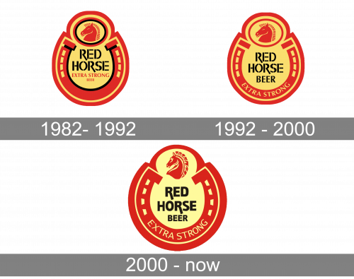
1982 – 1992
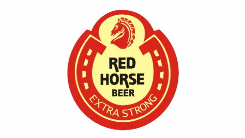
The original Red Horse Extra Strong badge, introduced in 1982, has stayed with the brand for almost ten years. It was a yellow and red logo, with a solid red horseshoe as the base. The upper part of the logo was decorated by a stylized image of a horse head, enclosed I tow a double circular frame in red and black. The lettering in black was set in a stable stencil font in the middle of the horseshoe and accompanied by a lightweight red tagline.
1992 – 2000
The redesign of 1992 removed the black outlines from the circular frame around the horse and the horseshoe, and moved the “Extra Strong” part of the lettering a bit to the bottom, so that now it was arched along the red horseshoe, executed in bold yellow capitals, while the “Beer” got enlarged and was moved directly under the “Red Horse”, repeating the style and size of the main lettering.
2000 – Today
Another redesign of the Red Horse Extra Strong badge was held in 2000, keeping the composition and color palette of the original version, but refining all the elements, making up the contours smoother and more elegant. The lettering became thicker, yet due to the rounded angles started looking more sophisticated than ever before, and the same thing happened to the red head of a horse, drawn on top of the logo.
Font and color
The bold black lettering from the Red Horse Extra Strong logo is set in a modern and strong sans-serif typeface with the softened uppercase characters looking stylish and confident. The closest font to the one used in this insignia is, probably, Akagi Black or Mestre Heavy, although with some modifications, such as elongated bars of some letters.
As for the color palette of the Red a horse Extra Strong logo, it is based on a combination of red, black, and yellow, with the black elements looking bring her than others. The scheme of the badge looks very professional and professional tense, evoking a sense of quality and excellence.


