The consumer goods company Reckitt Benckiser Group is headquartered in Slough, England. The range of goods it makes and sells includes a vast variety of health, hygiene, and home products.
Meaning and history
In 1999, Reckitt & Colman (Great Britain) merged with Benckiser N.V. (the Netherlands) to form the Reckitt Benckiser Group.
Before we start discussing the logo of the newly formed company, the Reckitt Benckiser logo, let’s take a look at the brand identities of its predecessors.
1978 — 1991

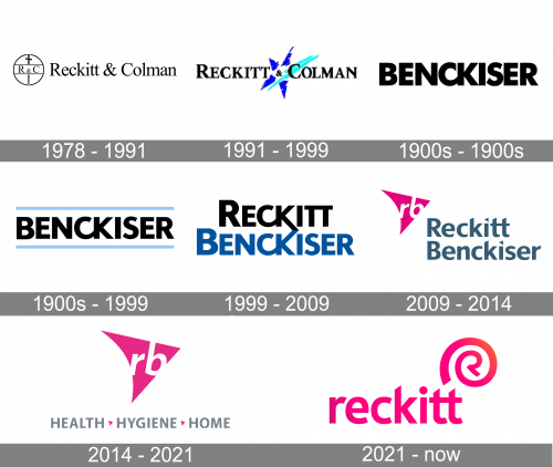
The company’s oldest logo was the name wordmark accompanied by a modest emblem. The wordmark was a regular text saying ‘Reckitt & Colman’ in black serif letters. The emblem, meanwhile, is a black circle with a sword hung vertically in it and a horizontal bar in the middle. The bar, for its part, has ‘R & C’ typed onto it in the same style as the big wordmark.
Reckitt and Colman: 1991 — 1999
The logo Reckitt and Colman used featured the name of the brand with a bright blue star in between the two words. The star was formed by casual strokes.
The type was an all-caps sans with mostly traditional proportions.
Benckiser: 1900s — 1900s
The logo consisted of only the wordmark in black. The type was a moderately bold sans with gently rounded ends.
Benckiser: 1900s — 1999
Reckitt Benckiser: 1999 — 2009
After the merger, the new company adopted an unpretentious wordmark logo consisting of two lines. The first line showcased the word “Reckitt” in black, while the word “Benckiser” in blue could be seen below.
The type wasn’t the same as in any of the previous logos, yet it retained the traditional style that the typography of the old logos used.
The letters were very legible and had classic proportions. There were no serifs. While all the glyphs were capitalized, the initials were slightly larger than all the other letters.
Although the overall look of the type was generic, the designers added at least three original features making the logo unique and meaningful. First, they joined the letters “c” and “k” in both words. Also, they joined the ends of the two “k’s” so that they form an arrow. This element was highly meaningful. If it could speak, it would say: “The two companies joined their efforts to pursue great goals” or “We use what we have in common (this part of the message is symbolized by the “ck”) to embrace the future (arrow).” If you’d like to put this into a single word, this word would probably be “synergy.”
2009 — 2014
A decade later, there was already no need to allude to the merger of the two companies. The new logo only emphasized the optimistic theme using the same symbol, the arrow, in a modified form.
Also, this design served another goal. It was a transitional logo that reflected the connection between the full name and the new short name. For five years, the two versions of the brand’s name were used together on the logo.
On the left, there was a stylized arrowhead in pink showcasing the abbreviation “rb” in white inside. To the right, there was the full name in a sans serif type. While the initials were capitalized, all the other letters were now lowercase, to echo the style of the abbreviated wordmark.
2014 — 2021
The full name disappeared from the Reckitt Benckiser logo altogether. The pink arrow was now placed above the lettering “Health, hygiene, home,” which made the design more meaningful showing the range of products the brand produced.
2021 — Today
The 2021 emblem uses a pink word ‘Reckitt’ made from lowercase letters of a typical sans-serif style. Besides that, there’s also an emblem that looks like a pink spiral culminating in a capital ‘R’.
Font
The simplicity of the typeface can be explained by the need for a perfectly legible logo.
Color
The palette of the 1999 Reckitt Benckiser logo was inspired by the colors used on the logos of the company’s predecessors (black and blue).
The palette of the 2009 logo was more complex. The color of the lettering “Reckitt Benckiser” mixed the blue and black from the previous logo, while the pink added a vivid accent. The same color scheme, with a slight shift, is used in the current Reckitt Benckiser logo.


