Alcoa Corporation is an industrial company registered in the USA. The company has a rather long history; it was founded in Pittsburgh, Pennsylvania in 1888 by Charles Martin Hall, the inventor of aluminium electrical smelting process. At that time, the enterprise was called “Pittsburgh Reduction Company. Today’s name, Aluminum Company of America and its acronym “Alcoa” it received in 1910. The company went through many periods of economic and legal difficulties but eventually managed to become come one of the most sustainable corporations worldwide. Today Alcoa is ranked as the eighth among the biggest producers of aluminium in the world. In 2017, it received a net income of about 217 million US dollars.
Meaning and history
Alcoa is an American steel company engaged in aluminum production. It is the third of the six world leaders in aluminum production and mining, after Rusal and Chalco. Also engaged in bauxite, alumina, aluminum, and aluminum alloy products. Founded in 1886, when Charles Martin Hall discovered and patented a way to produce aluminum.
The man behind Alcoa is a real legend. Charles Martin Hall passed an electric current through alumina and obtained a new metal, aluminum. He managed to find sponsors for industrial production, and together they formed the Pittsburgh Reduction Company.
Although, Charles Martin Hall made his invention almost at the same time as the Frenchman Paul Heroult. This, this technology today is known as the Hall-Heroult process, which is currently the only technology for industrial aluminum production and is used all over the world.
The company was renamed Aluminum Company of America in 1907, and in 1910 the abbreviated name Alcoa was given to the two areas where the company’s main production facilities were located. Alcoa was adopted as the official name of the company only in 1990.
What is Alcoa?
Alcoa is the name of one of the world’s largest producers of aluminum. The company was established in the United States in 1888 and was originally called Pittsburgh Reduction Company, which was changed to Aluminum Company of America, shortened to Alcoa, in 1910.
1894
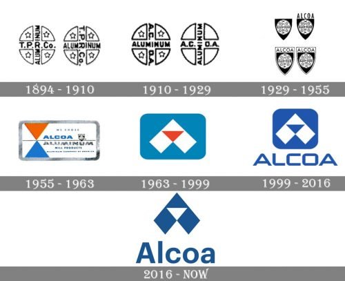
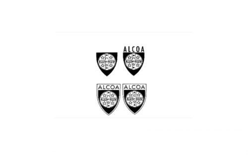
The logo used at the turn of the century was a circle broken down into four equal segments by the lettering “T.P.R.Co” (an abbreviation of “The Pittsburgh Reduction Company”) and “Aluminum.” Each of the segments contained a five-pointed star.
1910
When the company was renamed Aluminum Company of America, the abbreviation “T.P.R.Co” was replaced by “A.C.O.A.” In addition to the logo with the stars, the brand introduced a logo featuring empty segments.
1929
After the company adopted its current name, the roundel was placed inside a shield shape featuring the word “Alcoa” above.
1955
The company used rectangular logos housing the words “Alcoa” and “Aluminum” separated by a horizontal bar. To the right, there was a combination of orange and blue triangles positioned symmetrically one above the other.
1963
The new emblem seemed to have been inspired by the triangle motif from the previous logo. It looked more complicated now and reminded the letter “A.”
1999
The lettering “ALCOA” appeared below the triangle-inspired emblem. The palette grew simpler because the orange disappeared. The emblem was white on the blue background.
2016
The designers have simplified the Alcoa logo by removing the box in which the triangle emblem was placed. The emblem is now blue over the white background. The type has also grown somewhat simpler.
Font and Color
The heavily stylized lettering from the primary Alcoa badge is set in a heavy futuristic sans-serif typeface with rounded angles and straight cuts of the bars’ ends. The closest fonts to the one, used in this insignia, are, probably, Hyperspace Race Expanded Heavy, or Future Tense Regular, but with some minor modifications of the contours.
As for the color palette of the Alcoa visual identity, it is based on a calm yet intense shade of blue, which stands for professionalism and confidence, reflecting such qualities of the company as expertise, reliability, and determination.


