

![]() Rapid City Rush Logo PNG
Rapid City Rush Logo PNG
The Rapid City Rush play professional hockey for Rapid City, South Dakota. The team name derives presumably from Mount Rushmore, the main attraction in South Dakota after it was carved into gigantic busts of four US presidents.
Besides, the name “Rush” has some symbolic meaning ‒ an ice hockey team bearing such a name should be fast and vigorous. And what is more, it goes in line with the name of their location ‒ Rapid City.
Meaning and history
![]()
The Rapid City Rush, a professional ice hockey team based in Rapid City, South Dakota, was founded in 2008. The team’s inception was led by a group of local investors passionate about bringing professional hockey to the region. The Rush quickly became a prominent figure in the ice hockey community, joining the Central Hockey League (CHL) for their inaugural season.
Throughout its history, the Rapid City Rush has achieved significant milestones. One of their most notable achievements came early in their journey when they won the Ray Miron President’s Cup during the 2009-2010 season. This victory, only in their second season, marked them as a formidable force in the league. Additionally, the team has seen numerous playoff appearances, further solidifying its reputation for competitive play and sportsmanship.
In recent years, the Rush has undergone several changes, including league transitions. They moved to the ECHL in 2014, continuing to showcase their skill and determination. As of now, the team continues to play in the ECHL, striving to recapture the glory of their early years. Their current position reflects a blend of experienced players and fresh talent, aiming to achieve new heights in the ever-evolving landscape of professional ice hockey.
What is Rapid City Rush?
Rapid City Rush is a professional ice hockey team competing in the ECHL. Founded in 2008, they have a history marked by notable achievements including a President’s Cup win. Based in South Dakota, they continue to be a significant player in the ice hockey world.
2008 — 2014
![]()
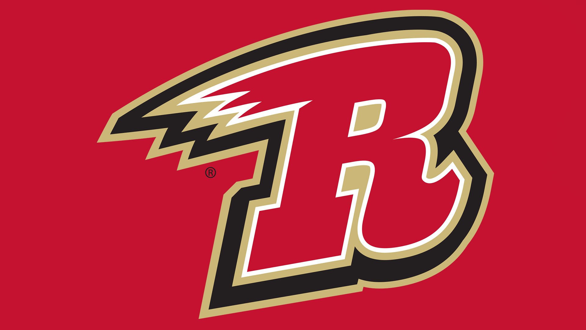
The Rapid City Rush logo looks as if the franchise didn’t put much effort into designing it. It features only one element ‒ a stylized “rushing” letter “R” in red color outlined in white, gold and black.
2014 — Today
![]()
The team have kept their primary logo unchanged since it was unveiled in 2008.
Alternate Logos
Besides the primary logo they have two alternate logos which incorporate more details. One of them features the four presidential busts in gold against a red circle with a black outlining and “Rapid City” written in white on the top. At the bottom there is the team name with the same stylized letter “R” and a soaring puck.
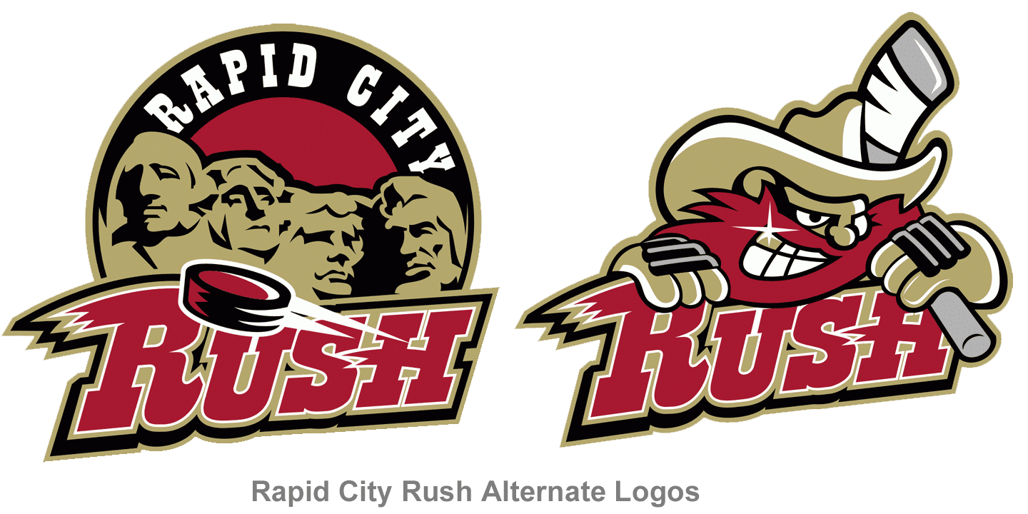
The latter is the team name against the background of a grinning red-beard cowboy holding a bandaged hockey stick on his shoulder.


