The Premier Development League is the old name of the league now known under the name of USL League Two.
Meaning and history
USL League Two, initially known as the Premier Development League (PDL), was founded in 1995 as a part of the United States Interregional Soccer League (USISL). This league was created to expand and improve soccer capabilities across the United States and Canada, particularly focusing on urban areas. It also provided an opportunity for college soccer players to continue playing during summer without affecting their college eligibility. The inaugural season featured 27 teams, with the Richmond Kickers claiming the first title.
The league underwent significant growth and evolution. In 1999, the USISL was rebranded as United Soccer Leagues, and the PDL became known as the USL Premier Development League. This period saw an expansion to 42 teams in six divisions. Notably, the Chicago Sockers won the league in their debut season. The mid-2000s marked a period of consolidation and further growth for the league, with significant milestones like the live broadcasting of the PDL Championship game on national television and professional teams beginning to invest by adding U-23 development sides.
In recent years, USL League Two has continued to thrive, featuring 122 teams split across eighteen regional divisions and four conferences as of 2023. It remains a developmental soccer league, forming an integral part of the United States soccer league system, with its headquarters in Tampa, Florida. The league’s current champions, as of 2023, are Ballard FC, who claimed the title by defeating Lionsbridge FC. This ongoing success and expansion reflect USL League Two’s prominent position in the development and promotion of soccer talent in North America.
What is USL League 2?
USL League 2 is a developmental soccer league sponsored by United Soccer Leagues in the United States and Canada. It is part of the United States soccer league system, featuring 122 teams divided into regional divisions and conferences, headquartered in Tampa, Florida.
1995 — 2010
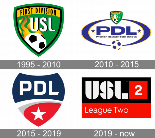
The Premier Development League logo, designed in 2010, stayed with the organization for longer than a decade and was kept for the following version, created in 2010. It was a bright green smooth crest with a double black and green outline and a wide yellow banner on its top part. The banner contained a two-lined inscription in black sans-serif capitals, which were slightly narrowed. The main part of the logo featured a black and white football with a stylized gradient flame coming out of it and a white shadowed “USL” abbreviation set on the right part of the crest.
2010 — 2015
 The old PDL logo featured the short name of the league in large dark blue letters, while the full name in smaller letters could be seen below. The design was placed inside an ellipse. There was the USL shield overlapping the border of the ellipse on the top, while below it a football could be seen.
2015 — Today
The shape of the Premier Development League logo is something in between a shield and a drop with its top cut. In the upper half of the drop, there’s the lettering “PDL” in white on dark blue background, while below it there’s a white star on the red background.
2019 — Today
The logo presented is a bold and graphic representation of the USL League Two, a soccer league in the United States. Dominated by stark contrast, it features a black rectangular background bisected horizontally by a vibrant red stripe. Emblazoned across the upper half are the letters “USL” in white, each character occupying its own space within the black field, providing a clear and striking visual segmentation. The “L” cleverly integrates the number “2” within its lower half, signifying the league’s tier within the United States soccer league system. Beneath the red stripe, the words “League Two” are written in white, aligning with the lower edge of the “USL” above. The use of white text against the black and red segments ensures high visibility and instant recognition, while the simple yet effective design elements convey a sense of professionalism and competitive spirit associated with the league. The overall aesthetic is modern, clean, and indicative of a structured, organized sports entity.


