

![]() Prada Logo PNG
Prada Logo PNG
Prada, one of the leading Italian luxury fashion houses, was established in 1913. The wordmark has stayed almost the same throughout the company’s history.
Meaning and history
![]()
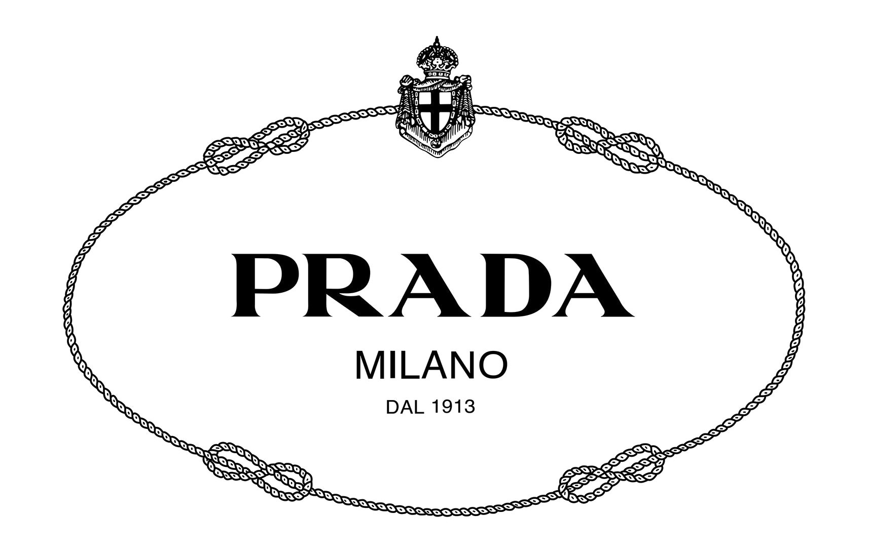
The history of the Prada logo started in 1919, when the company was proclaimed the official supplier of the royal family in Italy. Due to this fact, the brand received the right to include elements of the House of Savoy’s heraldry in its logotype. Prada built its first logo with the help of two elements of the House of Savoy’s heraldry: the coat of arms and the rope. In addition to this, the Italian company included its own wordmark in the logo. The fact that Prada had royal patronage helped it to compete with its rivals, for instance, Gucci, which could not boast such an honor. That is why making royal symbols a part of the logo could be considered an extremely wise move for the company.
![]()
However, in the course of time the fashion house removed the design elements connecting it with Italian monarchy. The rope design, the coat of arms, and even the banner shape disappeared leaving a simple wordmark.
Current symbol
The most characteristic feature of the wordmark is probably the font, which sports a combination of two types of strokes: thin and thick. The letter “R” has a distinctive line due to which it is immediately recognizable. Also, the letters “A” have unique shape at the top.
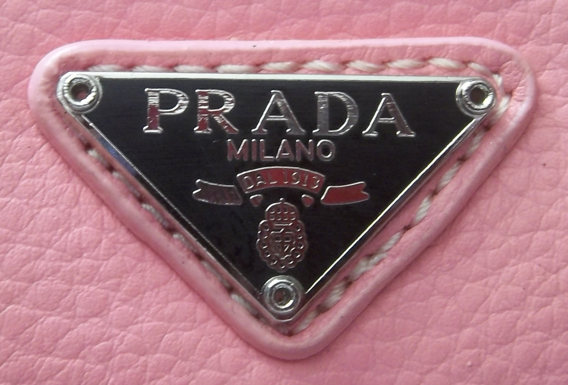
The fashion house may tweak the logo depending on the collection. For instance, some bags have the Prada logo plates with a triangle, some say just “Prada”, while others say “Prada Milano”. Also, a squiggle may appear underneath.
What’s the idea behind the emblem?
The main idea behind the logo is actually a conspicuous lack of a logo. In contrast to other fashion houses, Prada proclaims “anti-status” or “reverse snobbery.” Because of this, the wordmark typically appears only on little tags, buckles, and clasps.
Font
![]()
If you take a look at the earliest Prada emblem you will notice that the typeface has not changed. The current wordmark features the same custom serif all-cap font as the logo introduced in 1919.
Color
![]()
The choice of color emphasizes the idea of minimalism and refinement. Whatever shape the standard Prada logo has had, it has always used only one color, black, against the white background. However, in certain visual contexts designers may give the logo in white or gold, but it is just a minor exception from the general rule.


