

![]() Bape Shark Logo PNG
Bape Shark Logo PNG
While the so-called BAPE Shark logo entered the fashion industry in connection with its parent brand, it doesn’t seem to be based on its symbolism.
Meaning and history
![]()
The Japanese clothing company A Bathing Ape opened its first shop in 1993. The name of the label was inspired by the movie Planet of the Apes. One of the most popular items the brand has manufactured so far is the BAPE Shark hoodie, a combination of stylishness and quirky gimmicks. Interestingly, the design was inspired by military emblems seen on the nose of fighter planes or even the hulls of battleships.
Symbol
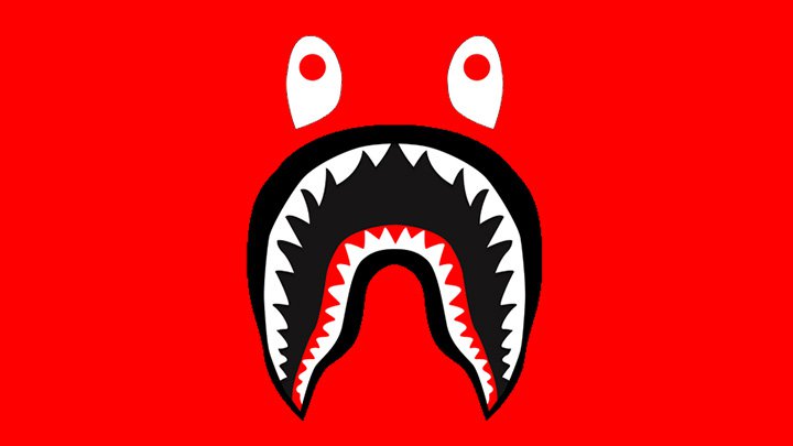
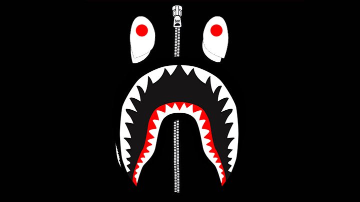
While the emblem is highly stylized, you’ll hardly have any doubt as to what creature you see in front of you. The two rows of sharp white teeth create a characteristic curve of the shark’s mouth. There’s a small red line in the mouth, which is probably supposed to be a tongue (or, to use the scientific term, a basihyal).
The teeth on both sides are identical. Such symmetry makes the picture more attractive and probably more logo-like, but it also makes it less natural. Is it possible that a real shark could have identical teeth on both the left and right parts of its mouth? The eyes are also highly stylized. Apart from the red pupils, we can also mention the shape.
Emblem
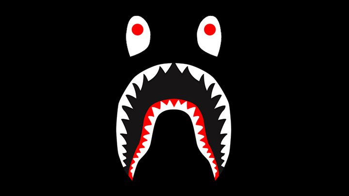
However, the fact that the shark looks far from realistic doesn’t matter as what the designer was actually aiming at was to communicate a certain emotion. Can you guess which? With its mouth and eyes opened so wide, with the pupils set so high, this shark appears to be terrified. Who was it that made the creature so frightened? Can it be the owner of the shark hoodie?
Font
While the logo of the parent brand, BAPE, has been given in a distinctive typeface, the BAPE Shark emblem is different. It doesn’t include text at all.
Colors
![]()
The palette used for the BAPE Shark logo is incredibly popular. The emblem is dominated by black. There’re several white elements (the teeth, the eyes) looking very bright on the black background. To end up, you can see a couple of red accents (the pupils of the eyes, and part of the mouth).
In addition to the basic version described above, the brand also uses additional variations. For instance, the shark’s mouth and eyes are sometimes placed over the white, grey, blue or red background. Also, the “lips” of the shark can be given in grey. Anyway, this kind of logo is pretty adaptable in terms of the palette, which is essential as it’s often printed on merchandise.


