Post Office is one of the main postal service providers in Great Britain, which was founded in 1986, and today covers the country with more than 10 thousand offices across England.
Meaning and history
The postal service is one of the basic units of communication in any country. The history of the Royal Mail of Great Britain, one of the oldest in the world, apart from its successful work, is also rich in revolutionary innovations for its time.
The Post Office appeared in Britain quite a long time ago – in 1516. Until then, ordinary people had to deliver letters by hand.
Flemish merchants brought the postal service to the country – they were carting correspondence between states. Later, the privilege of delivering letters was taken over by English merchants. The founder of the postal service was Henry VIII, who promoted the development of international correspondence.
The Royal British Postal Service is still a state enterprise. About ten percent of the shares are owned by the company’s employees, and the rest are managed by a special agency. The two main names associated with Britain’s postal system are, of course, Royal Mail, and the Post Office, which are different companies, but both are government-owned and run by agreement. In 1986 the post offices responsible for letter and parcel delivery were spun off into separate firms under the Post Office Group brand.
The “Post Office” company was introduced at the end of the 1960s, as an evolution of the General Post Office, founded in 1934 based on the historical General Letter Office.
What is Post Office?
Post Office is a postal service company from the United Kingdom, which was officially established in 1986, and today has a huge chain of more than 10 thousand branches across the country. Apart from postal services, the company also provides banking and retail.
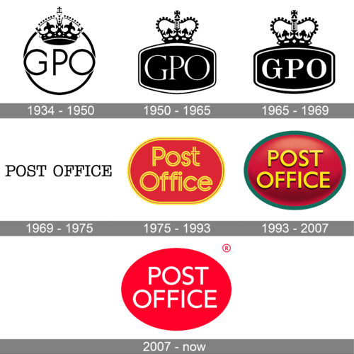
In terms of visual identity, Post Office in its current state got formed in the middle of the 1980s, but its logo history has to be traced back to the 1930s when the badge of the General Post Office was introduced.
1934 – 1950
The logo, used by General Post Office in the 1930s—1940s, featured a simple roundel with the GPO abbreviation in the center and an ornate crown placed in its top part. The crown was overlapping the outline of the circle, but repeats the contours, creating a very balanced and elegant look.
1950 – 1965
The redesign of 1950 has played with the shape of the General Post Office badge, turning a circle into a horizontally-oriented rectangle with the sides arched from the center. The color badge has a thin double outline in white and was decorated with a sophisticated crown on top.
1965 – 1969
In 1965 the lettering on the General Post Office logo was emboldened and switched its typeface to a more traditional serif one. Now the GPO abbreviation became the main element of the badge, attracting all the attention. As for the crown, it kept the contours from the previous version but got slightly enlarged.
1969 – 1975
The redesign of 1969 introduced a super minimalistic Post Office logo, where the name of the company was written in the uppercase of a delicate typewriter serif font, in black medium-thick bars against a plain white background. This version of the badge stayed with the agency for about six years.
1975 – 1993
In 1975 the Post Office logo was significantly changed. Now the lettering in an outlined serif typeface was written in two levels in yellow lines, over a gradient red background. The shape of the badge featured a horizontally-oriented oval, with the red background enclosed into a double yellow frame, supporting the style of the lettering.
1993 – 2007
The redesign of 1993 has refined the contours and the color palette of the Post Office logo, adopting a more modest and geometric Sans-serif typeface for the inscription, and adding more volume to the composition. The red background became darker, the shape — more circular, and the contours more distinctive and bold. The yellow lettering was now accompanied by a thin green outline of the roundel.
2007 – Today
In 2007 the Post Office logo was redrawn in a flat minimalistic style, with the white inscription set against a flat red horizontally-stretched roundel with no framing. The simplicity and brightness of the palette make up a very modern and powerful image for the company.
Font and color
The clan medium-weight lettering from the primary logo of Post Office is set in the uppercase of a geometric Sans-serif typeface, which looks very similar to such fonts as Marcher Regular, or Neue Radial A Book.
As for the color palette of the Post Office’s visual identity, it is based on a combination of red and white. The color of the post office in Great Britain has been red since its inception, and it was made this way, to keep the needs of the people in kind. Like phone booths, it is not difficult to find a letterbox on the street.


