

![]() Alstom Logo PNG
Alstom Logo PNG
Alstom is a company, specialized in manufacturing high-speed railway transport. It was established in 1928 in France and is known as a producer of the AGV and TGV trains, as well as the metro.
Meaning and history
![]()
Alstom is a French company and a global leader in the field of transport and energy infrastructure. Founded in 1928, Alstom was the product of the merger of two industrial groups. With the acquisition of Electriques de France in 1932, it became involved in train production.
Today Alstom is a world-leading name in the production and transmission of power and infrastructure for rail transport. Alstom sets the highest standards in innovative environmentally clean technologies. Alstom Concern is the only diversified manufacturer in railway machine building. The range of services in this field is almost unlimited – from rolling stock construction and service to signaling and infrastructure.
At the moment Alstom SA has concentrated its activity on the railway industry. The companies produce many different types of railway locomotives, diesel locomotives, and electric trains. In addition, urban streetcars are produced. The second aspect of the company’s activities is the production of power-generating equipment. The company also produces electrostatic precipitators for industrial enterprises. Till 2006 the company was engaged in shipbuilding.
Today Alstom is present in more than 100 countries and employs about 92,000 people.
What is Alstom?
Alstom is a French company, engaged in the transportation and energy infrastructure segments. The company was established at the end of the 1920s, and by today has grown into one of the world’s most reputable names in the industry.
1928 – 1930
![]()
The original brand logo was the company’s name surrounded by horizontal lines (two below, one above). The whole logo was black.
1930 – 1961
![]()
For thirty years, the brand used just the black-colored inscription without any dots or lines as the logo.
1961 – 1976
![]()
In 1961, the company designers added a big square with the white ‘A’ onto the inscription.
1976 – 1980
![]()
This design is a black arrowhead with two white ‘A’ letters intertwined into one inside of it.
1980 – 1985
![]()
In the 80s, the company was known as Alsthom Atlantique. During this time, it used this name and two thick red lines beneath it as the logo.
1985 – 1989
![]()
In 1985, Alsthom returned to its original name, deleted the ‘Atlantique’ part from the logo and narrowed one of the red lines.
1989 – 1991
![]()
In 1989, the brand merged with the British giant named General Electrics. It was generally the same logo, but the name turned into ‘GEC Alsthom’. Because of it, it was also elongated.
1991 – 1998
![]()
In the redesign, the letters were put further apart and received a less bold print. The lines were enlarged to follow the size of the inscription and also brightened. A red, downward triangle was also put above this logo.
1998 – Today
![]()
The Alstom visual identity is simple and professional. Based on the wordmark, it has one bright graphical element, which represents the company’s nature and character.
The Alstom nameplate is written in all capitals of the sans-serif typeface, where all the letters feature simple straight shapes and only “A” is customized. The middle bar of the letter “A” is curved and open, which adds freshness and style to the logo.
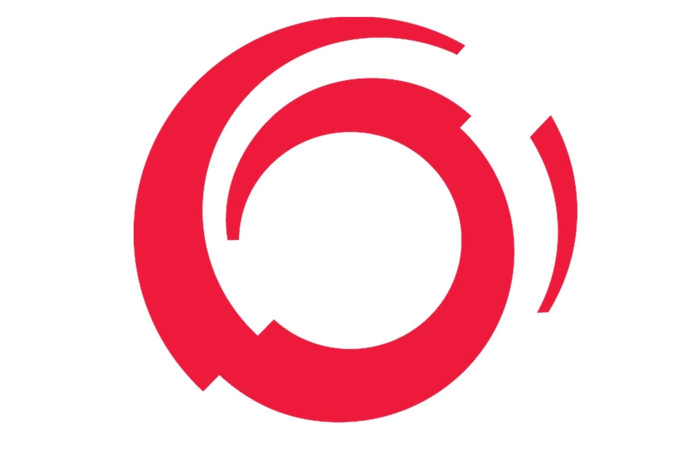
The letter “O” of the Alstom wordmark is replaced by the red abstract image, which looks like a swirl, moving into the future. It is a reflection of the company’s progressive approach and the value of innovations.
The “Mobility by Nature” tagline in all the lowercase lettering is placed under the wordmark and executed in a traditional serif font, which adds elegance and timelessness. The tagline features two solid dots on both sides, which perfectly balance the red swirl.
The deep blue and red color palette of the Alstom logo reflects the company’s authority and power. It is a color combination, that evokes a sense of security and reliability, showing the strong sides of the brand and making customers trust it.
Font and Color
The bold stylized logotype from the primary Alstom badge is set in a geometric sans-serif typeface with the modified contours of the letter “A” and the “O” replaced by a graphical element. The closest fonts to the one, used for the Alston badge are, probably, Aalto Sans Essential SemiBold and Moniak Sans Black.
As for the color palette of the Alstom visual identity, it uses a timeless elegant combination of navy blue and scarlet red which evokes a sense of excellence, sophistication, and professionalism the colors also represent the reliability and confidence of the company.


