 Portuguese Primeira Liga Logo PNG
The Portuguese Primeira Liga, primarily known for its role in the world of professional football, is not a company but a top-tier football league in Portugal. Unlike a traditional business with a single owner, the league is collectively managed by its participating clubs. It operates primarily within Portugal, featuring a host of clubs from various regions across the country. The league’s widespread operation throughout Portugal has made it a focal point of national sports culture, attracting fans from all corners of the nation and fostering a vibrant footballing community.
Meaning and history
The inception of the Portuguese Primeira Liga dates back to 1934, when it was founded under the guidance of the Portuguese Football Federation. This establishment marked a significant milestone in the history of Portuguese football, introducing a standardized national league to foster competitive play across the country. Over the years, the league has witnessed numerous outstanding achievements, including the emergence of world-renowned football clubs like Benfica, Porto, and Sporting CP. These clubs have not only dominated domestically but also made significant impacts on European competitions, bringing prestige to the league. In recent years, the Primeira Liga has continued to uphold its esteemed position in European football. The league is recognized for its competitive nature and its ability to nurture talented players who often make waves in larger European leagues, thereby maintaining its reputation as a crucial pillar in the global football community.
What is Portuguese Primeira Liga?
The Portuguese Primeira Liga is a premier professional football league, representing the highest level of competition in Portugal. It’s not a traditional company but an organization that encompasses various football clubs competing annually to secure the championship title. The league is a central figure in Portuguese sports culture, known for its intense matches, passionate fanbases, and a history of producing internationally acclaimed football talents.
1991 – 1997
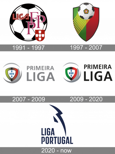
The original emblem depicted a soccer ball with some text bits written on it. It included the word ‘Liga’ in bold letters of red and white, three ‘F’, ‘P’ & ‘F’ letters in pink serif, as well as little simplified version of the Portuguese coat of arms in the corner.
1997 – 2007
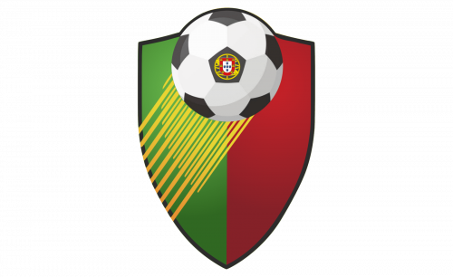
The next logo depicted a taller, sharper shield, colored 50/50 in green and red. In its peak, there was an image of a soccer ball with a more detailed coat of arms in the center. Some yellow lines also stretched from it to the left and down, symbolizing the ball’s flight.
2007 – 2009
A simpler design appeared in 2007. The emblem became a grey round outline, although it wasn’t even complete – there were only two crescent shapes in it. The middle of this ‘ball’ was occupied by a shield colored in Portuguese colors, as well as a variant of the Portuguese crest in the center. ‘Primeira Liga’ was written nearby in grey letters.
2009 – 2020
By 2009, the colors on the shield shifted to brighter shades to resemble the national flag better. Also, the letters on the wordmark turned black.
2020 – Today
At first glance, the Portuguese Primeira Liga logo may seem nothing but a chaotic collection of multicolored shapes. If you take a closer look, though, you will definitely notice that, first, the smaller shapes form a large circle, and, additionally, that they form a pattern looking very much like the pentagonal and hexagonal seams on a classic football.
The shapes colored yellow, purple, pink, green, and teal are placed over a black background and because of that acquire a neon feel. The lettering “Liga NOS,” which reflects the name of the league’s sponsor, can be seen below. The letter “O” here is made up of small white “rays.”


