The Pokémon franchise has a recognizable wordmark logo given in blue and yellow. The English version is probably most known around the world, but it is not the only one. When the logo is given in Japanese, it looks completely different and uses a different color scheme, while still preserving its playful quality.
Meaning and history

The project was started by Satoshi Tajiri in 1995. Originally it was just a couple of video games designed by Game Freak and published by Nintendo. The project is managed by Nintendo, Game Freak, and Creatures, while the trademark itself belongs to Nintendo.
What is Pokémon?
Pokémon is the name of a famous Japanese franchise, created by Satoshi Tajiri in 1995. Starting from the series of comics and animation, the franchise has released a video game, which has rocked the entertainment industry in the 2010s.
1990 – 1992
The very first logo for the iconic franchise was designed at the beginning of the 1990s when a Pokémon was called “Capsule Monsters”. The badge featured a bold stylized inscription in a super light shade of gray with the “P” in “Capsule” and the “O” in “Monsters” having their negative spaces colored black and white, making up silhouettes of weird creatures.
1994
The redesign of 1994 followed the rename of the project into “Pocket Monsters”. The new design concept was based on an image of a dragon-like monster standing between two stylized capital letters, “P” and “M”, drawn in geometric details with sharp black contours. This badge was only active for several months.
1998
In 1998 the first Pokémon logo was introduced. It was an arched stylized inscription in light yellow and blue, with a contoured rounded “Catch ‘‘em if you can!” The tagline is in white and black. This badge was very close to the one the whole world knows today. It stayed with the franchise for a couple of months and was replaced by a stronger version at the end of the year.
1998 – Today
The Pokémon logo got another redesign at the end of 1998, with the concept kept, but all the contours and colors strengthened and intensified. Now the inscription is a bit shadowed, which adds volume to the badge, and the tagline is usually not used in the official version of the logo. The main thing about the Pokémon visual identity is its contrasting color palette and the distinctive geometry of the characters, with the straight cuts and sharp angles of the contours.
Symbol
Technically, the Pokemon logo is just a wordmark, but in fact the funny characters are an even more recognizable element of the franchise. The lists of the most popular characters may vary a lot depending on who made them, but they often include Pikachu, Charizard Mewtwo, Mew, Ash, Arceus, Misty, Brock, Red, and May.
As for the wordmark itself, it is also recognizable due to the choice of typeface and color. The letters are placed in such a way that they form an arch. The insignia uses a playful, comic typeface, extremely appealing to the target audience, children. The wordmark is sometimes modified depending on the topic (Pokémon Sun, Moon, Alpha Sapphire, Omega Ruby).
Emblem in pop culture
There are quite a few connections with the Pokémon franchise in different media. On the whole, the Pokemon characters have already reached the level of pop culture icons. They are mentioned in movies and newspapers, appear on magazine covers and become a part of parks etc.
Psychologists explain that one of the reasons for this is that the game creates a rich fictional universe and also gives its fans a chance to affirm their personality. Children choose a character that is somehow close to their own individuality and in this way assert what they like and dislike, distinguishing themselves from their friends.
Font
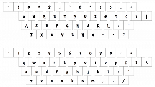
The customized typeface used for the Pokemon logo resembles the namesake font. It exists in two versions, Pokemon Solid and Pokemon Hollow. All the consonants in the wordmark are capitalized, while the characters that stand for the vowels are lowercased.
Color
Thanks to the blue outline, the yellow letters look brighter and more vivid. The yellow color in itself symbolizes joy and optimism. Emphasizing these qualities, blue adds a touch of excellence and class.
Who designed the Pokemon logo?
The Pokémon logo was designed by Ken Sugimori, a famous Japanese artist, who worked on all video games content of the Pokémon franchise, and on animated series as well. Ken Suginori started as the art director of the whole franchise, responsible for the creation of the Pokémon characters.


