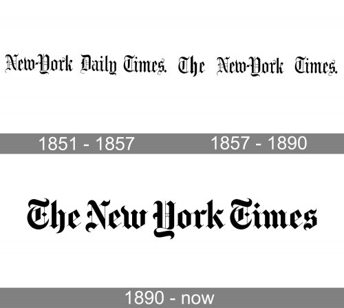
The New York Times has a recognizable logo, which looks almost the same as it did more than 150 years ago when the newspaper was created. The wordmark was tweaked several times but never completely changed.
What is the symbol of the New York Times company?
The symbol of the New York Times is its iconic bold gothic-style logotype, which does not need any graphical additions, as each line and element in every character of the I scripts is perfectly balanced and drawn with superb precision. The lettering evokes a sense of perfection and professionalism, showing the newspaper as a reliable and reputable one.
Meaning and history
The New York Times is one of the most respected and monumental newspapers of the modern print world was founded in 1851 by Colonel Raymond to create a newspaper that would not spread silly rumors and gossip, but would be an adequate and reliable source of information for people who are interested in the events going on around them.
In 1896 the paper was acquired by Adolph Ochs, under whom the circulation alone increased from 19,000 copies to 400,000.
The international version of the New York Times began publication in 1946.On September 14, 1987, the New York Times printed its heaviest newspaper, weighing 5.4 kilograms and consisting of 1,612 pages.On January 22, 1996, the New York Times began publishing daily articles online.
The New York Times was one of the last newspapers to adopt color photography. On October 16, 1997, the paper’s first-ever color photograph appeared on its front page.
What is The New York Times?
The New York Times is one of the world’s most popular and respected periodicals, founded in 1851. Today it is the second most circulated newspaper in the United States after The Wall Street Journal, with a daily circulation of more than 550,000 copies, and digital circulation of about 3 million.
1851 – 1857
The first issue of the newspaper was published in 1851. It was called the New York Daily Times back then.
1857 – 1890
In six years the newspaper changed its name dropping the word “Daily”.
1890 – Today
The following notable modification of the logo occurred in the 1890s, when the hyphen in the word “New-York” was dropped. When the current version of the logo made its debut in 1967, the newspaper lost about 1,000 subscribers. Surprisingly, the most notable change was that the period after the title was dropped.
Symbol
Times video hub emblem
The New York Times video hub logo, which was created by Work-Order, modified the “T” character so as to place a digital play button inside.
Font
The latest version of the New York Times logo was created by Edward Benguiat, one of the most well-known designers in the US, the author of quite a few typefaces (Souvenir, Tiffany, Korinna) and logos (Reader’s Digest, Sports Illustrated, Esquire). The New York Times’ logo looks like it might be set in a classic blackletter typeface, but it is in fact hand-made.
Color
The New York Times logo uses the same black-and-white color scheme as the rest of the newspaper’s headings. It looks classic and gives a chance to emphasize the intricate shape of the characters.


