

![]() Pierce the Veil Logo PNG
Pierce the Veil Logo PNG
The Californian band Pierce the Veil was created in 2006. The band has gone through a series of logotypes. Although they were different from one another, they typically had a pronounced retro feel. The most well-known of them has been the one introduced on the ‘Collide with the Sky’ album cover.
Meaning and history
![]()
The debut album, ‘A Flair For The Dramatic’, featured the band’s name in a retro typeface. It looked somewhat similar to an old Wild West saloon sign. The color pattern of the letters imitated wood making the resemblance even more obvious. The name of the album was given in an intricate script.
The Pierce the Veil logo seen on the cover of the ‘Selfish Machines’ album looked absolutely different from the previous wordmark in style and mood. It was a combination of the three scripts comprising the Billhead family. Some letters were taken unchanged, while others were modified.
Symbol
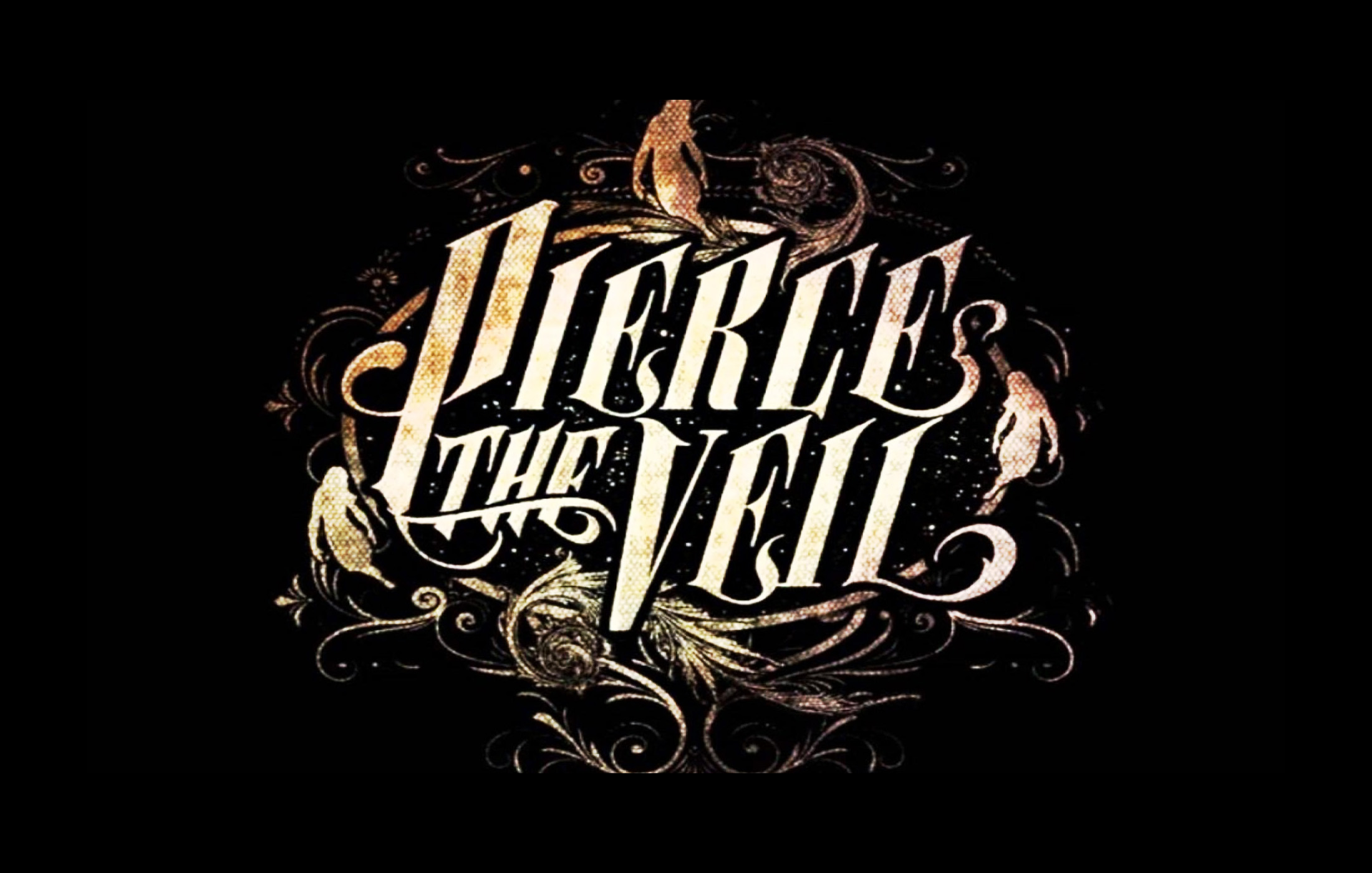
The cover of the ‘Collide with the Sky’ album (2012) looked somewhat similar in style to the previous script logo, with its intricate details, but in fact, each letter was heavily modified and actually it was a completely new logo. The same wordmark could be seen on the cover of the documentary ‘This Is a Wasteland’ (2013) detailing the band’s first world tour.
Misadventures emblem
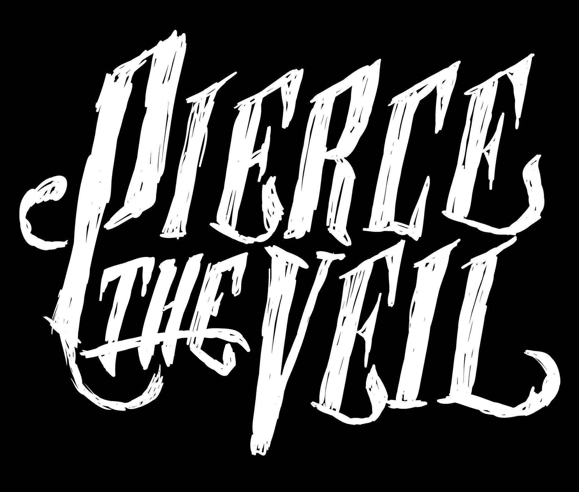
The ‘Misadventures’ album cover (2016) featured a different logo – simpler and more casual. Taking into consideration that the three letters “e” and the two letters “i” were different from each other, it is natural to suggest that this was not an existing typeface but a hand-drawn lettering. However, the release of the album with the new wordmark did not mean that the band got rid of the previous logo – it is still used on its print and digital promotion materials.
Font
![]()
The Pierce the Veil wordmark that appeared on the cover of the ‘Selfish Machines’ album was a heavily customized version of the Billhead font family published by Letterhead Fonts. The Billhead family consists of three typefaces called Billhead 1890, 1900, and 1910. All of them were inspired by period style billheads and letterheads.
It’s not that easy to detect the source font for all the other script logotypes, and it looks like in most cases it has been a custom artwork created from scratch.
Color
![]()
The Pierce the Veil logo has been given in a variety of colors depending on the background and visual context. The ‘Misadventures’ album cover is given in red and white, so the script logo is also red.


