

![]() Mötley Crüe Logo PNG
Mötley Crüe Logo PNG
The 80s music might have been different if there was no Mötley Crüe. Their stage shows, especially Tommy Lee’s drum stunts, set new standards with each tour. The band is famous not only for its music. All participants went through alcohol and drug addiction and had numerous intrigues with women. In general, their group had constant problems with the law, which often resulted in spending time in prison. In 2001, they even published a book, called “The Dirt”, which told about all the scandalous nuances of “Mötley Crüe “. The book became a bestseller.
Meaning and History
![]()
The band was formed in Los Angeles in 1981 by Nikki Sixx and Tommy Lee, who were later joined by Mick Mars and Vince Neil. With the arrival of the guitarist Mick Mars, the so far unnamed group was now calling itself “Mötley Crüe”. The band gained lots of fans and sold over 100 million albums, with the majority being bought in the United States. The musicians took a break for several years and resumed their work in 2019 and recorded songs for Jeff Traiman’s biopic “The Dirt”.
What is Mötley Crüe?
Mötley Crüe is an American glam metal band. The musicians have managed to cover many musical directions, including hard rock, heavy and glam metal. Even several decades later, they still have loyal fans
1981 – 1983
![]()
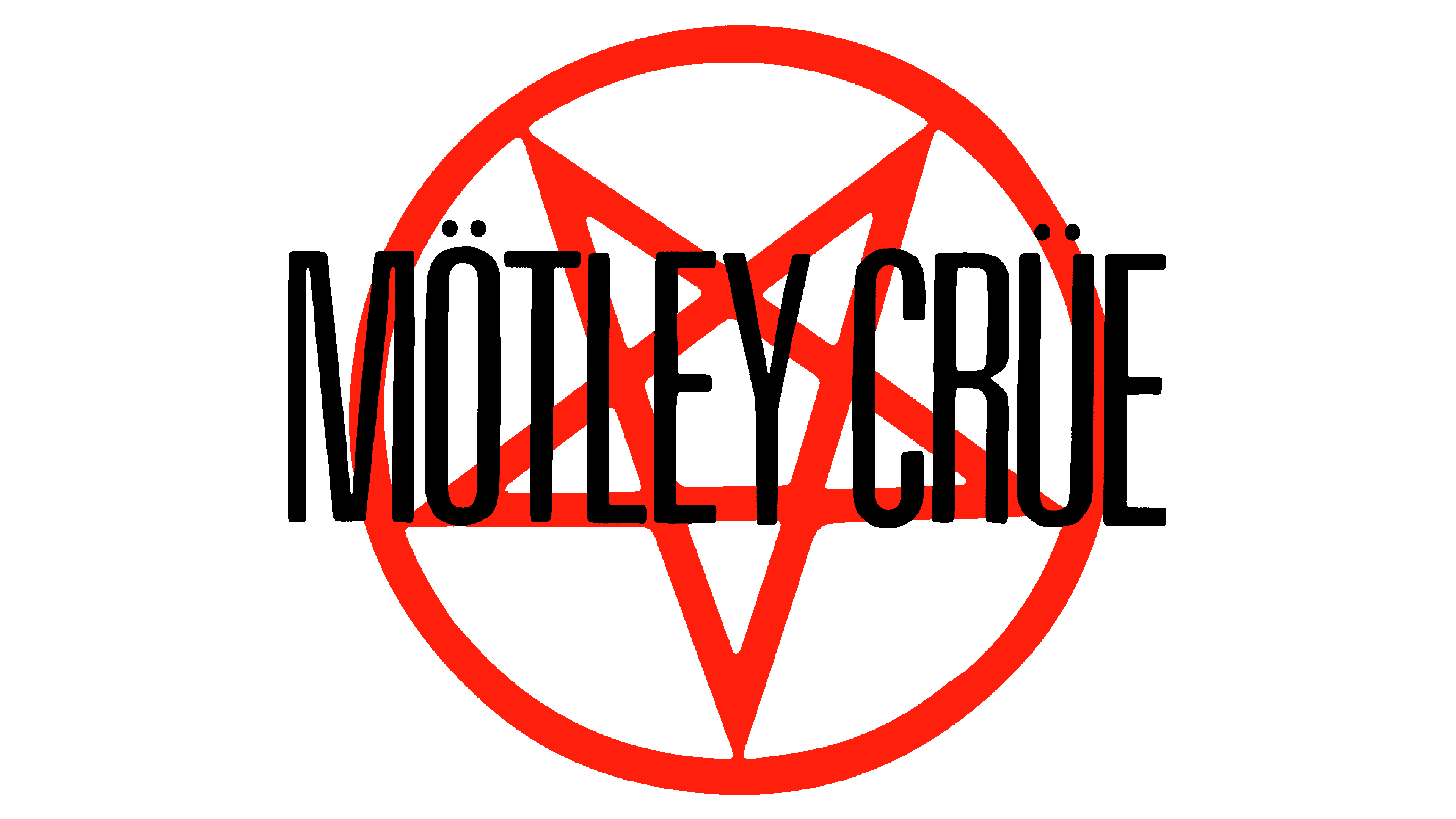
The first logo of the band consisted of just its name. It was printed using a geometric, italicized font with all the letters being capitalized. The minimal spacing between the letters along with the red color of the lettering and black background set a bold and daring mood with a hint of passion and even risk.
1983 – 1985
![]()
In 1983, Mötley Crüe changed manager Coffman to Doug Thaler and Doc McGee, known for his work with bands such as Kiss and Bon Jovi. The new logo looked very much like the previous one featuring all uppercase red letters with very narrow spacing. However, the letters are no longer italicized and the new font has more smooth curves to it. It looks a lot like Frown Town by Typotheticals.
1985 – 1987
![]()
This year, the band released one of its bestsellers – “Theatre of Pain”. The black color and diagonal cuts and sharp serifs go well with this theme. To preserve the visual identity of the band, the logo designers continued to use wide and narrow lettering and narrow spacing. A unique feature of this logo of an interesting play with the first letter which had one of its strokes extending way below all the other letters and the middle one not going all the way down. The “R” also had a long leg, which was a mirror image of the elongated “M”. The font used for this inscription has a Gothic feel to it and resembles a serif version of Gameness Regular otf (400) by typodermic.
1987 – 1989
![]()
The red color was brought back in 1987 when the “Girls, Girls, Girls” album was made. With cursive, interconnected letters, the name seemed to be handwritten. The arching of the inscription gave more character and dynamics.
1989 – 1994
![]()
The “Dr. Feelgood” album featured an updated logo with a black rectangular background and red cursive lettering. Moreover, the letters had an uneven edge, which gave the inscription a horror-like feel and the impression that it was red blood. The dark theme was enhanced by the fact that the dots resembled the eyes and there were two white skulls on either side of the emblem. In addition, the elongated strokes of some of the letters made it seem that these are some kind of blade.
1994 – 1997
![]()
A quite mystical, bloody, and hard-to-read logo accompanied the “Mötley Crüe” album. The name was now printed in two lines and featured bold, uppercase letters on a black background. Similarly to the previous version, the letters did not have a clean edge and also had black splashes all over them. The black background also had red smears across it. The logo was a perfect reflection of the band’s spirit.
1997 – 1999
![]()
The updated logo, seen on the “Generation Swine” album, had a very similar style to the previous one with uneven lettering and smeared background. This time, though, it was just black and white. Once again, the designers did a great job reflecting the mood the band wanted to create with its music.
2000 – 2008
![]()
This logo was used on the band’s “New Tattoo” album. Unlike other logos, it has a relatively positive appearance. Nonetheless, the sharp, pointed ends of the strokes might give some a feeling of danger. The lettering resembles some type of Japanese or Chinese hieroglyphs. In fact, it looks a lot like Thundercover otf (400) by CheqInk. It was the second time that the name of the band was printed in two lines, creating a more balanced cohesive image.
2008 – 2011
![]()
The band had a new emblem designed for their new album. It used this emblem during its tours as well. The red color was brought back and was used in combination with black to create mystical patterns in the background. The name had a typeface that resembled Old English lettering. They used white for the inscription, but it looked a bit dirty since there were some black smears and splashes. This technic enhanced the dark, mystical look of this emblem.
2011 – Today
![]()
This logo looks nothing like the previous versions. For the background, the designers used a group photo of the band and a gray/black abstract backdrop. When comparing the font used in this emblem and the one featured in the original logo, one will see that they are almost identical. The name was printed using italicized, sans-serif lettering with a white and blue metallic gradient. The addition of a border around the letters and a shadow gave them a three-dimensional feel.
Font and Color
The band always had very striking and bold choices when it comes to fonts. Many of its albums featured tall, narrow letters that were spaced closely together. In other cases, the font had a Gothic influence and gave association with something dark and negative. The color palette often included red, which is not only associated with excitement but also rage and aggression. Another color often used by the band is black, a color of mystery, suffering, and even death.


