

![]() Petit Bateau Logo PNG
Petit Bateau Logo PNG
Petit Bateau is a French brand of children’s clothing and underwear founded in 1920. By the 90s, its products became known as a relatively fashionable brand, and one with a higher grade of quality. It’s one of the first brands to use short, bleached and elastic underpants rather than older buttoned garments.
Meaning and History
![]()
The company was registered as a brand in 1920, although it’s been active as a producer of clothing since the 1890s. It was founded by Pierre Valton, and the company remained in the hands of his family until 1988, when the business was taken over by Yves Rochet. The latter still owns Petit Bateau.
The name translates to a ‘little boat’, and this connection is reflected in the company logotypes and branding. The origins are in the 1890s’ nursery rhyme by the French author George du Maurier, which Etienne Valton, the second owner, liked and used as inspiration for the company name in 1920.
What is Petit Bateau?
Petit Bateau is an old French brand of clothing and underwear, particularly for children. The brand was created in 1920, although its history is even older. It’s known as one of the pioneers of clothing designs, being one of the first companies to produce underwear of modern design.
1920s – 1930s
![]()
The original logotype was a depiction of a small sailboat floating on waves, all made in black lines. It wasn’t very detailed, as there were comparably few strokes. Beneath, there was the company name written in quotation marks and all capitalized letters. The font was a simple sans-serif style. In the very bottom was the word ‘déposé’, meaning ‘registered’.
1930s
![]()
The second logo used a similar design, although with more nuance and a new round frame around the entire logotype.
1930s – 1940s
![]()
The third logo was a lot more simplistic. The shapes were comparably simple, without any shading and with as few lines as possible. The boat used white shapes with a darker outline. It was placed in front of a big black circle, although it also extended beyond it. Beneath it on the circle were several white wavy lines.
1940s – 2000s
![]()
The logo was simplified further in the 40s. The boat now had only two sails (unlike the previous designs). It was absolutely white and placed inside a bold frame ring. The rest of the logo, a typically rectangular shape, was grey. The only exception is the brand name written along the bottom line in white, thin letters.
2000s – 2010s
![]()
A similar design was used later, although with a different color scheme. The new boat had bright yellow sails and the blue body. The waves beneath and the frame around were dark blue. The rest of the logo, now a square, was a lighter shade of blue. The name now followed the curve of this circular frame. They put it beneath the emblem and colored it blue, as well.
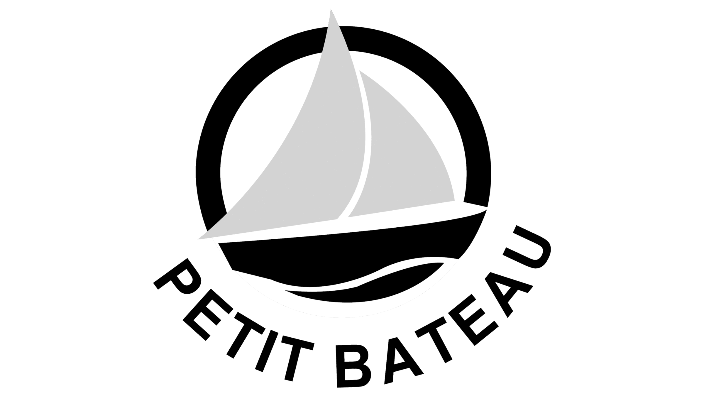
2010s – today
![]()
In the 2010s, they simplified the logo again. The sails didn’t change much, but the body merged with the waves in an obscure colored, wavy fragment. The round frame was still around, as was the name beneath. All of them were painted dark blue.
Color

The color scheme of the modern Petit Bateau logotypes relies heavily of the color blue. It reflects the maritime nature of the brand’s name, and even the shade of the 2010s logotype is known as ‘navy blue’, which alludes to the general idea.
Font
The font changed little for the last several decades. The latest style is a round, smooth sans-serif without any sharp turns and angles. The earlier designs were comparably thinner, whereas the current style is noticeably bold. They exclusively use capitalized letters, as well.


