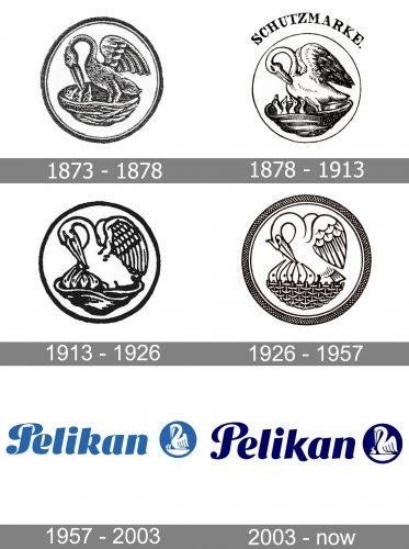
Pelikan is a German manufacturer of writing, office, and art equipment. Starting from 1873, the Pelikan logo has had the same core – it has always featured a pelican in a nest with the chicks. However, the image has been redrawn multiple times, each new version coming with new details.
Meaning and history
In 1838, chemist Carl Hornemann opened a color and ink factory in Hanover, Germany. In 1871, Guenther Wagner, who worked there as chemist and plant manager, took over the company.
1873 — 1878
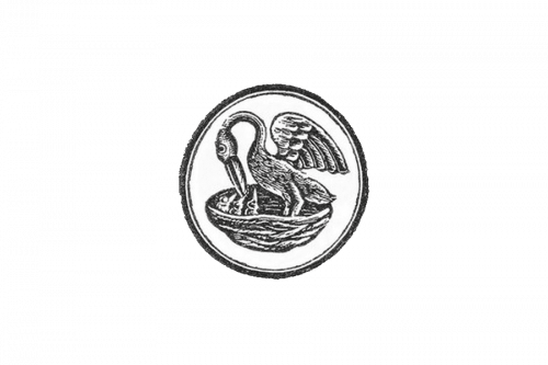
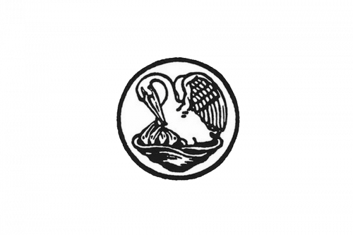
The author of the original logo was Günther Wagner himself. He was inspired by his family’s coat of arms. The emblem featured a rather dark pelican with a huge beak and three chicks. The first products, where it was used, were the so-called Small Honey Paints, a type of watercolor.
According to the brand’s website, the original logo was designed in 1873.
1878 — 1913
The logo was officially registered. It has been known among the oldest trademark registrations in Germany. In fact, it was only in 1874 that the Trademark Protection Act was issued in the German Empire.
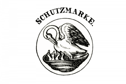
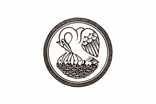
In this version, the pelican is by far lighter and has a smaller beak. The beak forms a closed shape with the chest, while in the previous logo, the beak was further from the chest, thus forming an open shape. The wing is straighter.
There is an even more noticeable difference – there are four chicks now. Also, it’s the only version that comes with the lettering “Schutzmarke” arced above the bird.
While the global Pelican website insists this logo was registered in 1878, the UK version states that it took place in 1895.
1913 — 1926
The bird was redrawn in a more realistic and elegant manner. There were four chics, like in the previous version, but the pelican’s wing was more rounded and full, for instance.
Below the circle, there was the name of the brand in a thin, slightly casual type.
1926 — 1957
The new design was introduced by O. H. W. Hadank. While preserving the same theme, it became cleaner. Many strokes and details that hadn’t been necessary to understand the picture disappeared. The frame, on the other hand, grew bolder and more elaborate.
Here, a bold cursive wordmark appeared for the first time.
According to the explanation on the company’s website, “the original focus on Christianity receded” in this version, in contrast to the previous ones.
1957 — 2003
This one already looks pretty much like the current Pelikan logo.
For one, the emblem became dark green. Also, it was once again simplified, which perfectly fit the minimalism tendency in logo design. For instance, the nest and the ring were solid blue (instead of being made up of multiple strokes). The number of chicks was reduced to two.
The wordmark grew bolder and looked almost exactly like the current one.
2003 — now
Only one chick stayed. Other than that, the modifications were comparatively subtle. All of them were aimed at making the design even more minimalist, while also making it more logical and natural.
The number of feathers in the wing was reduced. The lower part of the beak grew bolder. The neck grew bolder, too. The blue became darker.
Also, the wordmark became lighter and cleaner (note, for instance, the simplified shape of the “k”).
Font
The type in the Pelikan logo is inspired by an elegant cursive script with a great variation in the thicknesses of the strokes. Yet, it doesn’t have too many elaborate details. It appears that the designers tried to hint at the company’s rich history without letting the wordmark look dated.
Color
The saturated and dark shade of blue creates a decent contrast, while also adding a touch of uniqueness (in comparison, for instance, with simple black logos).


