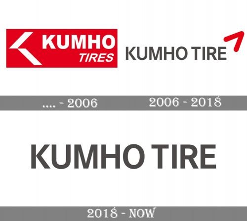
The logo of Kumho Tire Co., Inc. has been growing simpler with time. It has gone through at least four updates so far.
Meaning and history
The history of KumhoTire goes back to 1946 when in the small town of Gwangju resident In-Chuk Park opened the first production of rubber tires for cars. Initially, the small shop had a capacity of 20 times a day sales in Thailand. The company successfully operated until the war and was destroyed during the war in 1950 — 1953.
After the war, it took some time to build up the manufacturing process again. Mr. Park organized two companies, one of which later became the best tire manufacturer in Asia and then in the world, and already in the middle of the 1960s the products of the company were approved by the Ministry of Transport and entered a wide market in the United States. The production volume increased and in 1974 an additional production line for radial tires is built.
The success was so great that in 1992 Kumho became one of the ten largest tire manufacturing corporations in the world.
What is Kumho?
Kumho Tire is one of the world’s leaders in the field of tire production, which was established in South Korea in the middle of the 20th century. Nowadays, car owners associate the brand name with the reliability and durability of products made according to the latest methods.
Before 2006
The company was founded in 1960 under the name of Samyang Tire. It is a South Korean tire company based in Gwangju, South Korea. Today, it works under the following names: Kumho Tires, Kumho Tyre and Kumho Tyres (the choice of the name is connected with business locations).
The older logos featured a stylized plane or bird symbol made up out of two parallelepipeds. The shape was accompanied by the lettering “Kumho” (in a generic sans) and “Tires” (also in a sans serif type, italicized). The palette could include white, red, and blue.
2006
In contrast with the previous logo, the words “Kumho Tyre” were now given within a single line. The lettering was gray and rather large, the blue or red background disappeared. In the top right corner, you could see the so-called red “Wing” symbol, which had been borrowed from the logo of the parent company, the Kumho Asiana Group. The vivid, memorable symbol was designed by Landor in 2009.
It could be often seen paired with the tagline “Better. All-ways.”
2018
When the Kumho Asiana Group sold the tire company to Doublestar, the logo was modified. Although the modification was pretty subtle – only the red “wing” was removed – this drastically changed the overall style of the Kumho logo making it rather generic.
Font and Color
The modest yet confident lettering from the primary Kumho Tire logo is set in the uppercase of a clean and distinctive sans-serif typeface. The closest fonts to the one, used in this insignia, are, probably, Neue Haas Grotesk Display 65 Medium Or Sequel Sans Headline Semi.
As for the color palette of the Kumho Tire visual identity, it is even more modest and simple than its typeface. Based on a dark shade of gray, the logo of the company evokes a sense of stability and trustworthiness,’professionalism, and a fundamental approach to all production stages and processes.


