Ajinomoto is the name of a multi-profile company, which was established in Japan in 1917, and today is engaged in various activities, including food production, pharmaceuticals, and even computer components. The company was founded by Suzuki and Co and grew into a huge brand throughout the years.
Meaning and history
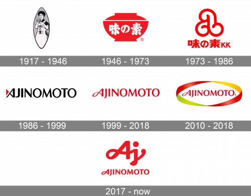
Ajinomoto is a company with a very rich history, so no wonder that its visual identity has been redesigned quite many times throughout the years. In the very beginning, the brand was using the logo of its mother company, Suzuki, but starting in 1946, Ajinomoto uses its insignia, which always has an intense red shade in its palette, no matter which style it is executed in.
1917 – 1946
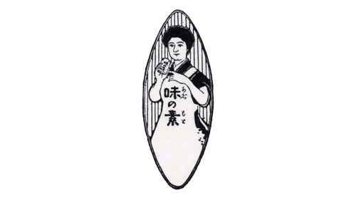
The very first logo the company, known today as Ajinomoto got in 1917, while it still was one of the Suzuki&Co subsidiaries. It was a classic and elegant medallion in black and white, with the image of a Japanese lady wearing a white apron with bold black hieroglyphs on it. The lady was placed inside a vertically stretched oval medallion with the background featuring a vertical striped pattern.
1946 – 1973
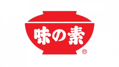
In 1946 the brand gets its official Ajinomoto name and introduces the first separate logo. It was a bold red and white emblem with the solid red bowl as the main element. The smooth white lettering (the name of the brand in Japanese) was written over the red body of the bowl in soft and thick lines. It was a very warm and modern image, which evoked a sense of trustworthiness and cozy Home feelings.
1973 – 1986
The redesign of 1973 was held by Saul Bass bureaux. The famous designer introduced something unique and eye-catching, creating a smooth playful signifier for the Japanese food brand. The red and white color palette was the only thing that stayed unchanged. The main element of the logo was a stylized letter “A” executed in several thick curved lines, which created a very attractive and playful appearance. The letter could be drawn in red and placed on a white background above the bold red logotype in Japanese. The second version featured white lines of the “A” on a solid red square with rounded angles. There was also a version with the “A” composed of several thin white lines.
1986 – 1999
In 1986 the Ajinomoto logo was redesigned again. The new version offered something brutal and confident — the uppercase black logotype in a clean and distinct sans-serif typeface with the diagonal bar in the letter “A”. The red color was still there, but it was a very small element on the left from the inscription. It was a solid triangular, pointing to the right, just like a Play button. The red triangle and the white negative space in the letter “A” formed a sharp geometric infinity symbol.
1999 – 2018
The redesign of 1999 softened the strict black logotype, created in 1986, and redrew it in scarlet-red. The first “A” got its tail elongated and curved, forming a smooth and sophisticated infinity sign on the left. The second letter of the inscription, “J”, got its tail a bit longer too, as for the other letters, they remained in the same style as before, but due to the use of the new color, they looked smoother and more welcoming. In the same year, Ajinomoto also got an icon. It was its unique letter “A” written in white on a solid red circle, placed inside a white square.
2010 – 2018
The red logotype, designed in 1999, was adopted for the secondary Ajinomoto logo, which was used internationally. It was absolutely the same bright red inscription, which gained a thick multicolor framing, composed of a horizontally placed oval, formed by a ribbon. The new palette featured yellow, green, and red shades, representing the variety of goods, offered by the brand.
2017 – Today
The redesign of 2017 emboldened the red Ajinomoto logotype and placed it under a new company’s signifier, which is a handwritten cursive “Aj”, executed in thick smooth lines with the ends slightly rounded. The whole image today looks very kind and friendly, and in the bright red and white color palette, it also evokes a sense of power and professionalism.


