

![]() Paco Rabanne Logo PNG
Paco Rabanne Logo PNG
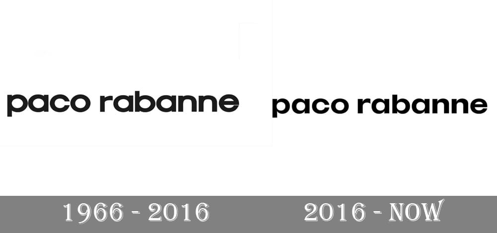
When the Paco Rabanne logo was updated in 2016, it went unnoticed by the majority of customers as the overall look and style of the emblem remained the same. And yet, when you compare the two versions side-by-side, you immediately perceive the stylish, sophisticated curves the wordmark has acquired as a result of the redesign.
Meaning and history
The history of the fashion house dates back to 1966 when young designer Paco Rabanne (real name Francisco Rabaneda y Cuervo). During this period, Paco Rabanne presented his collection on the Parisian runway, which caused a real sensation.
In 1969, the brand presented its first women’s perfume and the first men’s fragrance was created by Paco Rabanne in 1973.
Paco Rabanne revolutionized the world of fashion, so the brand had a reputation as a provocateur and rebel.Today Paco Rabanne is a big world-class holding company, but the founder of the brand is still directly involved in the brand.
What is Paco Rabanne?
Paco Rabanne is the name of a famous French brand, founded in the 1960s and named after its founder, the designer of Spanish origin Paco Rabanne (real name – Francisco Rabaneda y Cuervo). Today the brand is known for its extravagant clothing and high-quality perfumes.
1966
![]()
The original wordmark was the same as the current one: the lettering “Paco Rabanne” in a sans serif type. It was the lowercase version of a geometric font. While it was legible and did its job well, it was not unique and seemed to lack a sense of craftsmanship.
2016
![]()
At first glance, before you compare the two versions side-by-side, it is almost impossible to see the difference. And yet, the difference is profound, in artistic respect. The authors of the logo have emphasized the difference in the width of the strokes, due to which the design has got a unique touch and a more richly sculpted aesthetic.
According to the brand’s press release, the new details were inspired by ink traps. An ink trap in a type is a place where ink is naturally spread when the type is printed. The ink trap appears instead of the corners or details deliberately removed from the glyphs. If there were no ink traps, the excess ink would ruin the typeface.
“PR” emblem
![]()
In addition to modifying the primary Paco Rabanne logo, the brand also updated the “PR” monogram. Interestingly, the monogram uses different “P” and “R” than the wordmark.
Font and Color
The minimalistic lowercase lettering from the primary badge of the Paco Rabanne fashion house is set in a custom sans-serif typeface with thick distinctive lines and straight clean cuts of the ends. The closest fonts to the one, used in this insignia, are, probably, Internacional Alt Bold, or TT Firs Neue DemiBold, but with the letters a bit extended.
As for the color palette of the Paco Rabanne fashion brand, it is based on black and white, the scheme, used by many other luxury brands in this industry. Black is a timeless symbol of elegance, precision and excellence, which makes it possible to place the logo on any background without losing its visibility and uniqueness.


