Outlook is the name of an e-mail service, created in 1996. The service provides the ability to send and receive emails, write notes, save messages, and many interesting features. Even corporate tasks such as creating conferences, meetings, using calendars, and coordinating events can be done with the service.
Meaning and history
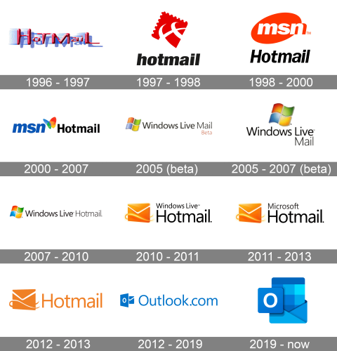
Today one of the most popular e-Mail service providers, Outlook was established as Hotmail in 1996, getting its current name only in 2012. Throughout the years the service has undergone several major rebranding, being a part of MSN, and Windows Live.
1996 – 1997
The very first logo for the e-Mail provider was created in 1996 when Hotmail was just introduced to the public. The logo featured a three-dimensional composition, based on a stylized logotype, with a contrasting shadow. It was a modern glossy red inscription on a white and purple background, which looked bright and strong. The letters featured different sizes, which made the whole badge friendly and cool.
1997 – 1998
The redesign of 1997 made the Hotmail professional and strict, fully changing the concept of the badge and its mood. The new logo was composed of an emblem, set above the bold lowercase logotype in black italicized sans-serif letters. The Hotmail emblem depicted a stylized dark red postal stamp, placed slightly diagonally. On the stamp, there was a white partial image of a globe, executed in thick smooth lines.
1998 – 2000
The previous logo didn’t last long, as in 1998 the email service was renamed MSN Hotmail, and the need for a new badge appeared. The logo for MSN, introduced in 1998, featured an orange and black color palette, with the simple yet intense MSN emblem placed above the black title case “Hotmail” in a strict italicized sans-serif typeface, with the bold letters slightly narrowed.
2000 – 2007
The MSN corporate identity was redrawn in 2000, hence the Hotmail logo was changed accordingly. Now it was the new MSN emblem (a bold lowercase inscription in blue followed by a stylized butterfly in blue, green, red, and yellow), set on the left from the black straight “Hotmail” in a strict yet modern sans-serif typeface. In some versions, the second part of the badge was set in white and had its massive letters outlined in blue.
2005 (beta)
In 2005 the beta version of Windows Live Mail was created, so the new logo was used by the service for several months. It was an iconic Microsoft weaving flag, composed of four fragments, placed on the left from a medium-height sans-serif inscription in dark gray. The “Mail” part of the logotype was set in thinner lines and had a dark red “Beta” tagline under it.
2005 – 2007 (beta)
A few months later the logo was slightly refined, making the lettering black, and placing it under an enlarged and brightened up Microsoft flag. The letters of the inscription got a bit taller, and the “Mail” part (still in thinner lines” was now placed right under the “Live” of the first level. It looked pretty well-balanced and professional.
2007 – 2010
The Windows Live Hotmail name appeared in 2007, along with the new logo, designed for the service based on the previous concept. It was still a bright Microsoft flag, set on the left from the horizontally oriented inscription in a clean and modern sans-serif, with all three words in black, and the “Hotmail” part in thinner lines.
2010 – 2011
The redesign of 2010 adopted a new style of the email service logo. The four-colored Windows flag was gone from the badge, and the new emblem in orange and white replaced it. The new graphics depicted a three-dimensional envelope placed in ¾ turn and accompanied by thin smooth fire lines. As for the logotype, it was set in the same sans-serif, as on the previous versions, but with the “Hotmail” part enlarged and set under the small “Windows Live”.
2011 – 2013
The name of the service was changed to Microsoft Hotmail in 2011, so the inscription on the logo was replaced, with black color being a bit muted, and turned into darkish gray. As for the emblem, it remained the same in style, shapes, and contours, but got its intense orange shade a bit lightened up.
2012 – 2013
The additional logo was created for the e-Mail service provider in 2012. The badge in orange and white was used along with the primary version, introduced a year earlier. The secondary badge was flat and featured an orange envelope with no gradients, set on the left from the lightweight orange “Hotmail” wordmark in a clean and modern sans-serif typeface. Simple and contemporary.
2012 – 2019
The service was renamed into Outlook in the middle of 2012, and this is when the new visual identity was created. A completely refreshed look and a new blue and white color palette are what we all saw after the major Outlook rebranding. The emblem, set on the left from the enlarged sans-serif logotype, featured a blue and white envelope, overlapped by a sharp square with the white letter “O” on it. The redesign was held according to the complete visual identity refinement of Microsoft Office.
2019 – Today
The redesign of 2019 made the Outlook logo smoother and brighter, removing the lettering part and keeping only graphics in a rich blue color palette. Now the solid blue square with rounded angles and a white “O” on it, is set over the opened blue envelope, with the checkered file coming out of it. Different shades of blue and smooth angles of the geometric figures in the logo make the Outlook visual identity look friendly yet professional and contemporary.


