For much of its history, the emblem of OSRAM Licht AG, a lighting manufacturer based in Munich, Germany, revolved around the light bulb. The current Osram logo, though, is a simple wordmark without the pictorial part.
Meaning and history
The word “Osram” comes from the 1906 patent for the incandescent lamp developed by Carl Auer von Welsbach. However, the company under this name was formed only in 1919 as a result of a collaboration between Auergesellschaft, Siemens & Halske, and Allgemeine Elektrizitäts-Gesellschaft.
The old logo used in Germany starting from 1919 featured the word “Osram” in an elegant type with varying thickness and decorative thin serifs. The Italian version showcased blue block lettering, which was modified more than once over time.
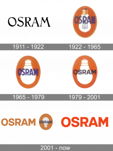
1911 – 1922

Their earliest logo was a sort of typed wordmark of their name, made from tall, serif letters.
1922 – 1965
The light bulb emblem was introduced in the early twenties. Originally, there was a tiny pointed pimple on the bulb apex – it was used because at that era the air was sucked out from the bottom so as to make the bulb sealed from there.
Several years later, a new approach started to be used: the air was now removed from the top. This method was reflected in the logo – the pimple disappeared. You can already see this in the 1928 logo.
1965 – 1979

In 1965, the previous design was stripped of much detail, which included the bulb. It was now a white image with just general shapes. Besides, a slight outline around the oval in the previous logo is now gone.
1979 – 2001

In 1979, the text bit was changed. The letters were shortened and darkened, but not much else changed.
2001 – Today (Lighting products)
Over time, there was some playing around with the shape of the oval, the trim, the shades, and the type. Yet, the overall style remained pretty much the same.
Around 2000, the brand returned to its heritage. The logo now featured the word “Osram” in blue over the light bulb, which was now turned upside down. The orange ellipse returned, too.
2001 – Today

Eventually, the Osram logo was reduced to a wordmark in an austere sans.


