At the heart of the automotive parts and accessories industry, NAPA (National Automotive Parts Association) stands as a pivotal entity, facilitating the distribution and retail of quality auto parts across the United States. Founded on the principle of providing an extensive catalog of parts for various vehicle types, NAPA operates through a network of stores and distribution centers strategically located to serve both professional mechanics and DIY enthusiasts efficiently.
Meaning and History
Founded in 1925 by a collective of automotive parts sellers, the National Automotive Parts Association (NAPA) embarked on a mission to revolutionize the distribution of auto parts across the United States. This visionary group recognized the necessity for a more efficient and reliable supply chain in the automotive industry, setting the stage for NAPA’s enduring legacy. The early years were marked by rapid expansion and the establishment of a robust distribution network, laying the foundation for its future success.
As NAPA grew, it distinguished itself through several key achievements that solidified its position in the industry. One of the company’s hallmark milestones was the development and introduction of its private label brand, offering high-quality automotive parts at competitive prices. This move not only expanded NAPA’s market share but also established it as a trusted name among automotive professionals and enthusiasts alike. Furthermore, NAPA’s commitment to innovation and excellence led to the implementation of advanced inventory and logistics systems, ensuring that customers could rely on NAPA for timely access to a wide array of parts and accessories.
Entering the 21st century, NAPA continued to adapt and thrive amidst the challenges and opportunities presented by technological advancements and changing consumer behaviors. Today, NAPA stands as a leading force in the automotive parts industry, boasting over 6,000 stores and distribution centers across the country. Its current position reflects a deep commitment to quality, customer service, and innovation. By continuously expanding its product offerings and embracing e-commerce platforms, NAPA ensures that it remains at the forefront of the industry, ready to meet the evolving needs of its diverse customer base. This enduring success is a testament to NAPA’s foundational vision of providing superior parts distribution and retail services, marking it as a pivotal player in the automotive world.
What is NAPA?
NAPA is an influential company specializing in the distribution and retail of automotive parts and accessories. With a rich history dating back to 1925, it serves as a vital resource for both professional mechanics and DIY car enthusiasts, offering a wide range of products through its extensive network of stores and distribution centers.
1925 – 1965
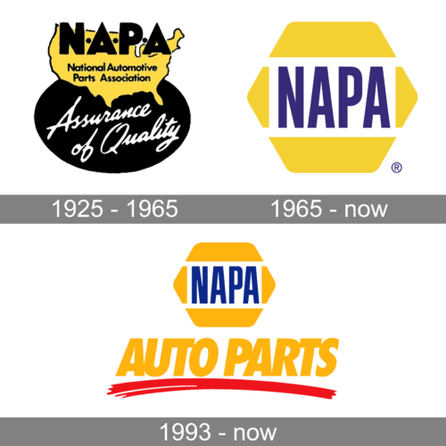
The first NAPA logo features a map of the United States in yellow, highlighting the nationwide reach of the National Automotive Parts Association. Overlaid on the map, in bold, black letters is the acronym “N-A-P-A,” indicating the association’s name. Below the map is a black oval with the phrase “Assurance of Quality” in a script typeface, suggesting the company’s commitment to high-quality automotive parts. The color contrast and combination of fonts convey a sense of trust and reliability in the brand.
1965 – Today
In the logo, NAPA is represented by a distinctive hexagon shape in yellow with the brand name “NAPA” boldly written in purple within it. The design is minimalist and modern, using a simple yet strong font that suggests durability and strength. The use of yellow, associated with energy and attention, and purple, representing quality and luxury, combine to imply a company that is both dynamic and high-end.
1993 – Today
The current NAPA logo again uses the recognizable hexagon shape in yellow, with the company name “NAPA” in the center in a bold, blue font. Below the hexagon, the words “AUTO PARTS” are written in a vibrant yellow script, which stands out against the white background and is underscored by a red swoosh. This logo design is bright and energetic, reflecting the brand’s focus on automotive excellence and the high-performance nature of its products.


