Oriflame is a Swedish cosmetic brand, which was established in 1967. The brand, founded by the Jochnick brothers, was one of the first to practice direct-selling and got extremely successful in Eastern and Western Europe. Today Oriflame is headquartered in Switzerland and has a yearly revenue of more than one billion euros.
Meaning and history
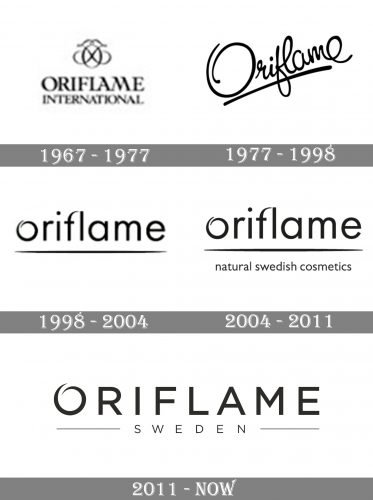
The Oriflame visual identity has always been based on light and elegant lettering, executed in a classy monochrome color palette, looking timeless and fine. Though the style of the logotype has changed a lot since the original version, created in 1967, the fresh and sophisticated mood is still there, brilliantly reflecting the essence and character of the brand.
1967 — 1977
The initial Oriflame logo, created in 1967, was composed of a capitalized serif inscription with the “International” tagline in smaller letters, and an elegant and light emblem placed above the lettering. The emblem featured an oval letter “O” with two crossed “J”s, standing for the Jochnick surname. The elongated and smooth lines on the elm ken were curved and looked sophisticated and playful.
1977 — 1998
The redesign of 1977 brought a new style to the Oriflame visual identity. The logotype was now placed diagonally, in the upright direction, and underlined with a smooth and thick touch. The custom cursive typeface of the new wordmark looked feminine yet bold and modern, perfectly reflecting the philosophy and purpose of the cosmetic brand. The “O” on this version had its contour open, which gave a theme for the following redesigns.
1998 — 2004
In 1998 the Oriflame visual identity was refreshed. Its logotype was completely changed and now boasted lowercase sans-serif lettering with a custom open “O”, executed in a smooth pointed line. The wordmark was underlined and looked modest, tender yet confident and contemporary.
2004 — 2011
The letters of the logotype became a bit bigger and the “Natural Swedish Cosmetics” tagline in the lowercase was added to the bottom part of the emblem. The additional lettering made the whole image look whole and complete and added confidence and professionalism to light and fine wordmark.
2011 — Today
The redesign of n if 2011 switched the iconic lowercase lettering to the uppercase, which completely changed the look of the Oriflame emblem, making it more progressive and modern. The “O” remained untouched, though all other elements were redrawn. The underline and tagline were now replaced by the capitalized “Sweden” with two long horizontal lines on the sides.
Font and color
The Oriflame wordmark in all capitals is executed in a simple and neat sans-serif typeface c which is pretty close to such fonts as Organetto Regular and Internacional Regular, but with some lines modified, “O” custom and all letters placed with a lot of space between them.
The official color palette of Oriflame is based on a classy combination of black and whites which is always in trend. Though depending on the needs, the logotype can sometimes be drawn in white and placed on a gradient purple and pink background, which perfectly shows the purpose of the brand and its femininity.


